

How much do solutions to social problems differ in their effectiveness? A collection of all the studies we could find.

Table of Contents
- 1 1. Data on how much solutions differ in effectiveness within cause areas
- 1.1 The original dataset: Disease Control Priorities in Developing Countries (second edition)
- 1.2 Other studies of global health
- 1.3 Health in high-income countries: public health interventions in the UK (NICE)
- 1.4 US social interventions: Washington State Institute for Public Policy Benefit-Cost Results database
- 1.5 Climate change: Gillingham and Stock
- 1.6 Education in the UK: The Education Endowment Foundation
- 1.7 Education in low-income countries: Education Global Practice and Development Research Group Study
- 1.8 Some other datasets
- 1.9 Patterns in the data overall
- 2 2. Given this data, how much do solutions within a cause area actually differ in effectiveness?
- 2.1 Ways the data might overstate the true degree of spread
- 2.2 Ways the data could understate differences between the best and typical interventions
- 2.3 A case study: GiveWell and the DCP2 data
- 2.4 Coming to an overall estimate of forward-looking spread
- 2.5 Response: is this consistent with smallpox eradication?
- 2.6 Response: is this consistent with expert estimates?
- 3 3. How much can we gain from being data-driven?
- 4 You might also be interested in
- 5 Appendix: Additional data
- 6 Read next
In a 2013 paper, Dr Toby Ord reviewed data compiled in the second edition of the World Bank’s Disease Control Priorities in Developing Countries,1 which compared about 100 health interventions in developing countries in terms of how many years of illness they prevent per dollar. He discovered some striking facts about the data:
- The best interventions were around 10,000 times more cost effective than the worst, and around 50 times more cost effective than the median.
- If you picked two interventions at random, on average the better one would be 100 times more cost effective than the other.
- The distribution was heavy-tailed, and roughly lognormal. In fact, it almost exactly followed the 80/20 rule — that is, implementing the top 20% of interventions would do about 80% as much good as implementing all of them.
- The differences between the very best interventions were larger than the differences between the typical ones, so it’s more important to go from ‘very good’ to ‘very best’ than from ‘so-so’ to ‘very good.’
He published these results in The Moral Imperative towards Cost-Effectiveness in Global Health,2 which became one of the papers that started the effective altruism movement. (Note that Ord is an advisor to 80,000 Hours.)
This data appears to have radical implications for people interested in doing good in the world; namely, by working on one of the best interventions in global health, you could achieve about as much as 50 people working on typical interventions in that area.
In some earlier research, I showed that many charitable interventions don’t seem to work at all. But the DCP2 data showed that even among interventions that work, there are still huge differences in impact, suggesting it would be worth going to great efforts to find the most effective ones.
So it’s crucial to know the extent to which this is true, and whether the results extend beyond global health.
At the time, it was widely assumed these patterns would hold, but this wasn’t carefully checked.
In this article, I’ve attempted to check these claims — I would really welcome further research into these questions, ideally by someone trained in social science.
In the first section, I list all the datasets I’ve seen comparing cost-effectiveness, and compare them to Ord’s findings in global health — finding that the 80/20 pattern basically holds up. (There is more technical information — log standard deviations, and log-binned histograms showing distribution shapes — in the additional data appendix.)
In the second section, I explore what we can learn from this data about how much solutions differ in effectiveness within cause areas, all things considered.
I’ll argue the true forward-looking differences between interventions within cause areas are not as large or decision-relevant as these results make them seem; though they’re still far more important than most realise. In other words, they’re underrated by the world in general, but may be overrated by fans of effective altruism.
In the third section, I speculate about the implications for how to choose interventions within a cause, arguing that it shows that the edge you gain from having a data-driven approach is less than it first seems.
Overall, I roughly estimate that the most effective measurable interventions in an area are usually around 3–10 times more cost effective than the mean of measurable interventions (where the mean is the expected effectiveness you’d get from picking randomly). If you also include interventions whose effectiveness can’t be measured in advance, then I’d expect the spread to be larger by another factor of 2–10, though it’s hard to say how the results would generalise to areas without data.
1. Data on how much solutions differ in effectiveness within cause areas
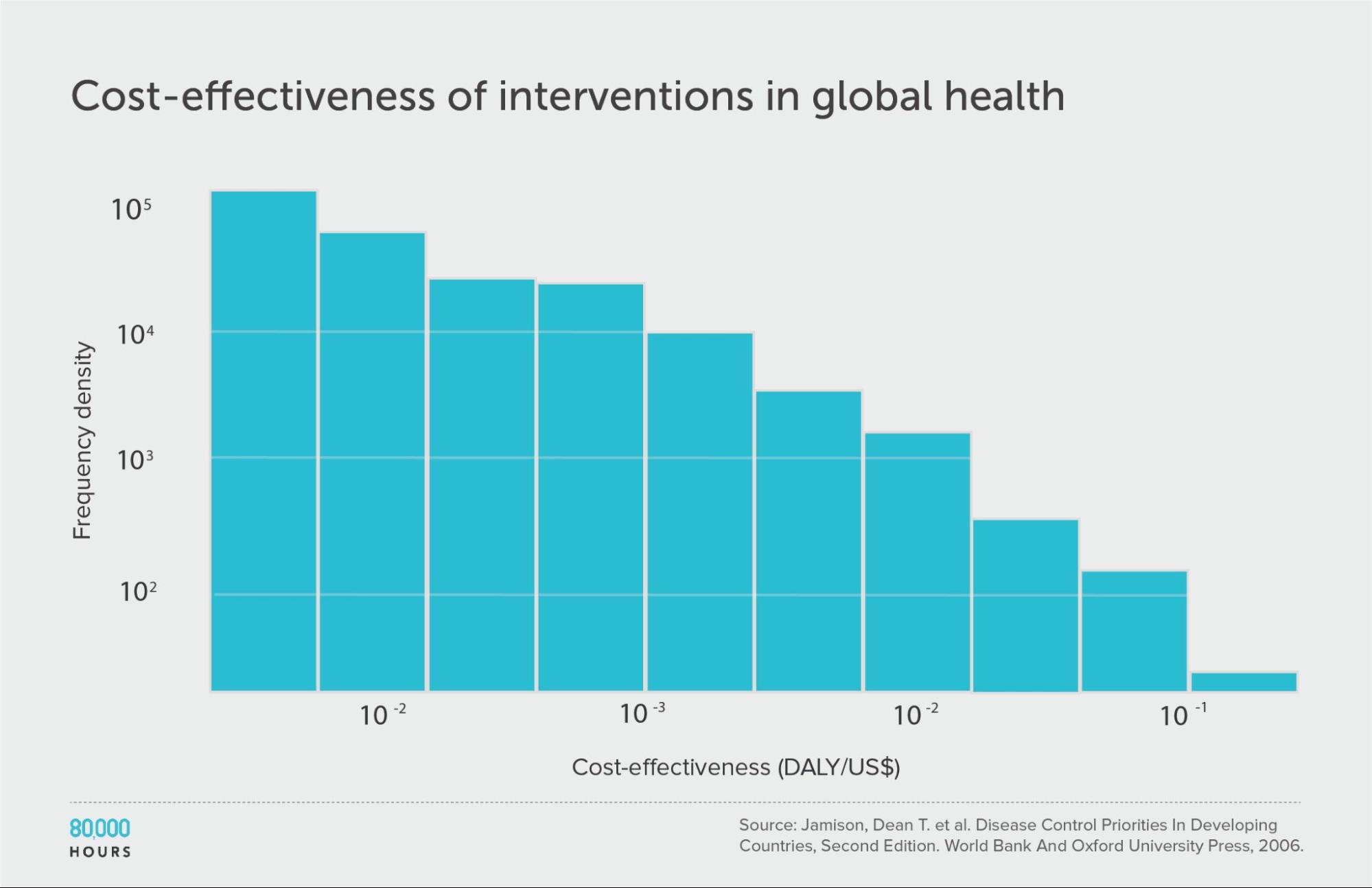
The original dataset: Disease Control Priorities in Developing Countries (second edition)
I’ll start with the dataset used in Ord’s original paper as our point of comparison.
The DCP2 was published in 2006. It compared 107 interventions within global health in poor countries, ranging from surgery to treat Kaposi’s sarcoma, to public health programmes like distributing free condoms to prevent AIDS.
For each intervention, there’s an estimate of how much illness it prevents — measured in disability-adjusted life years (DALYs) — and how much it costs. The ratio of the two is the cost effectiveness.
If we line up the interventions in order of cost effectiveness (shown on the Y-axis), we get the following graph:
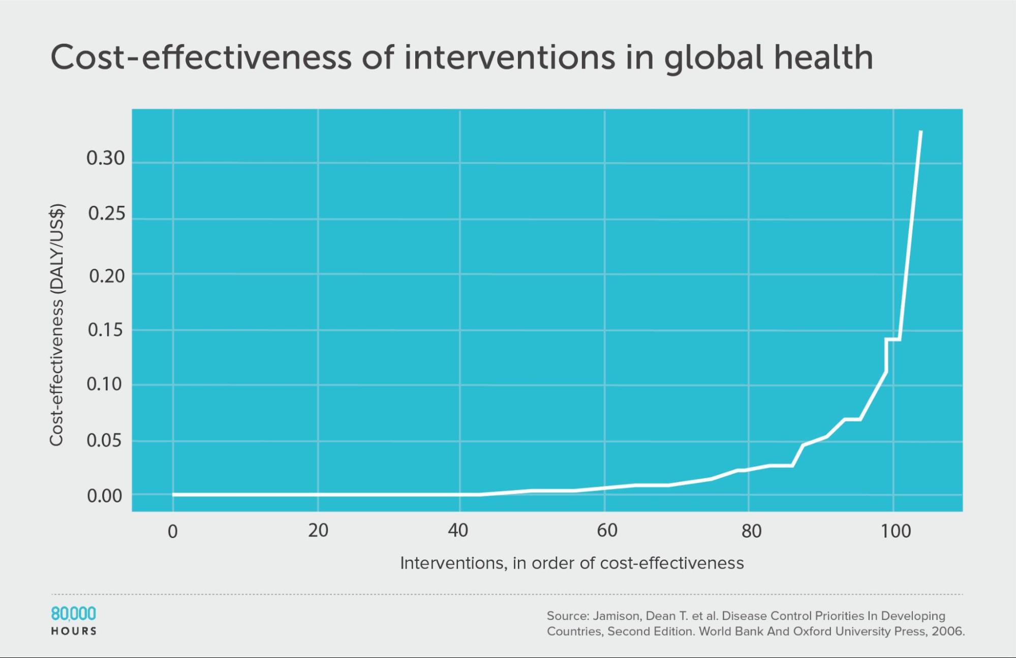
We can see that the first 60 interventions are near the zero line, and so aren’t very effective. But the top 20 or so achieve a huge amount per dollar.
| Measure | DALYs averted per US $1,000 |
|---|---|
| Mean cost effectiveness | 23 |
| Median cost effectiveness | 5 |
| Mean cost effectiveness of the 2.5% most cost-effective interventions | 250 (52x median, 11x mean)3 |
| Mean cost effectiveness of the 25% most cost-effective interventions | 794 |
Other studies of global health
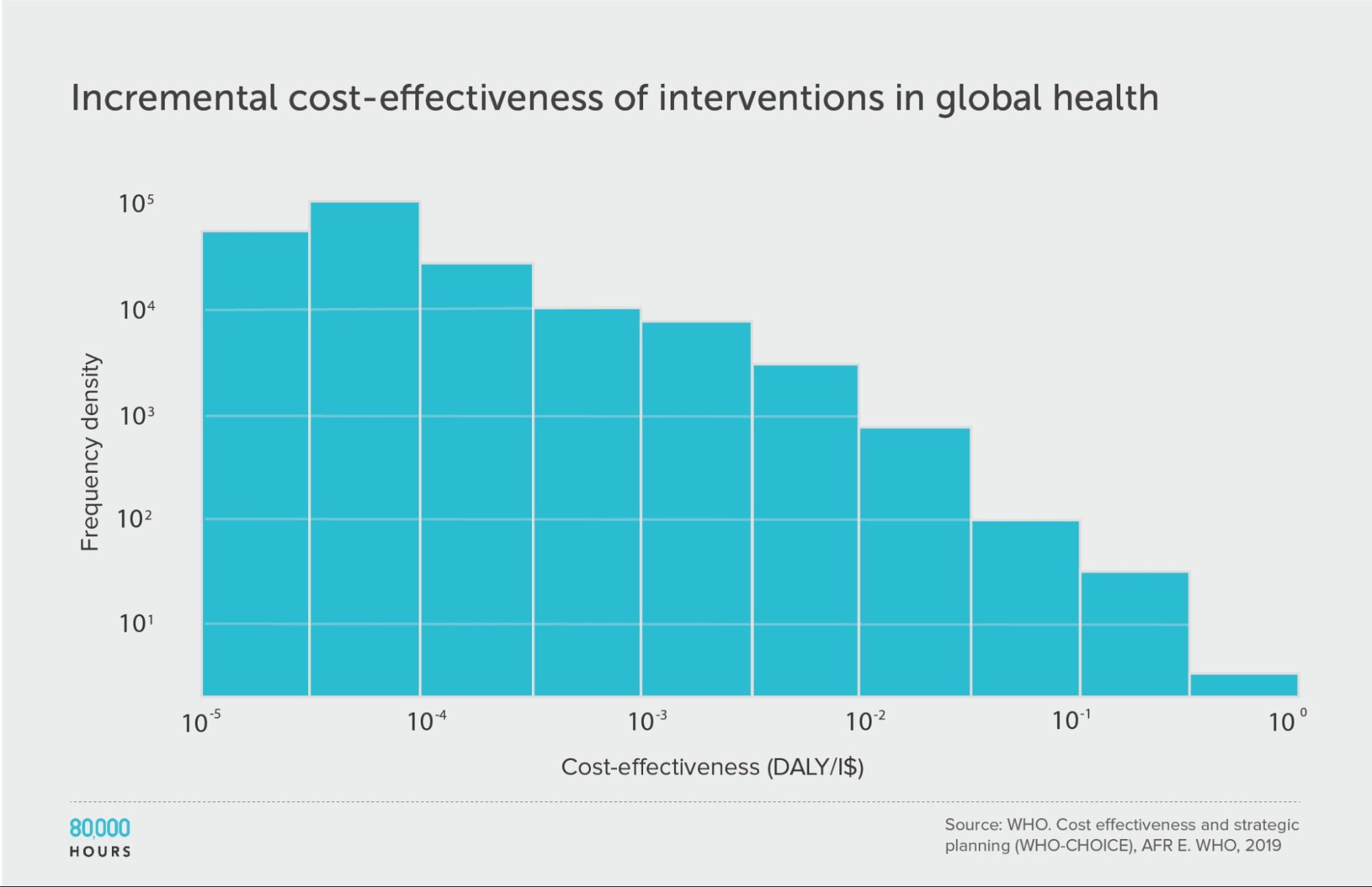
In the blog post GiveWell’s top charities are increasingly hard to beat, Alexander Berger, co-CEO of Coefficient Giving5, found three surveys of cost-benefit analyses for health interventions in the developing world: the DCP2, the more current third edition of the same report (DCP3)6, and a WHO-CHOICE review (which in turn provides two datasets: one for the average costs of the interventions, and one for the incremental costs).
This allows us to compare the DCP2 to some alternative and more current analyses. They turn out to show a similar pattern.
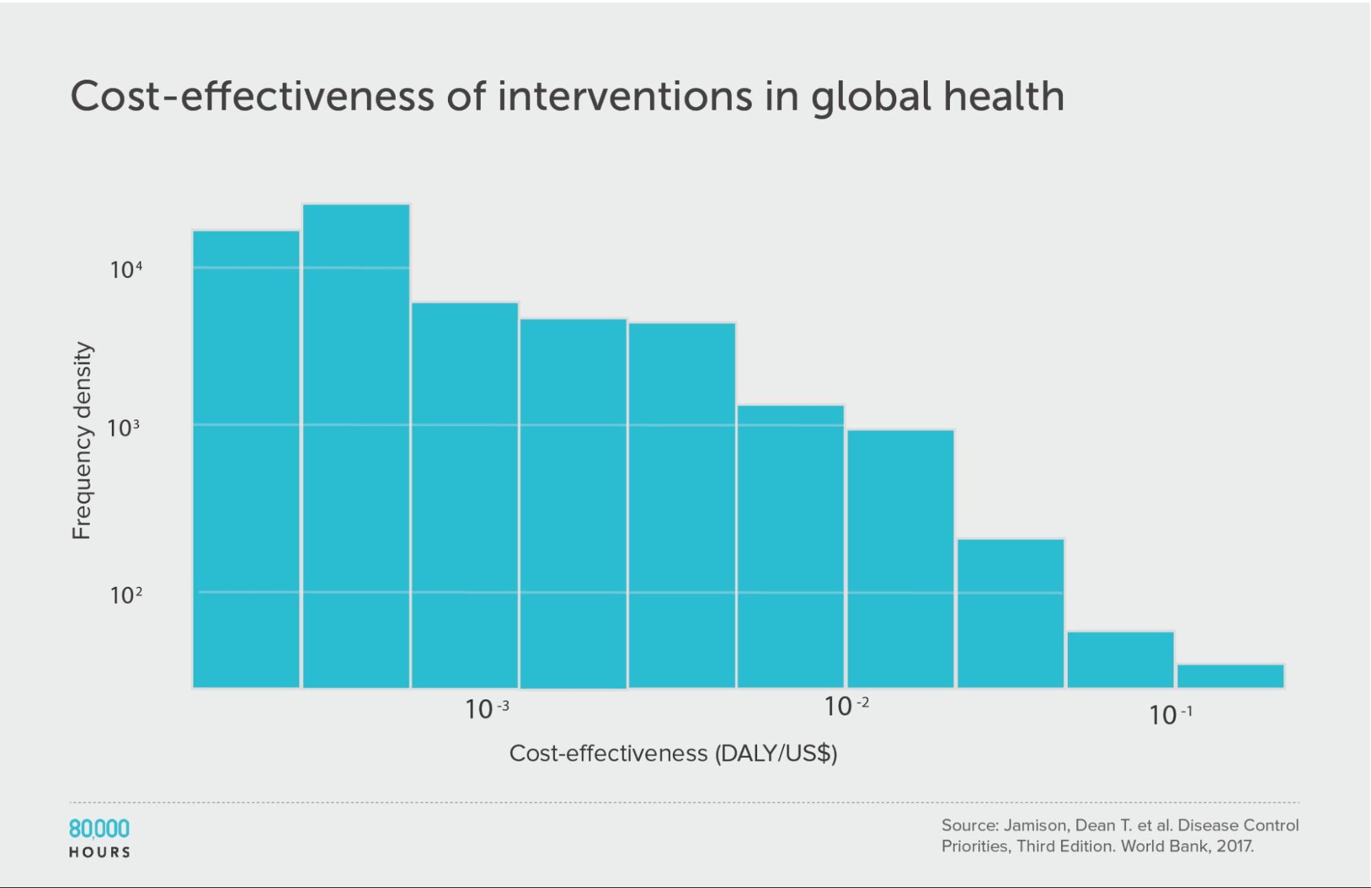
Disease Control Priorities (third edition)
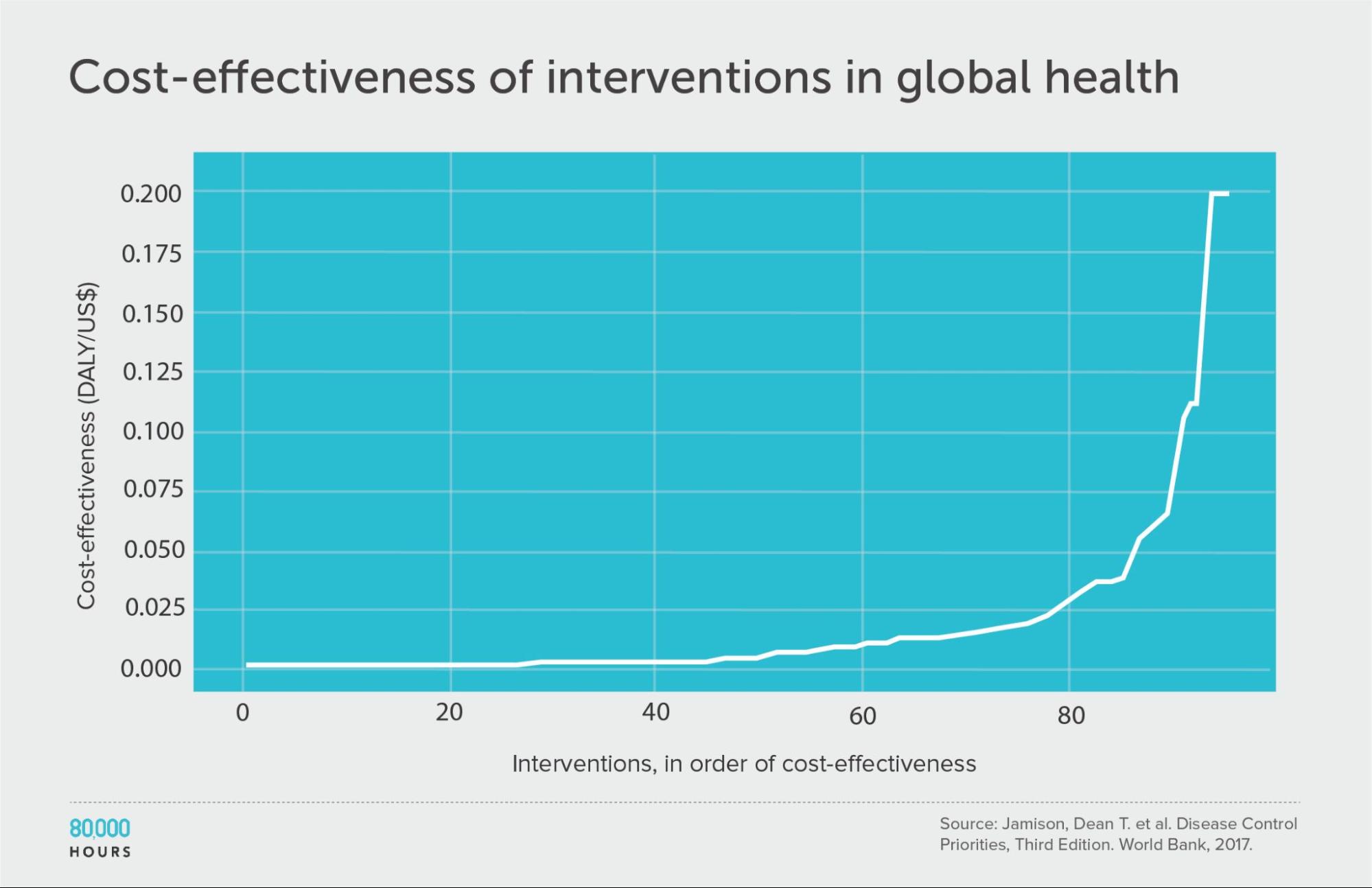
| Measure | DALYs averted per US $1,000 |
|---|---|
| Mean cost effectiveness | 17 |
| Median cost effectiveness | 4 |
| Mean cost effectiveness of the 2.5% most cost-effective interventions | 170 (38x median, 10x mean) |
| Mean cost effectiveness of the 25% most cost-effective interventions | 56 |
WHO-CHOICE (using average cost effectiveness)
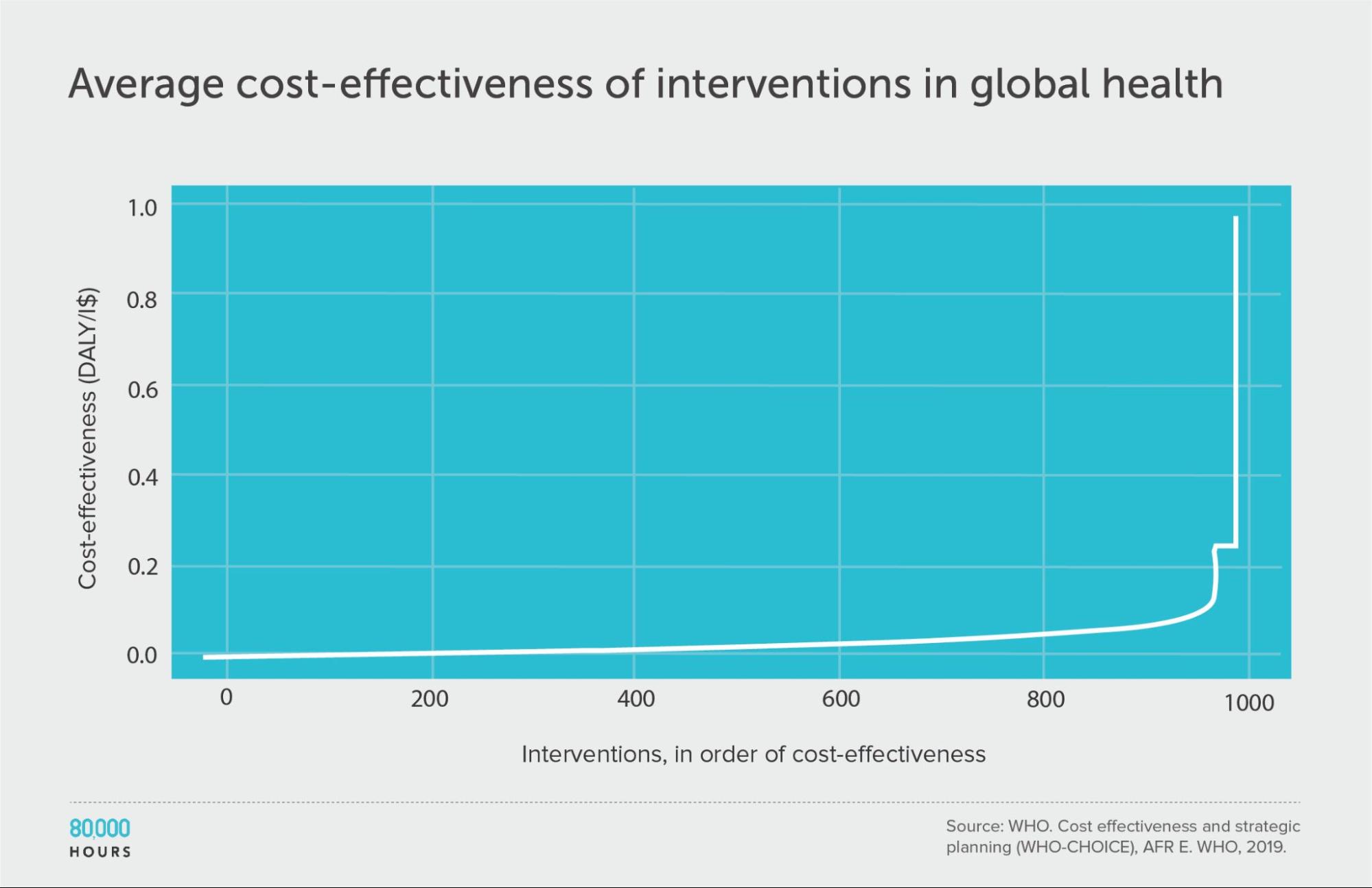
| Measure | DALYs averted per Intl$1,000 |
|---|---|
| Mean cost effectiveness | 29 |
| Median cost effectiveness | 12 |
| Mean cost effectiveness of the 2.5% most cost-effective interventions | 310 (25x median, 10x mean) |
| Mean cost effectiveness of the 25% most cost-effective interventions | 85 |
WHO-CHOICE (using incremental cost effectiveness)
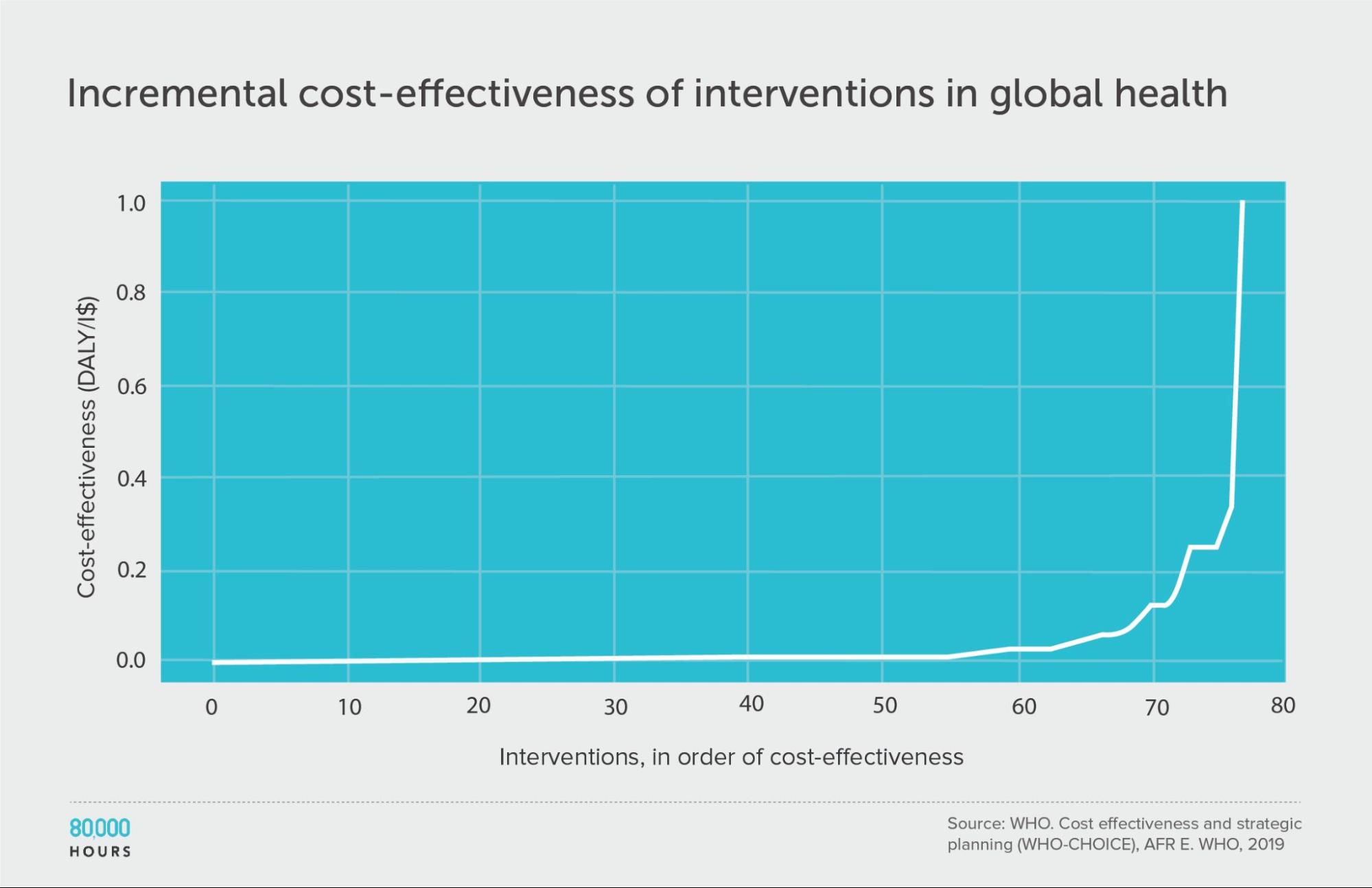
| Measure | DALYs averted per Intl$1,000 |
|---|---|
| Mean cost effectiveness | 41 |
| Median cost effectiveness | 7 |
| Mean cost effectiveness of the 2.5% most cost-effective interventions | 670 (93x median, 16x mean) |
| Mean cost effectiveness of the 25% most cost-effective interventions | 150 |
Health in high-income countries: public health interventions in the UK (NICE)
Berger also found a dataset for the UK — National Institute for Health and Care Excellence (NICE)7 — which enables us to extend the analysis to a high-income country.
The data is related to public health, and covers about 200 interventions focused on things like helping people stop smoking, reducing traffic accidents, improving dental health, and increasing testing for sexually transmitted infections. (The analysis was done in terms of quality-adjusted life years (QALYs) added instead of DALYs avoided, but for our purposes we can take these as equivalent.)
Here we find a similar pattern to health interventions in poor countries. Overall, the degree of spread seems similar or slightly larger than the DCP2.
However, in the DCP2, the mean, median, and top 2.5% are respectively 25x, 38x, and 16x higher, so the whole distribution is shifted upwards — in other words, interventions are way more cost effective in developing vs developed countries.
In fact, the difference in cost effectiveness of health interventions for rich and poor countries is so significant that even the top 2.5% of interventions in the NICE data creates fewer extra years of healthy life per pound spent than the mean in the developing world DCP2 data — and note the mean is the effectiveness you’d expect if you picked randomly. (Health in poor countries and health in rich countries are usually considered different cause areas by people interested in effective altruism in part for this reason.)
Interestingly, this roughly lines up with the difference in income between the UK and these countries, which makes sense, since richer people will generally be able to pay a lot more to protect their health (and logarithmic returns to health spending will mean the cost-effectiveness difference is proportional to the difference in income).
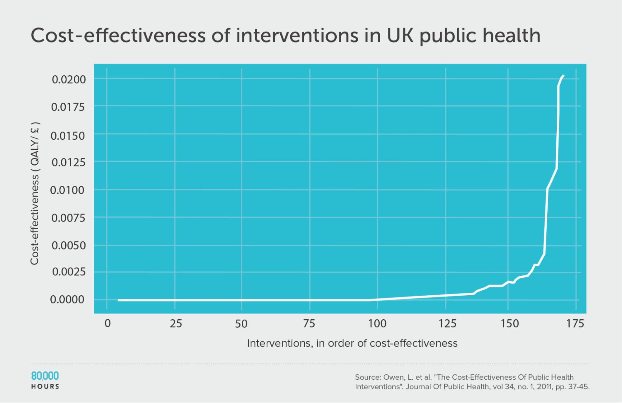
| Measure | QALYs created per £1,000 |
|---|---|
| Mean cost effectiveness | 1.0 |
| Median cost effectiveness | 0.1 |
| Mean cost effectiveness of the 2.5% most cost-effective interventions | 15.4 (120x median, 15x mean) |
| Mean cost effectiveness of the 25% most cost-effective interventions | 3.7 |
One additional source of data we didn’t have a chance to review is the CEVR CEA registry, which contains over 10,000 cost-effectiveness analyses on health interventions — this would be worth checking in future work.
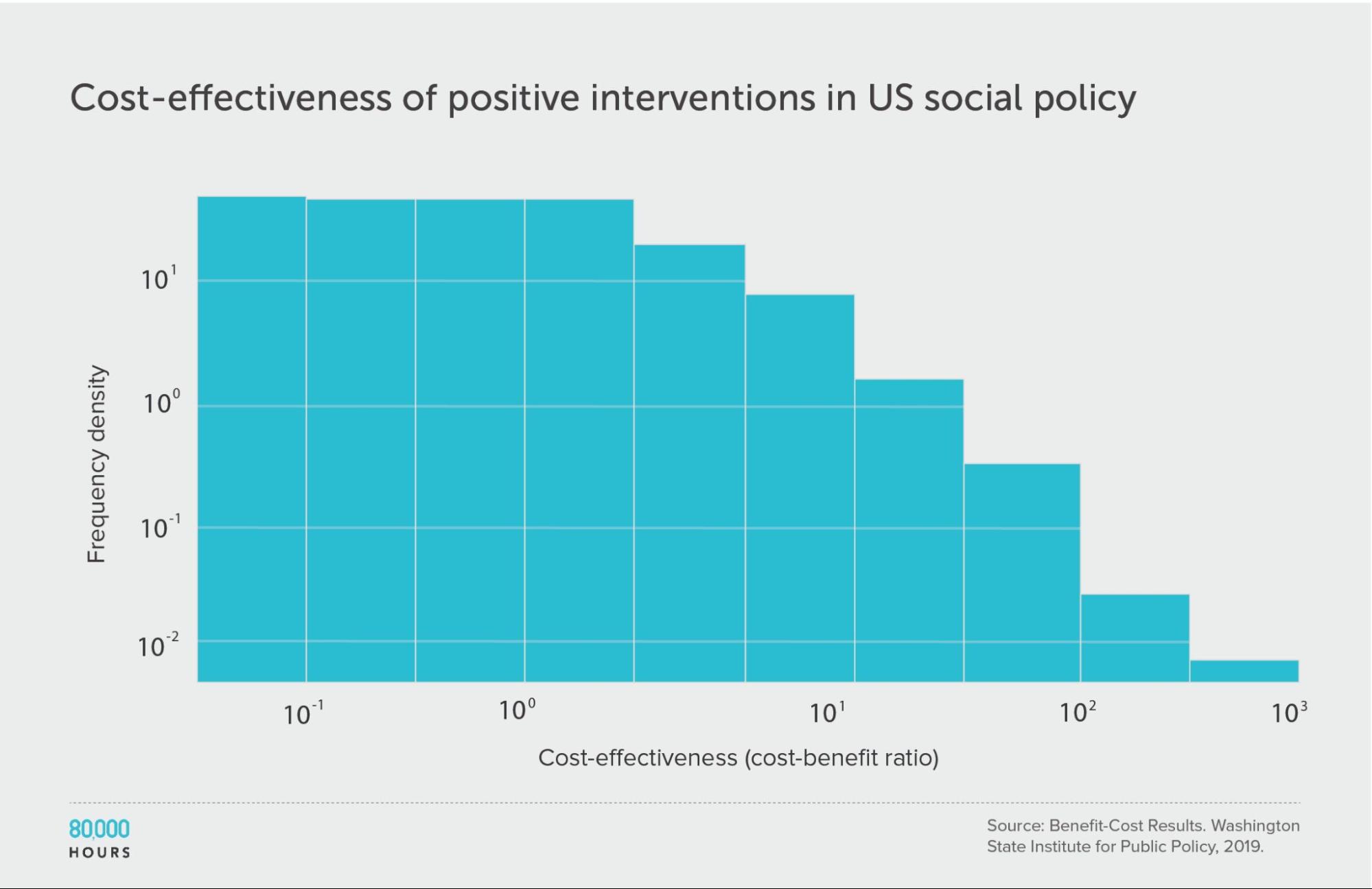
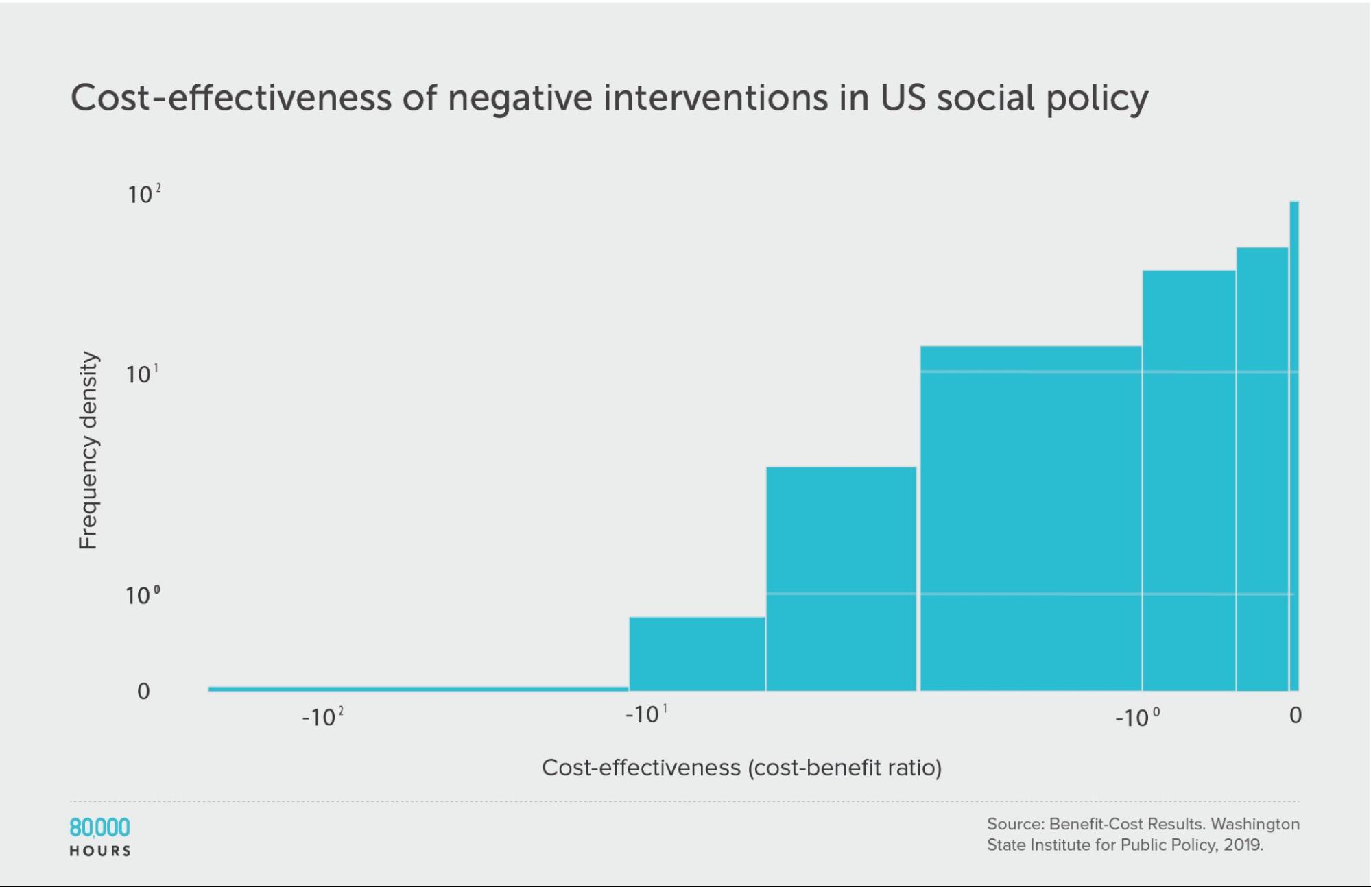
US social interventions: Washington State Institute for Public Policy Benefit-Cost Results database
Now, can we extend the analysis beyond health?
Alexander Berger also found a database of cost-benefit analyses for about 370 US social policies, compiled by the Washington State Institute for Public Policy.8 The data spans issues from substance use disorders, to criminal justice reform, to higher education and public health, so gives us information on multiple cause areas.
The studies aimed to account for a variety of benefits from the programmes (rather than just health), which were then converted into dollars and compared to the costs (also measured in dollars).
First, looking at positive cost-benefit interventions (i.e. where interventions were worth the money spent), we again find a similar pattern:
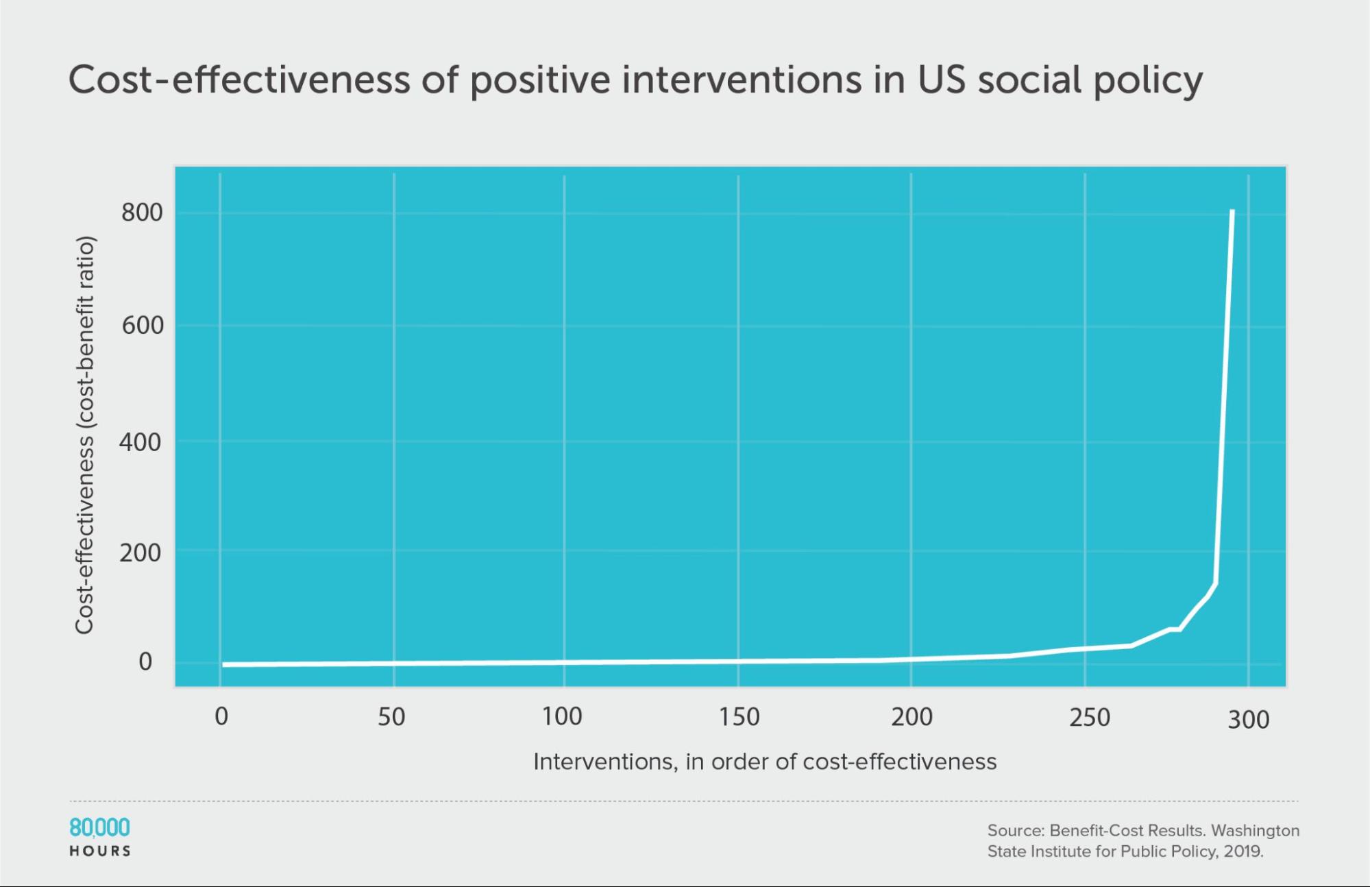
| Measure | Ratio |
|---|---|
| Mean cost-benefit ratio | 22 |
| Median cost-benefit ratio | 5 |
| Mean cost-benefit ratio of the 2.5% most cost-effective interventions | 360 (68x median, 16x mean) |
| Mean cost-benefit ratio of the 25% most cost-effective interventions | 75 |
Note: there are no units because cost-benefit ratios are unitless.9
Interestingly, and unlike within health, about 70 (19%) of the interventions had negative benefits — i.e. they made people worse off overall.
Though, they were distributed in a similar way. This is evidence in favour of a recent paper about ‘negative tails’ in doing good.
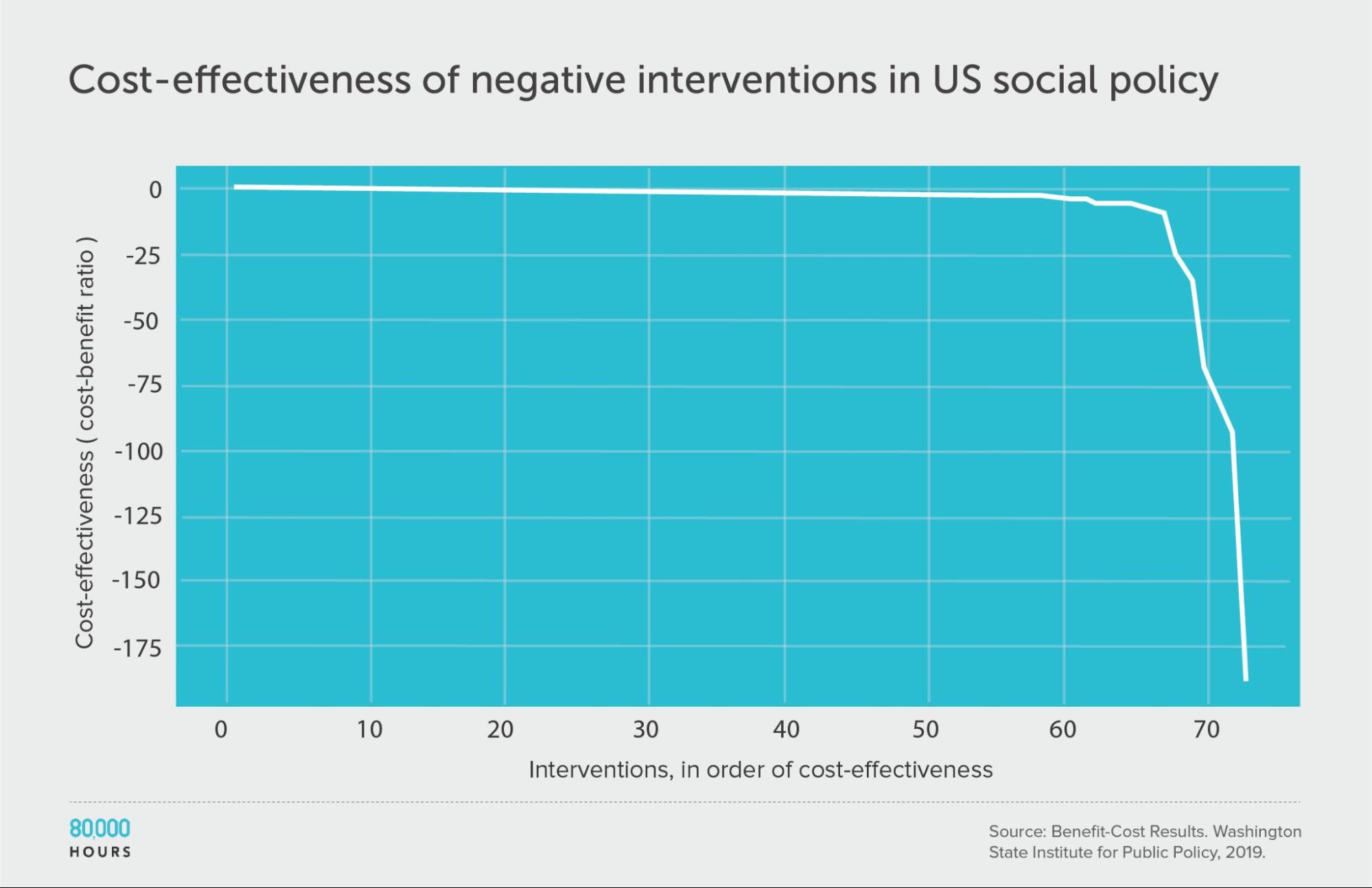
| Measure | Ratio |
|---|---|
| Mean cost-benefit ratio | -8 |
| Median cost-benefit ratio | -0.8 |
| Mean cost-benefit ratio of the 2.5% least cost-effective interventions | -140 (172x median, 18x mean) |
| Mean cost-benefit ratio of the 25% least cost-effective interventions | -29 |
But before we get too pessimistic, it’s important to remember that only a minority of interventions had a negative impact. The mean over the entire dataset was still positive. This means that on average people in the field are doing good — it’s just important to choose carefully.
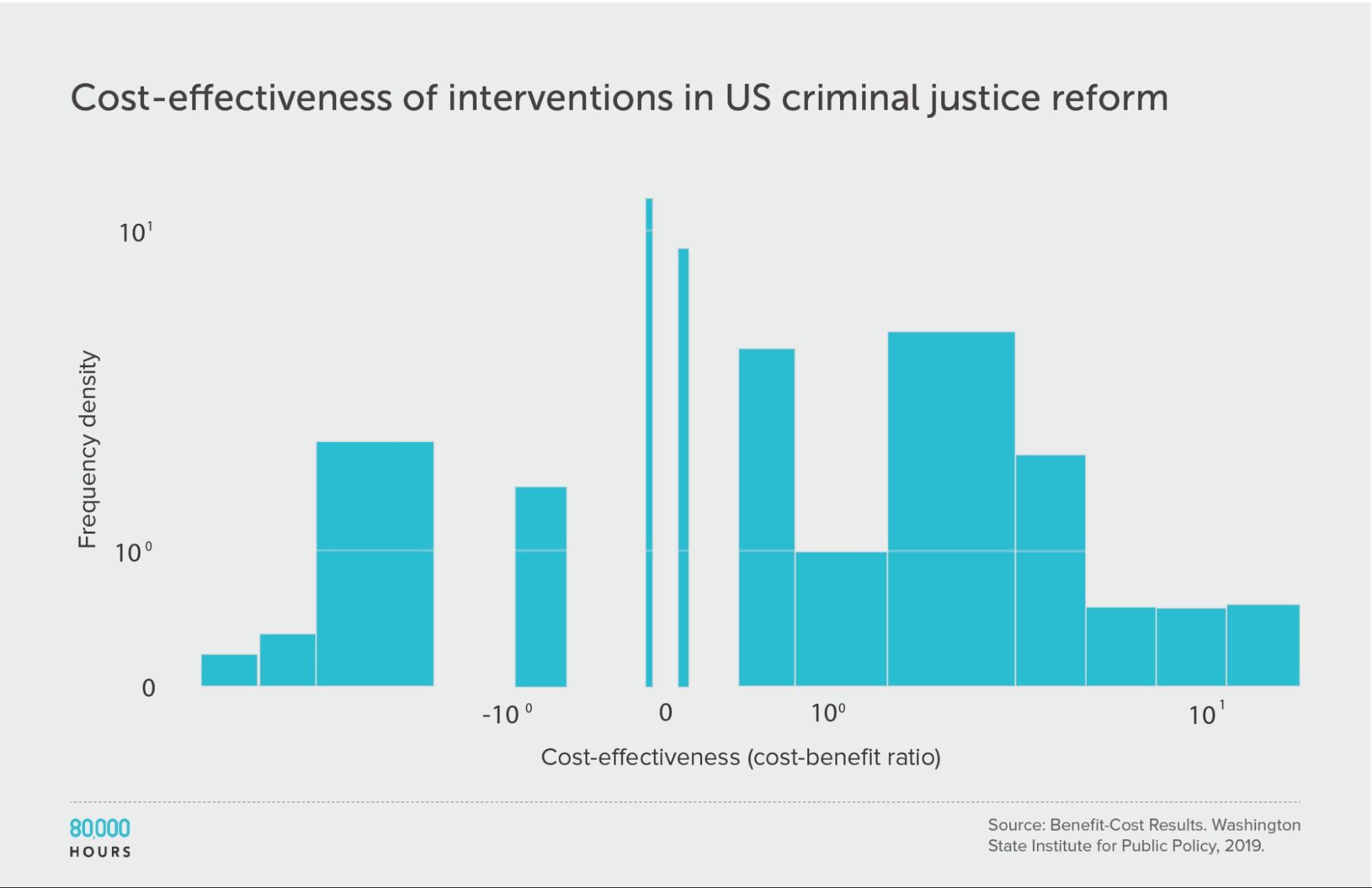
Criminal justice reform
Since these interventions span many different issues, we might ask what would happen if we further break down the data.
First, let’s focus only on criminal justice reform — just one of the causes in the full dataset.
The overall degree of spread is somewhat reduced, though still significant. This is what we’d expect since it’s a narrower domain, since one source of variation — the differences between cause areas — has been eliminated (though it could also be caused by a small sample size meaning there were no outliers in the sample).
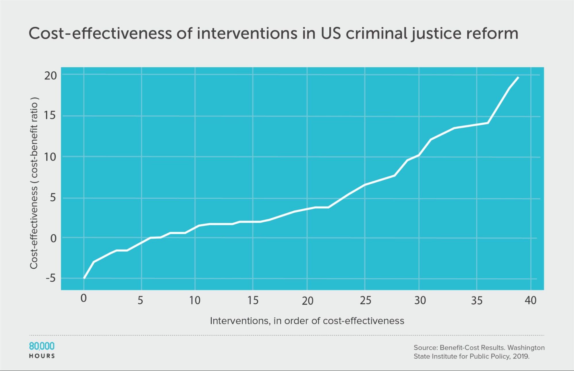
Summary statistics (ignoring the interventions with negative cost effectiveness):
| Measure | Ratio |
|---|---|
| Mean cost-benefit ratio | 6.8 |
| Median cost-benefit ratio | 4.8 |
| Mean cost-benefit ratio of the 2.5% most cost-effective interventions | 19.8 (6.0x median, 3,7x medan) |
| Mean cost-benefit ratio of the 25% most cost-effective interventions | 14.9 |
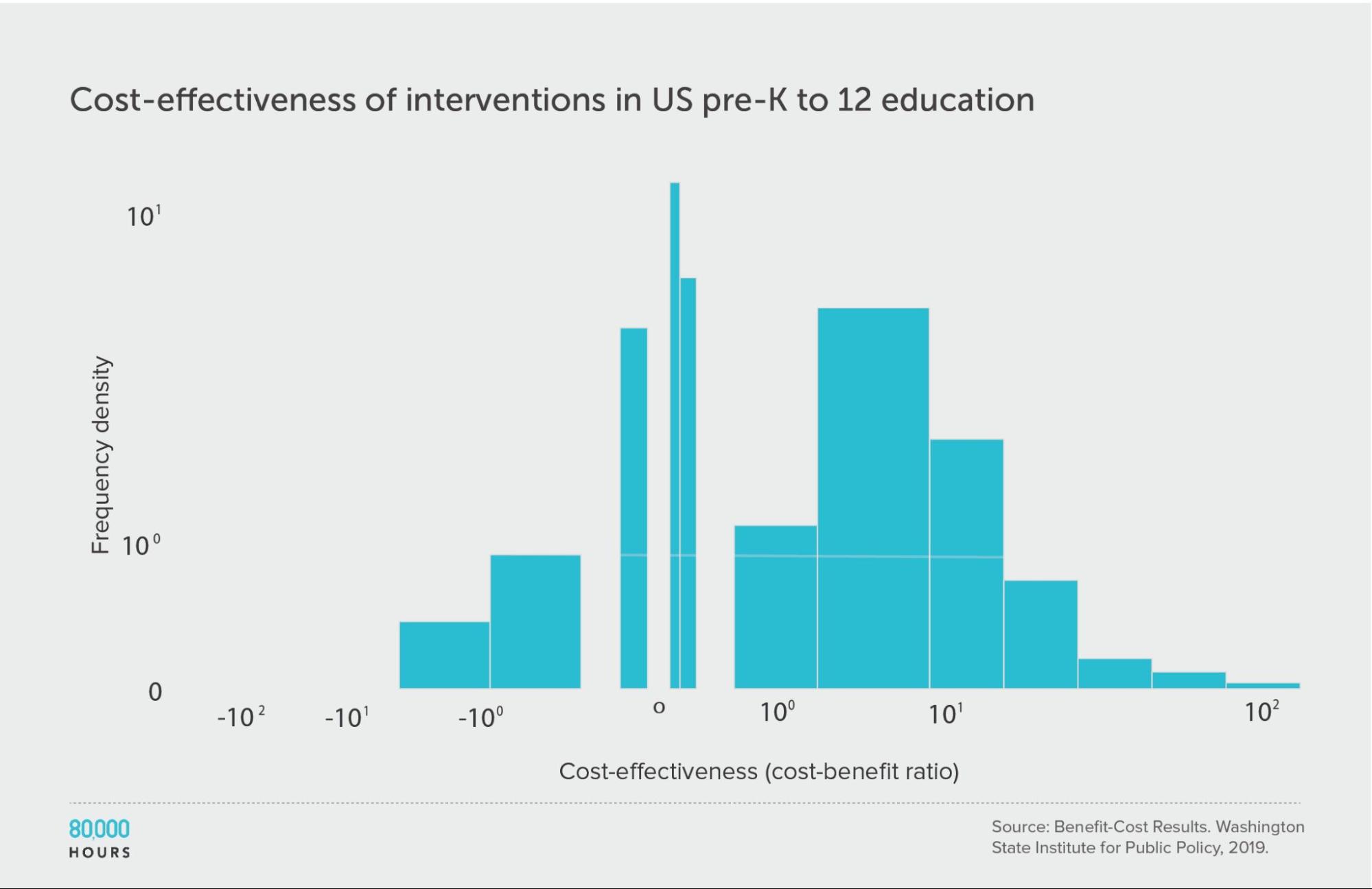
Pre-K to 12 education
We find a similar pattern of reduced but still significant spread if we focus only on education interventions.
It’s also interesting to note that there seem to be significant differences between the issues: the education interventions come out about four times more cost effective on average compared to criminal justice reform, even though both are in the same broad area of US social interventions.
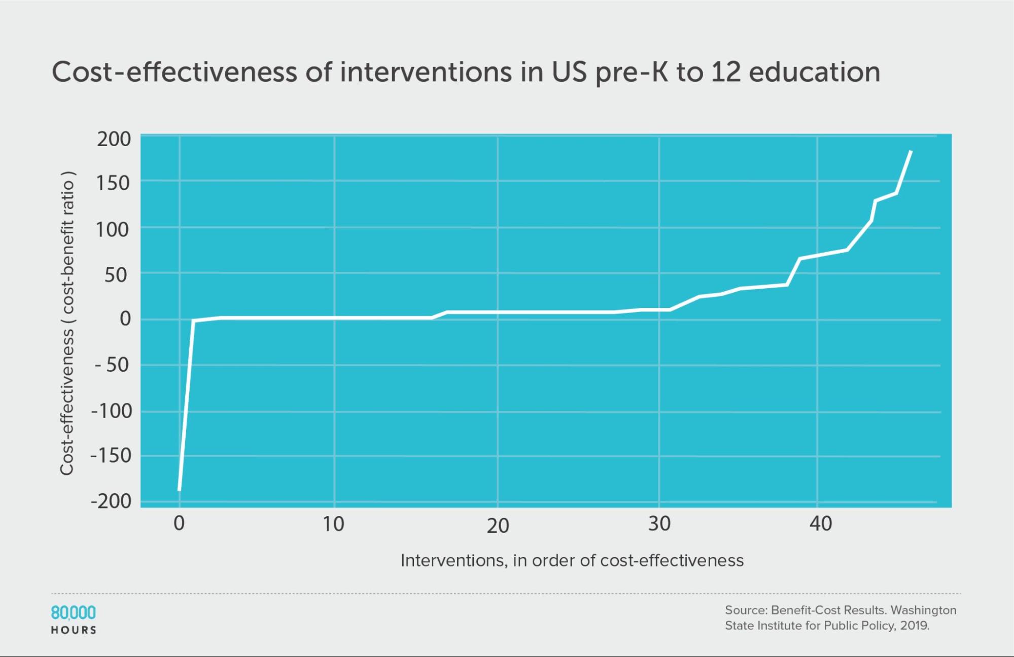
Summary statistics (ignoring the interventions with negative cost effectiveness):
| Measure | Ratio |
|---|---|
| Mean cost-benefit ratio | 27 |
| Median cost-benefit ratio | 7.8 |
| Mean cost-benefit ratio of the 2.5% most cost-effective interventions | 160 (21x median, 6x mean) |
| Mean cost-benefit ratio of the 25% most cost-effective interventions | 85 |
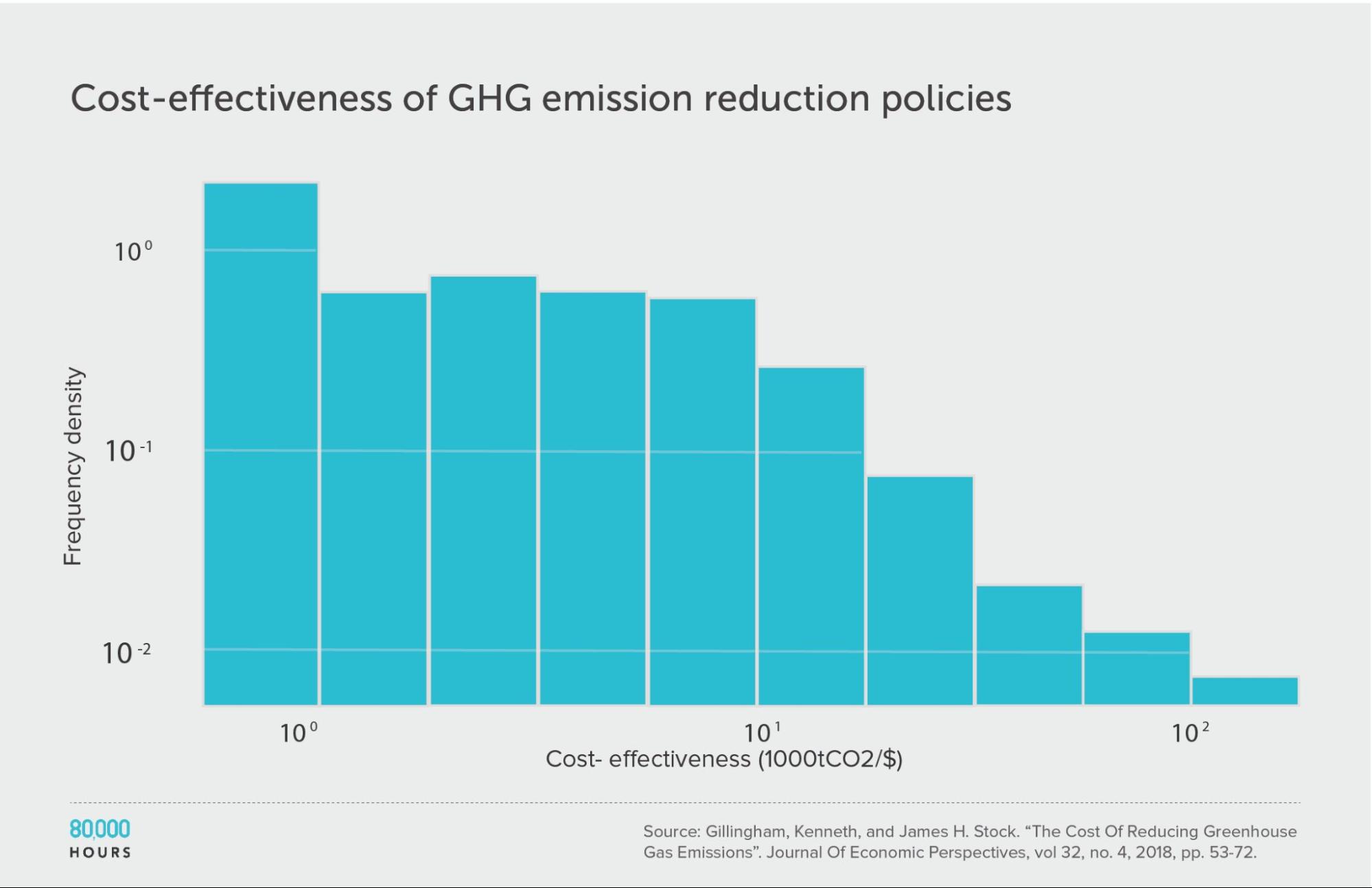
Climate change: Gillingham and Stock
Kenneth Gillingham and James Stock assessed the cost effectiveness of about 20 interventions to reduce greenhouse gas emissions.10 They compared the interventions in terms of tonnes of CO2-equivalent (tCO2e) greenhouse gas emissions avoided per dollar.
The pattern here was very similar to the DCP2.
Summary statistics (ignoring the interventions with negative cost effectiveness):
| Measure | tCO2e avoided per US $1,000 |
|---|---|
| Mean cost effectiveness | 23 |
| Median cost effectiveness | 10 |
| Mean cost effectiveness of the 2.5% most cost-effective interventions | 180 (18x median, 8x mean) |
| Mean cost effectiveness of the 25% most cost-effective interventions | 65 |
Note: the authors gave a range of cost-effectiveness estimates for each intervention — for our analysis we used the middle of these ranges.
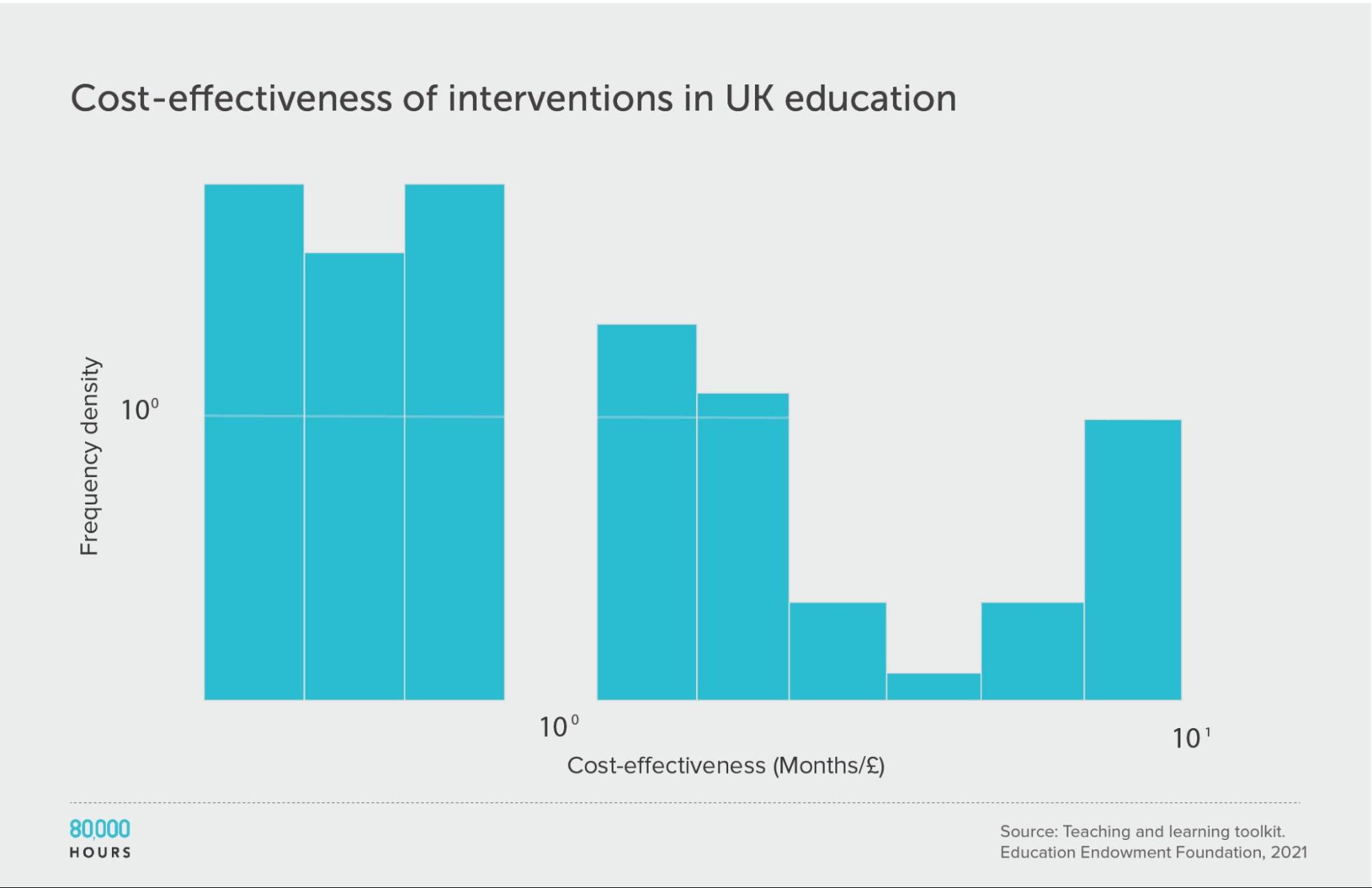
Education in the UK: The Education Endowment Foundation
The UK’s Education Endowment Foundation provides a toolkit that summarises the evidence on different UK education interventions.
Danielle Mason, Head of Research at the organisation, told me that the toolkit attempts to include all relevant, high-quality quantitative studies.
Each type of intervention is assessed based on (i) strength of evidence; (ii) effect size, measured in ‘months of additional schooling equivalent’; and (iii) cost. See how these scores are assessed here. We only considered studies with a “strength of evidence” score greater than 1.
This data roughly follows a similar distribution to the survey of US social interventions above, though the degree of spread is smaller. This could be because the variety of interventions studied is smaller. It might also be because most of the figures are based on meta-analyses, rather than single estimates. Single estimates tend to be more noisy, increasing spread. Meta-analyses are also more likely to be positive because they combine lots of smaller studies, so are less likely to be underpowered.
It’s unclear whether this data follows the same sort of heavy-tailed or lognormal distribution as the interventions discussed above. While the mean of the data is only slightly higher than the median, few interventions were studied, meaning it’s hard to determine the overall distribution.
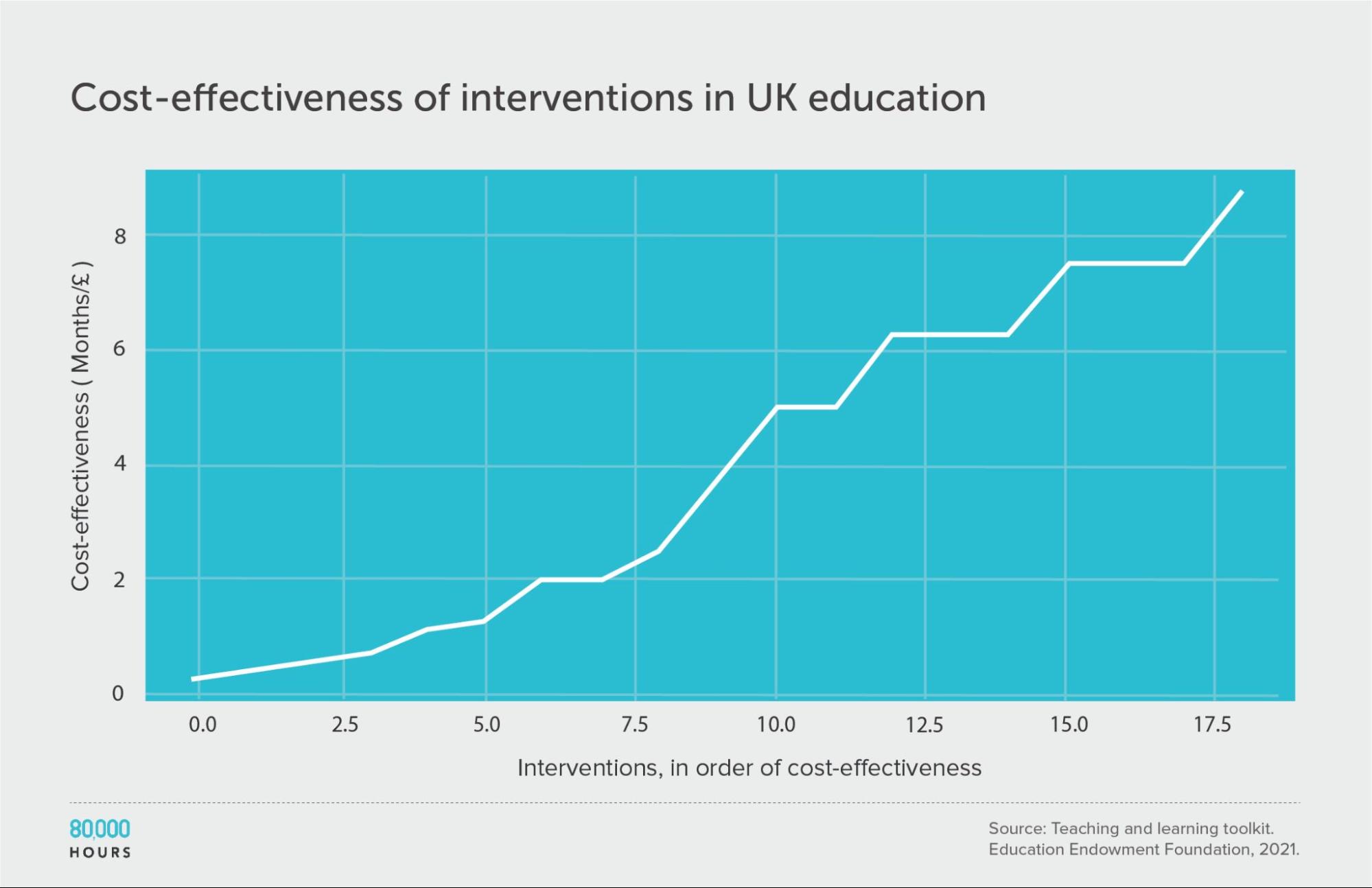
| Measure | Months of additional schooling equivalent per £100 |
|---|---|
| Mean cost effectiveness | 3.9 |
| Median cost effectiveness | 3.75 |
| Mean cost effectiveness of the 2.5% most cost-effective interventions | 8.8 (2.3x median, 2.2x mean) |
| Mean cost effectiveness of the 25% most cost-effective interventions | 7.5 |
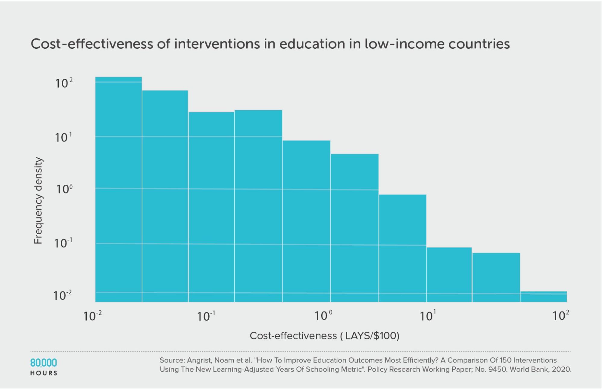
Education in low-income countries: Education Global Practice and Development Research Group Study
The Education Global Practice and Development Research Group conducted a study of 41 education interventions11 in low- and middle-income countries, published in 2020.
They compared interventions in terms of how many additional years of schooling they produced per $1,000, aiming to take into account both the number and the quality of the years. They called their metric “learning-adjusted years of schooling” (LAYS).
This education data is much more clearly heavy-tailed — even more so than the DCP2 — and likely follows a lognormal distribution.
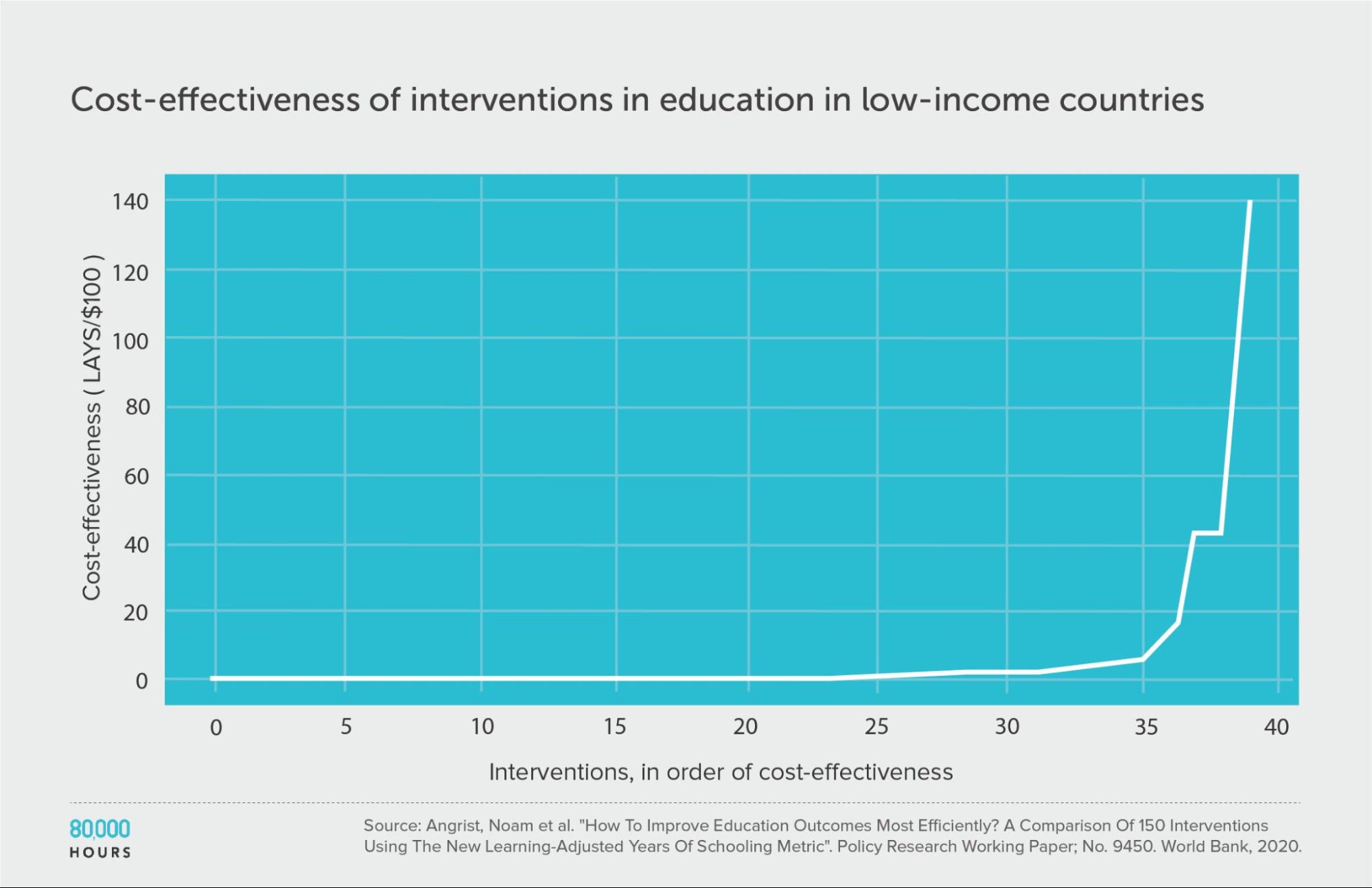
| Measure | LAYS per US $100 |
|---|---|
| Mean cost effectiveness | 7.1 |
| Median cost effectiveness | 0.64 |
| Mean cost effectiveness of the 2.5% most cost-effective interventions | 140 (220x median, 20x mean) |
| Mean cost effectiveness of the 25% most cost-effective interventions | 27 |
Some other datasets
The following studies are less comprehensive and rigorous than those above, but also help to check the general pattern in some different areas. I’ve included them to be comprehensive in what’s covered, and to avoid cherry picking studies that back up my findings. I’d be interested to learn about more studies of this kind.
Note that all of these are much narrower sets of interventions than those covered above, which will likely reduce spread. They also don’t explicitly account for costs, which I’ll argue in the AidGrade section means they probably understate spread.
AidGrade’s dataset of international development interventions — a potential counterexample?
We’ve seen some arguments against interventions being heavy-tailed based on AidGrade‘s dataset. They have a large dataset of interventions within international development, going beyond health.
They found that the distribution of effect sizes for interventions in their data was roughly normal rather than lognormal, though had a slightly heavier-than-normal positive tail.
However, this doesn’t mean that the distribution of cost effectiveness is normal, because there are two further factors to consider:
First, effect size is measured relative to many different types of outcome. This means that, roughly speaking, an intervention that cured 20% of people of the common cold would be given the same value as an intervention that cures 20% of people of cancer. Ideally there would be an attempt to weigh up the value of different outcomes across different studies (such as with DALYs, LAYS, or tonnes of CO2). This would add a source of variation, increasing spread.
Perhaps more importantly, costs also need to be considered. The costs of different interventions often differ by orders of magnitude, and so dividing by cost could increase spread a lot.
This would not be the case if costs and impact were closely correlated (which is what we’d hope to see if resources are allocated efficiently); however, empirically there seems to be a weak relationship between the two.
For instance, in the DCP2 data, dividing the average impact in DALYs by costs increases the degree of spread.
I’ve observed the same pattern in the other datasets I’ve checked. For instance, the Education Endowment Foundation dataset includes both average impact (measured in months of extra schooling equivalent) and costs, and the distribution of impact per cost is wider than average impact alone.
Without accounting for these two additional factors, we can’t draw conclusions about the shape of the distribution of cost effectiveness.
And my expectation is that if we did consider them, the distribution would become much wider, and would most likely be lognormal like the others.
You can see more explanation of the issue here.
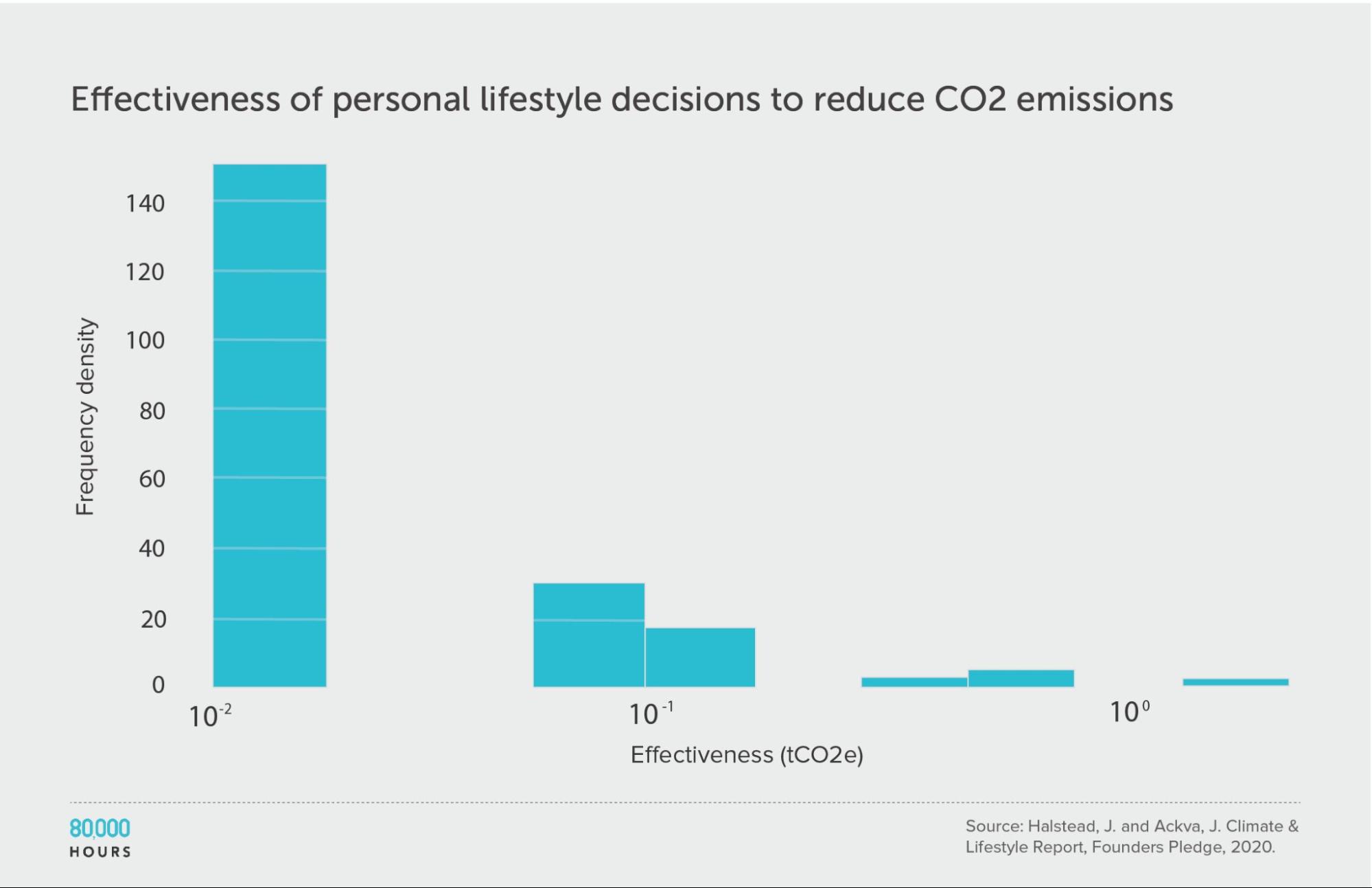
Personal actions to fight climate change
Founders Pledge produced estimates of the effectiveness of various personal lifestyle decisions for fighting climate change. They produced two sets of estimates: one accounts for government climate targets and policies, and the other does not.
This data shows somewhat less spread than in other datasets; however, they only compare “actions,” without fully correcting for how some of these actions are probably much more costly than others. If we added this additional source of variation, and calculated “CO2 averted per unit of effort,” then I would expect a significantly wider spread.
Founders Pledge also estimated that a US $1,000 donation to their top choice climate charity — which seems somewhat comparable to the costs of the interventions here — would avert 100 tonnes of CO2. If we included this in the dataset, then the top intervention would be 250 times the median, and 140 times the mean.
(The below figures do not include this intervention.)
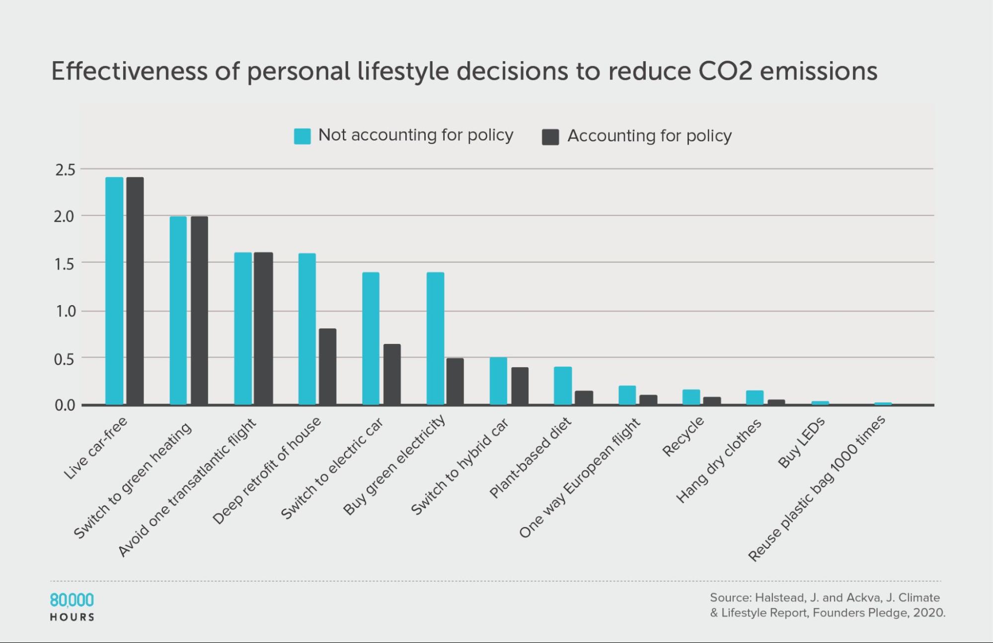
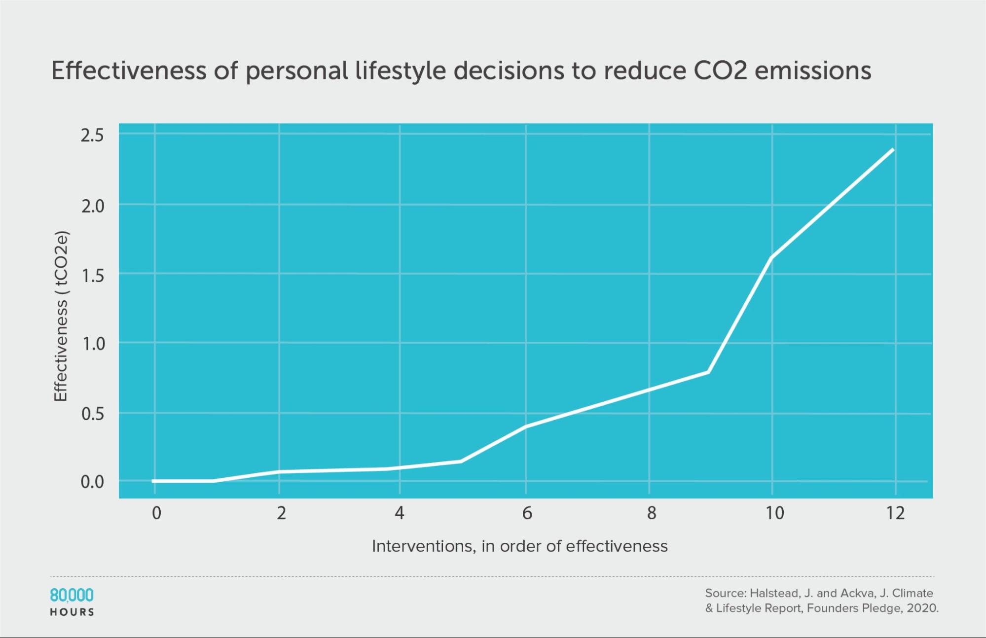
| Measure | tCO2e avoided |
|---|---|
| Mean effectiveness | 0.67 |
| Median effectiveness | 0.4 |
| Mean effectiveness of the 25% most effective interventions | 1.7 |
| Effectiveness of the best intervention | 2.4 (6x median, 3.6x mean) |
Units of tonnes of CO2-equivalent (tCO2e) greenhouse gas emissions avoided, accounting for policy.
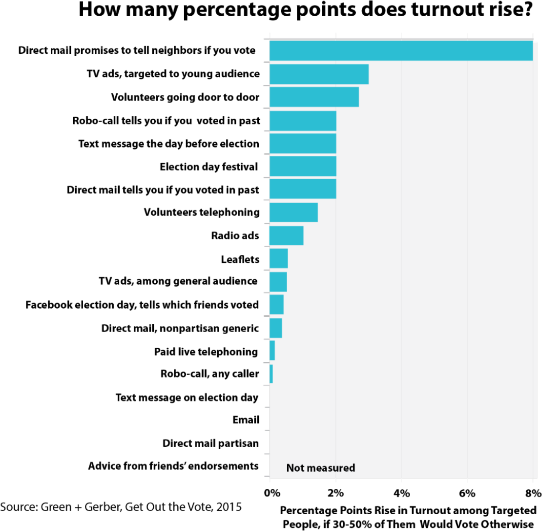
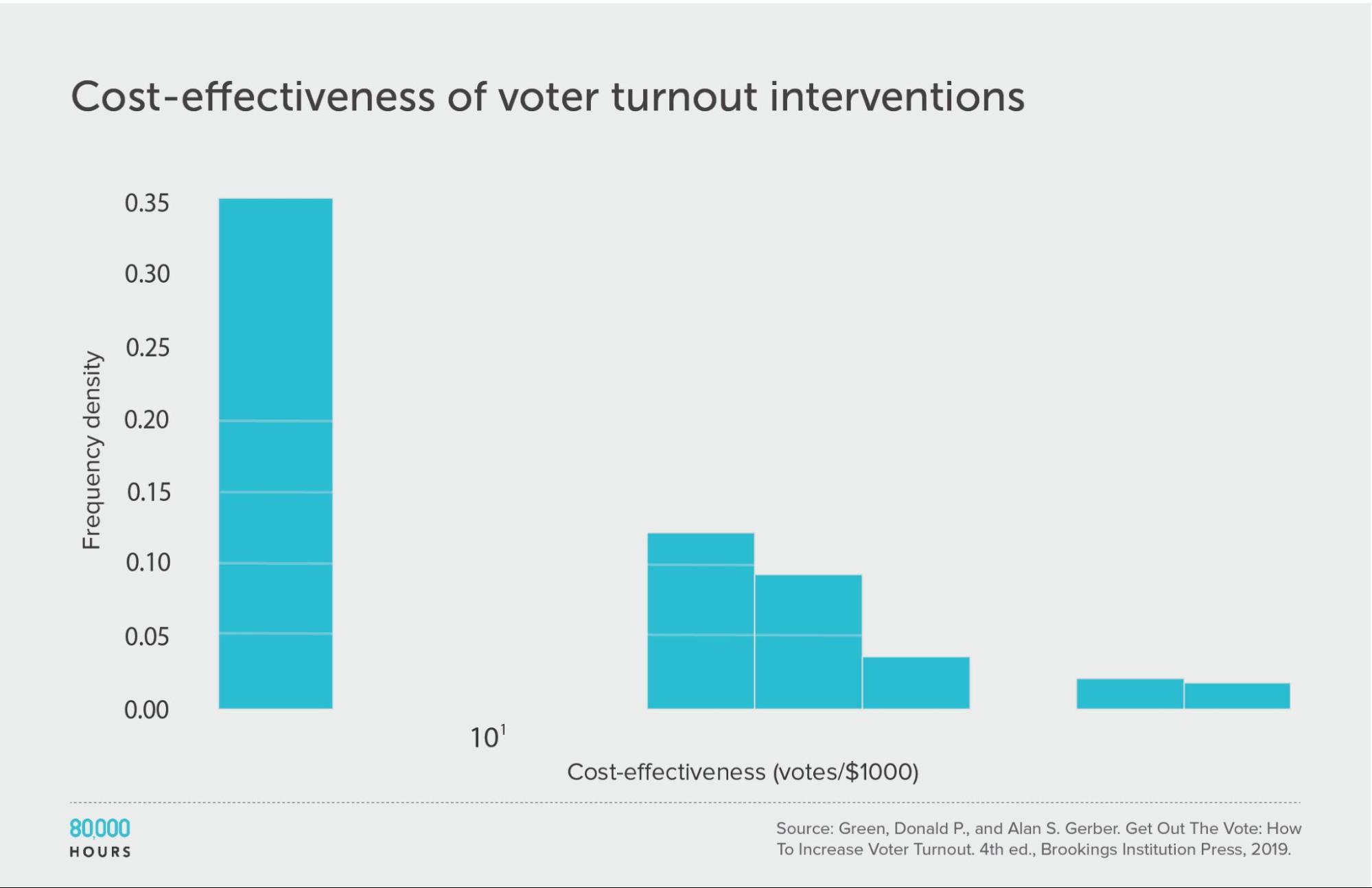
Get Out the Vote tactics
In Get Out the Vote: How to Increase Voter Turnout, the authors reviewed strategies for political parties in the US to encourage people to vote. They looked at 19 strategies — including various kinds of direct mailing, leafleting, phoning, and door-to-door knocking — first estimating how much they increased turnout as a percentage12:
Then they made estimates of cost effectiveness:
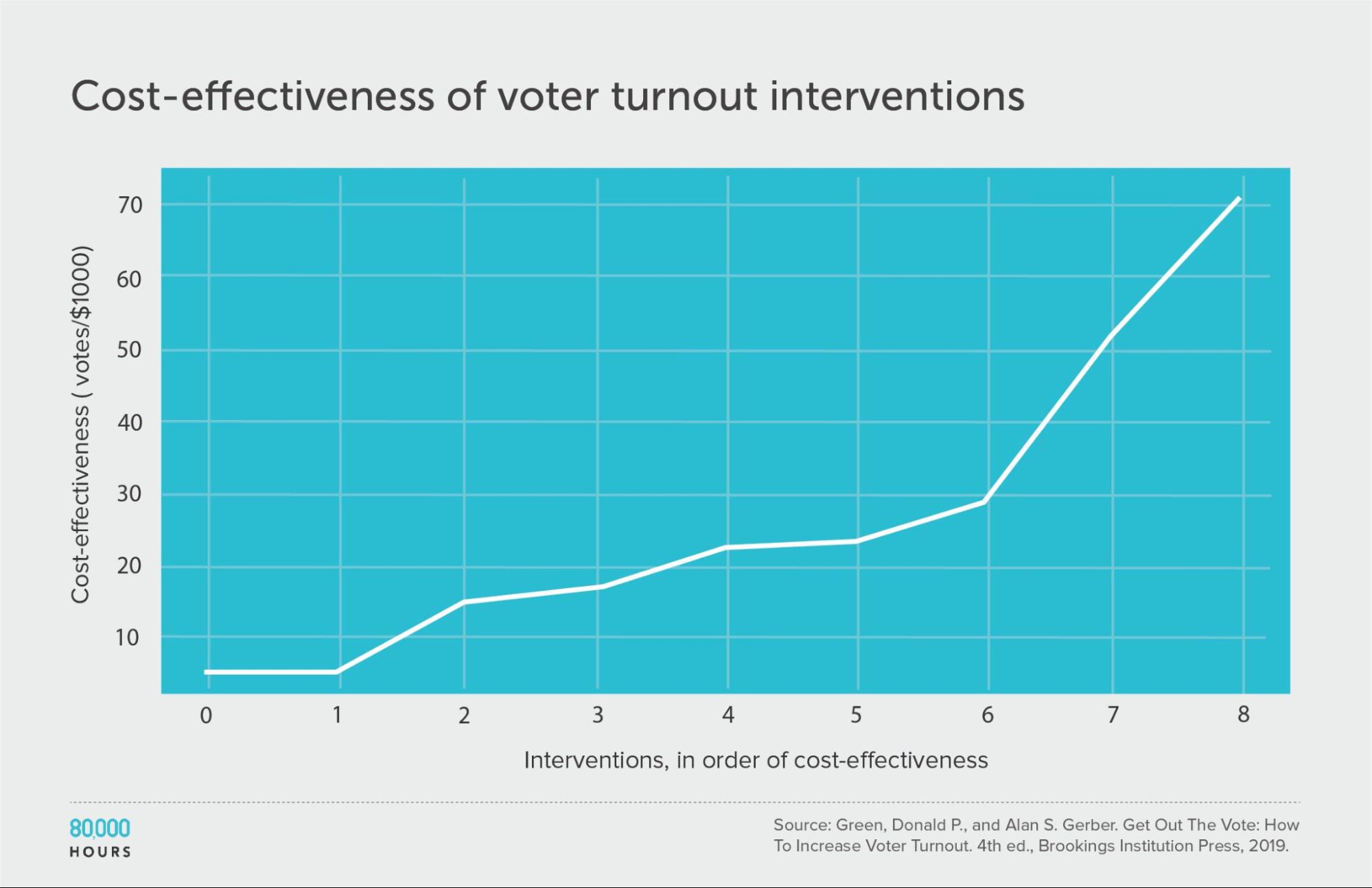
This dataset is too small to properly measure its shape, but we can see that four of the interventions didn’t have measurable effects, while the top clearly stood out.
| Measure | Votes per US $1,000 |
|---|---|
| Mean cost effectiveness | 26 |
| Median cost effectiveness | 22 |
| Mean cost effectiveness of the top 25% most cost-effective interventions | 51 |
| Cost effectiveness of the best intervention | 71 (3.2x median, 2.7x mean) |
Patterns in the data overall
Focusing mainly on the large datasets (>50 interventions), here are the key summary stats:
| Median | Mean | Mean of top 2.5% | |
|---|---|---|---|
| Disease Control Priorities in Developing Countries (2nd edition) | 4 DALYs averted per US$1,000 | 17 DALYs averted per US$1,000 | 170 DALYs averted per US$1,000 |
| WHO-CHOICE (using average cost effectiveness) | 12 DALYs averted per Intl$1,000 | 29 DALYs averted per Intl$1,000 | 310 DALYs averted per Intl$1,000 |
| WHO-CHOICE (using incremental cost effectiveness) | 7 DALYs averted per Intl$1,000 | 41 DALYs averted per Intl$1,000 | 670 DALYs averted per Intl$1,000 |
| NICE Cost-effectiveness estimates | 0.1 QALY created per £1,000 | 1.0 QALY created per £1,000 | 15.4 QALYs created per £1,000 |
| Washington State Institute for Public Policy Benefit-Costs Results Database (positive interventions) | 5 | 22 | 360 |
| Education Global Practice and Development Research Group Study | 0.64 LAYS per US$100 | 7.1 LAYS per US$100 | 140 LAYS per US$100 |
| Gillingham and Stock (climate change interventions) | 10 tCO2e avoided per US$1 | 23 tCO2e avoided per US$1 | 180 tCO2e avoided per US$1 |
What patterns do we see?
There appears to be a surprising amount of consistency in the shape of the distributions.
The distributions also appear to be closer to lognormal than normal — i.e. they are heavy-tailed, in agreement with Berger’s findings. However, they may also be some other heavy-tailed distribution (such as a power law), since these are hard to distinguish statistically.
Interventions were rarely negative within health (and the miscellaneous datasets), but often negative within social and education interventions (10–20%) — though not enough to make the mean and median negative. When interventions were negative, they seemed to also be heavy-tailed in negative cost effectiveness.
One way to quantify the interventions’ spread is to look at the ratio of between the mean of the top 2.5% and the overall mean and median. Roughly, we can say:
- The top 2.5% were around 20–200 times more cost effective than the median.
- The top 2.5% were around 8–20 times more cost effective than the mean.
Overall, the patterns found by Ord in the DCP2 seem to hold to a surprising degree in the other areas where we’ve found data.
| Ratio of top 2.5% to median13 | Ratio of top 2.5% to mean | |
|---|---|---|
| Disease Control Priorities in Developing Countries (2nd edition) | 52 | 11 |
| WHO-CHOICE (using average cost effectiveness) | 25 | 7 |
| WHO-CHOICE (using incremental cost effectiveness) | 93 | 16 |
| NICE Cost-effectiveness estimates | 120 | 15 |
| Washington State Institute for Public Policy Benefit-Costs Results Database (positive interventions) | 68 | 16 |
| Education Global Practice and Development Research Group Study | 220 | 20 |
| Gillingham and Stock (climate change interventions) | 18 | 8 |
2. Given this data, how much do solutions within a cause area actually differ in effectiveness?
In the DCP2, the top 2.5% of interventions were measured to be on average about 50 times more cost effective than the median. Does that mean you can actually have 50 times the impact?
It’s unclear, and I think it’s probably hard.
For one thing, the data we’ve covered are mostly backward-looking, and may not be a good reflection of realistic forward-looking estimates that take account of all sources of error, including model error.
Here’s an extreme example of the difference. Imagine 1,000 people buy lottery tickets, and one wins. The measured backward-looking distribution of payoffs is extreme — one person won a huge amount and everyone else won nothing. But beforehand, everyone had the same chance of winning, so there was no difference in the forward-looking value of the lottery tickets to each person.
Something similar could be happening in our studies. Perhaps many interventions looked similarly promising ahead of time, but only a handful succeeded — so it’s only when we look back that we see a large spread.
In this section, I list some ways that the data might overstate the degree of spread that’s looking forward, and some ways it might understate it. Overall, my guess is that the data overstates the true differences, but there is still a lot of spread.
(Note there’s nothing new about what I’m saying here (e.g. see this post by GiveWell from 2011). However, I often don’t see these points appreciated, so I thought it would be useful to relist them. These points are based on conversations I’ve had with people who have done research on these topics. I’m not a statistician and would love to see a more rigorous analysis.)
Ways the data might overstate the true degree of spread
Regression to the mean
There’s a huge degree of error in the estimates. Even if the estimates of DALYs averted per dollar were correct, DALYs don’t perfectly reflect improvements in health, and improvements in health aren’t all that matter.
Studies also often fail to generalise to different future contexts. Eva Vivalt found:
The typical study result differs from the average effect found in similar studies so far by almost 100%. That is to say, if all existing studies of an education program find that it improves test scores by 0.5 standard deviations — the next result is as likely to be negative or greater than 1 standard deviation, as it is to be between 0-1 standard deviations.
The median absolute amount by which a predicted effect size differs from the true value given in the next study is 99%. In standardised values, the average absolute value of the error is 0.18, compared to an average effect size of 0.12.
So, colloquially, if you say that your naive prediction was X, well, it could easily be 0 or 2*X — that’s how badly this estimate was off on average. In fact it’s as likely to be outside the range of between 0 and 2x, as inside it.
Finally, studies often have incorrect findings. In the replication crisis, it’s been found that perhaps 20–50% of studies don’t replicate, depending on the field and methodology.
All this error in the estimates means that the interventions that appear to be best have probably benefitted from positive luck, and are not as good as they seem — a phenomenon called regression to the mean.
In other words, measured impact is given by true impact and noise or random variation. If an intervention seems really good, it might be due to its true impact being high, or because the noise happened to be positive.
Going forward, noise is as likely to be negative as positive. This means that future measurements of the best interventions will probably look worse.
How large is this effect?
As a rough guide, researchers I’ve spoken to seem to think that effectiveness of the better interventions should be reduced by at least twofold, though the reduction could be tenfold or more.
Regression to the mean can also change the order of the interventions, because the effect is stronger for more error-prone estimates.
Technical aside on estimating regression to the mean
Ideally, we could start with a prior distribution, and then perform a Bayesian update using our measurements (with an assumption about how noisy they are). This would give us a posterior distribution of cost effectiveness, which could be compared to the original.
GiveWell did a quantitative analysis along these lines (and also see the comment thread), showing that when your estimate is highly uncertain, you don’t update much from your prior estimate of effectiveness, and vice versa.
However, this analysis was performed for normal distributions (rather than lognormal) and with hypothetical values, so I’m not easily able to adapt it to our purposes here. If your prior distribution is lognormal (which mine is), then the reduction in spread will be significantly reduced.
The researcher Greg Lewis used a different method to quantitatively correct for regression to the mean. He estimates that if we assume our cost-effectiveness estimates are 0.9 correlated with the true value, the real cost effectiveness of the top interventions is about half as much as the original figure.
I expect that the raw estimates in the DCP2 are much more noisy than a correlation of 0.9 would imply. If I repeat Lewis’s process but with a correlation of 0.5, I get a factor of 50 reduction in true cost effectiveness compared to the initial estimate. This is at least proof of concept that regression to the mean can be a very large effect.
I’m aware of attempts to do quantitative analyses for lognormal distributions by several others. I’d be keen to see someone try to combine all these analyses and apply them to the question of how much interventions can be expected to differ in cost effectiveness.
Interventions may no longer be available
The existence of research on an intervention doesn’t mean that it’s practical for a philanthropist or government to carry it out, and this is especially true of the best interventions.
If 1% of actors in the field are sensitive to evidence, then they will focus on the most promising 1% of interventions, ‘cutting off’ the tail of the distribution. This means that the best available interventions are often worse than the best that have been studied.
We’ve seen this play out in global health. One of the most cost-effective interventions in the data was vaccinating children, but these opportunities are almost all taken by the Gates Foundation and other international aid agencies.
Non-primary outcomes might be important too
All of my remarks apply only to the primary outcome studied (e.g. DALYs), but we also need to consider that most interventions have multiple outcomes that might matter.
For instance, many investments in health benefit the patients (as measured by DALYs) but might also have positive or negative effects on health infrastructure in the country, such as through training medical professionals, or discouraging government investment.
If these effects are small compared to the primary outcome, they can be safely ignored. They can also be ignored if they correlate closely with the primary outcome, because then we can use the primary outcome as a proxy for them.
For instance, many health programmes will also boost the income of the recipients (because if you’re healthy, you can earn more), but we should expect income benefits to correlate with health benefits, so the effects on income will partially factor out when we compare cost-effectiveness ratios.
However, if these other outcomes are large and positive (or if they anticorrelate with the primary outcome), then accounting for them could reduce the apparent difference in effectiveness between interventions measured on the primary outcome.
For instance, if one version of a programme spends more time training local healthcare providers, it might cost more to implement (reducing its effectiveness measured with DALYs in the short term) while doing more to improve health infrastructure and having a longer-lasting impact.
If the non-primary outcomes are large and negative, then they could completely reverse which interventions seem best.
Ways the data could understate differences between the best and typical interventions
Differences in execution and location
Some organisations will implement the same intervention better than others. Accounting for this difference will increase the spread in effectiveness between best and worst organisations you might support.
Once we’ve excluded organisations that seem obviously incompetent (which perhaps have zero impact), my impression is that the degree of variation on this factor is relatively small — perhaps around a factor of two between plausibly good organisations.
However, this is not guaranteed. For highly complex interventions, there are multiple steps that all need to be completed successfully, and if any step fails, the whole intervention fails. In economics this is called an ‘O-ring’ production process. In such a process, a small difference in the chance of successfully implementing each step adds up to a large difference in the chance of completing the whole process.
In addition, great organisations seem to produce more positive non-primary outcomes. For example, GiveDirectly has carried out several studies of its work, helping to create data on different ways of doing cash transfers that inform international development efforts more broadly.
In a similar vein, implementing the same intervention in different locations can have a big effect on cost effectiveness. For instance, malaria deaths in Burkina Faso are about five times the rate in Kenya, and about 50 times the rate in India. For a preventative intervention like nets, the benefit is proportional to the chance of infection, which makes a proportional difference to cost effectiveness.
Selection effects in which interventions were chosen
Which interventions are studied are not chosen at random; instead, they are chosen because they are unusually interesting and more likely to have especially large positive effects. Normally the point of running a trial is to find something better than what people currently focus on.
Running a trial is also expensive, so any intervention that has made it to that point must have a serious backer, which is probably also evidence that it’s better than average.
This is a reason to expect interventions that have been measured to be better than the full set of interventions that could be measured — i.e. there will be lots of hopeless interventions that no one wanted to research. This (combined with ignoring non-primary outcomes) could explain why so few of the interventions have negative effectiveness, even though it seems likely that some non-negligible fraction of international development interventions were negative.
The findings are probably better interpreted as the spread of effectiveness among interventions that were ‘plausibly good,’ rather than all interventions in the area — which will show more spread.
One improvement that could be made in future work would be to weight each intervention by the amount invested in it.
Difficult-to-measure programmes are not included
When we look at empirical studies of effectiveness, they often only cover interventions that can be measured in trials, and nearly always exclude interventions like funding research and lobbying government.
If we look at the history of philanthropy, many of the highest-impact interventions seem to be much less measurable, and have involved advocacy, policy change, and basic research.
This means that we should expect some of the best interventions in an area to be missing from these reviews. If these were added, then it would increase the potential spread of effectiveness among everything that’s available (though not among the interventions that have been studied).
I expect that the field of global health provides a best-case scenario for using data to select cost-effective interventions. This is because global health interventions are relatively easy to measure, which makes regression to the mean less pressing. In an area with much weaker estimates, like criminal justice reform, I expect the true degree of spread is more overstated than the data suggests.
A case study: GiveWell and the DCP2 data
It’s instructive to look at a real attempt to apply these corrections to see how they turned out.
When Giving What We Can started recommending global health interventions in 2009, it started with the most cost-effective interventions in the DCP2, and then looked for charities that seemed to competently implement those interventions.
This led Giving What We Can to recommend the SCI Foundation, Against Malaria Foundation (AMF), and Deworm the World (DtW) as donation opportunities. GiveWell also started to recommend the same charities.
In the DCP2 data, deworming was one of the most cost-effective interventions measured, at 333 DALYs avoided per US $1,000. Insecticide-treated bednets were the eighth most cost-effective intervention, at 90 DALYs avoided per US $1,000.
Since 2009, these interventions and charities have been subject to much additional scrutiny by GiveWell.
How well did those figures turn out to project forward, taking account of all of the factors above?
This story has both a positive and a negative side.
On the positive side, GiveWell still recommends AMF as among its most cost-effective charities, which is impressive 10 years later.
On the negative side, GiveWell’s best estimate is that AMF is much less cost effective than the DCP2 data would naively suggest. The latest versions of GiveWell’s cost-effectiveness sheets (as of 2022) give an estimate of under $5,000 per life saved in some countries. Saving a life is often equated to avoiding 30 DALYs, so this would be equivalent to a cost effectiveness of 6 DALYs avoided per $1,000. In the original DCP2 data, insecticide-treated bednets were estimated to avoid 90 DALYs per $1,000, so GiveWell’s 2022 estimate is about 15 times lower. Some of this is due to the best opportunities having been used up in the last 10 years, but I think most is due to regression from less accurate estimates.
So, we have an empirical estimate that the cost effectiveness of the best interventions in DCP2 were overstated by about an order of magnitude (though they were still very high).14
The picture with deworming is more complicated. The initial estimates were a great example of regression to the mean, and found to be full of errors. Then further doubts were cast on the most important studies in the so-called “worm wars”. GiveWell now believes deworming most likely doesn’t have much impact, but there’s a small chance it greatly increases income in later life, and because it’s so cheap, the expected value of deworming is still high.
The latest version of their cost-effectiveness model (version 4 from August 2022) shows they think deworming is similarly cost effective to malaria nets. This would mean that deworming’s effectiveness has also regressed by about a factor of 10 compared to the DCP2 data, but is also still among the most effective health interventions.
Though, it’s worth noting that this effectiveness is mainly driven by effects on income rather than health. You could see this as showing that the health effects have regressed to the mean far more than tenfold, or as an example of how considering multiple outcomes increased spread.)
It’s also worth noting that GiveWell recently started to use robustness of impact as a criterion for its top charities, so has removed deworming from their list of top charities (though they might continue to make grants from their new All Grants Fund). Learn more about these changes in GiveWell’s blog post.
Coming to an overall estimate of forward-looking spread
To come to an overall estimate of the degree of spread, you need to consider your priors,15 the strength of the empirical evidence, and the significance of the factors above.
I don’t expect the ‘market’ for charitable interventions to be especially efficient, which means there is scope for large differences. And since effectiveness is given by a product of factors, there’s potential for a heavy tail.
Moreover, if we’re unsure between an efficient world with small differences and an inefficient world with big differences, then our expected distribution has a lot of spread.16
My overall view is that there’s a lot of spread, though not as much as naively going with the data would suggest.
Perhaps the top 2.5% of measurable interventions within a cause area are actually 3–10 times better than the mean of measurable interventions, rather than the 8–20 times better we see in the data (and the lower end seems more likely than the upper end to me).
If we were to expand this to also include non-measurable interventions, I would estimate the spread is somewhat larger, perhaps another 2–10 fold. This is mostly based on my impression of cost-effectiveness estimates that have been made of these interventions — it can’t (by definition) be based on actual data. So, it’s certainly possible that non-measurable interventions could vary by much more or much less.
Overall, I think it’s defensible to say that the best of all interventions in an area are about 10 times more effective than the mean, and perhaps as much as 100 times.
Response: is this consistent with smallpox eradication?
Toby Ord roughly estimated that eradicating smallpox has saved lives for $25 per life (so far). Is the existence of interventions as cost effective as that consistent with my estimates?
$25 per life is around 1,000 DALYs averted per $1,000. This would place it in roughly the top 1% of the original DCP2 data.
If the true degree of variation is a factor of 10 less than the DCP2 data suggests, but we hold the cost-effectiveness estimate for smallpox eradication fixed, then it might mean that smallpox eradication is actually in the top 0.1% of interventions.
This doesn’t seem unreasonable, given that it was arguably the best buy in global health in the whole of the 20th century.
Moreover, smallpox eradication was not guaranteed to succeed. Its expected cost effectiveness at the time would have been lower than the cost effectiveness we measured after we knew it was successful.
So I think my estimates are consistent with the existence of smallpox eradication.
Response: is this consistent with expert estimates?
A recent survey of experts in global health found that the median expert estimated the difference between the best charity in the area and the average in terms of cost effectiveness is around 100 times.17
This is a larger degree of spread than I estimate — what explains the difference?
One factor is that this survey question was for ‘the best’ charity, whereas my estimate is for the top 2.5%.
Another factor is that the survey only asked for the difference between the ‘average’ and the best, but didn’t specify whether that meant the median or the mean. Interpreting it as the median seems more natural to me, in which case a difference of around a hundredfold is plausible.
It also seems plausible that many experts interpreted the question as being about backward-looking estimates, rather than a truly forward-looking estimate that fully adjusts for regression to the mean and the other issues I’ve noted.
That said, they are experts in global health and I’m not, so I think it would be reasonable to use their estimate rather than mine.
3. How much can we gain from being data-driven?
People in effective altruism sometimes say things like “the best charities achieve 10,000 times more than the worst” — suggesting it might be possible to have 10,000 times as much impact if we only focus on the best interventions — often citing the DCP2 data as evidence for that.
This is true in the sense that the differences across all cause areas can be that large. But it would be misleading if someone was talking about a specific cause area in two important ways.
First, as we’ve just seen, the data most likely overstates the true, forward-looking differences between the best and worst interventions.
Second, it often seems fairer to compare the best with the mean intervention, rather than the worst intervention.
One reason is that as the effectiveness of an intervention approaches zero, the ratio between it and the best intervention approaches infinity. So by picking from among the worst interventions, you can make the ratio between it and the best arbitrarily high. This is a real problem, because the worst interventions do often have zero (or even negative) cost effectiveness. (Though it does also say something about the world that such ineffective interventions are being implemented!)
What if we compare the best interventions to the median rather than the worst?
If someone has already chosen a particular intervention that you know is near the median, then you could point out that the backward-looking difference in cost effectiveness is often over 100 times.
But if we don’t know anything about what they’ve chosen, then it seems more accurate to model them as picking randomly.18 That means they might pick one of the best interventions by chance. A random guess gives you the mean of the distribution rather than the median.
In a distribution with a heavy positive tail,19 the mean tends to be a lot higher than the median. For instance, in the DCP2 the mean was 22 DALYs averted per $1,000, compared to five DALYs averted for the median — about four times higher.
Moreover, if it’s possible to use common sense to screen out the obviously bad interventions, then they may effectively be picking randomly from the top 50% of interventions, and their expected impact would be twice the mean.
So, comparing the best to the mean, rather than to the worst or median, will tend to reduce the degree of spread.
If we also consider the difficult-to-measure interventions that are missing from the datasets, but make up the positive tail, the difference between the mean and the median will be even larger.
Overall, my guess is that, in an at least somewhat data-rich area, using data to identify the best interventions can perhaps boost your impact in the area by 3–10 times compared to picking randomly, depending on the quality of your data.
This is still a big boost, and hugely underappreciated by the world at large. However, it’s far less than I’ve heard some people in the effective altruism community claim.
In addition, there are downsides to being data-driven in this way — by insisting on a data-driven approach, you might be ruling out many of the interventions in the tail (which are often hard to measure, and so will be missing).
This is why we advocate for first aiming to take a ‘hits-based’ approach, rather than a data-driven one.
Another important implication is that I think intervention selection is less important than cause selection. I think the difference between interventions in a single problem area is much smaller than the difference in effectiveness between problem areas (e.g. climate change vs education) — which I think are often a hundredfold or a thousandfold, even after accounting for the issues mentioned here (such as regression to the mean). I go through the argument in the linked article — but one quick way to see this is that comparing across causes introduces another huge source of variation in how much good an intervention does.
This means, in terms of effectiveness, it’s more important to choose the right broad area to work in than it is to identify the best solution within a given area.
This is one reason why the effective altruism community focuses so much on deciding which problem to focus on, rather than trying to improve the effectiveness of efforts within a wide range of causes.
Though of course it’s ideal to both find a pressing problem and an effective solution. Since the impact of each step is multiplicative, the combined spread in effectiveness could be 1,000 or even 10,000 fold.
Thank you especially to Benjamin Hilton for doing most of the data analysis in this post, and for Toby Ord’s initial comments on the draft. All mistakes are my own.
Discuss this article on the EA Forum. Or ask me a question about it on Twitter here.
You might also be interested in
- Is it fair to say most social interventions don’t work?
- Some solutions are far more effective than others
- Can you guess which government programmes work?
- Podcast: Alexander Berger on improving global health and wellbeing in clear and direct ways
Speak to our team one-on-one
If you’ve made it through this giant article, you’re probably the kind of person our advising team would like to speak to! They can help you consider your options, make connections with others working on our top problem areas, and possibly even help you find jobs or funding opportunities. (It’s free.)
Appendix: Additional data
Standard deviation log10 cost effectiveness
Another way of looking at the spread of these distributions is by looking at the standard deviation of the log cost effectiveness.
This is because these are heavy-tailed distributions, so the regular standard deviation isn’t meaningful. Instead, we can take the log of cost effectiveness.
Many heavy-tailed distributions are lognormal; the log of a lognormal distribution is a normal distribution, so then we can look at the standard deviation of this normal distribution as usual.
This shows that the health interventions were indeed the most heavy-tailed, though there is still a lot of spread within the other areas.
| Data | Standard deviation log10 cost-effectiveness |
|---|---|
| Disease Control Priorities Project (2nd edition) | 0.96 |
| Disease Control Priorities Project (3rd edition) | 0.73 |
| WHO-CHOICE (using average cost-effectiveness) | 0.85 |
| WHO-CHOICE (using incremental cost-effectiveness) | 1.03 |
| NICE Cost-effectiveness estimates | 1.13 |
| Washington State Institute for Public Policy Benefit-Costs Results Database (positive interventions) | 0.7 |
| Washington State Institute for Public Policy Benefit-Costs Results Database (negative interventions) | 0.8 |
| Washington State Institute for Public Policy Benefit-Costs Results Database (criminal justice reform) | 0.5 |
| Washington State Institute for Public Policy Benefit-Costs Results Database (pre-K to 12 education) | 0.7 |
| Gillingham and Stock (climate change interventions) | 0.6 |
| Education Endowment Foundation Toolkit | 0.5 |
| Education Global Practice and Development Research Group Study | 0.5 |
| Founders Pledge (personal actions to fight climate change) | 0.8 |
| Get-Out-The-Vote tactics | 0.4 |
Log-binned histograms showing distribution shape and full datasets
We can use histograms to group the data into sections and give an intuitive idea of the distribution shape for each set of data. Because this data spans many orders of magnitude, these histograms are binned such that each bar has equal width on a log scale. In general, these histograms confirm the hypothesis that these distributions have heavy tails — most look qualitatively similar to power law distributions.
DCP2
DCP3
WHO-CHOICE
Health in high-income countries: public health interventions in the UK (NICE)

Washington State Institute for Public Policy Benefit-Costs Results database
Positive interventions:
Negative interventions:
Criminal justice reform:
Pre-K to 12 education:
Climate change: Gillingham and Stock
Education Endowment Foundation Toolkit
Education Global Practice and Development Research Group Study
Founders Pledge: personal actions to fight climate change
Get Out the Vote tactics
Read next
This is a supporting article in our foundations series. Read the next article in the series.
Notes and references
- Jamison, Dean T. et al. Disease Control Priorities In Developing Countries, Second Edition. World Bank And Oxford University Press, 2006, https://openknowledge.worldbank.org/handle/10986/7242.↩
- Ord, Toby, The Moral Imperative towards Cost-Effectiveness in Global Health, Center for Global Development, 2013, https://www.cgdev.org/publication/moral-imperative-toward-cost-effectiveness-global-health.↩
- I look at the top 2.5% of interventions because the main datasets have 100–300 interventions, so this lets me make an estimate for the tail, but without using only one piece of data. Still, the top 2.5% comprise only 3–4 data points in some cases, so my estimate for the top 2.5% is noisy. It is more robust to look at the top 25% of interventions, though this does not capture ‘the best’ as well.↩
- We also calculated the log10 of the standard deviation of these distributions. You can find more information in the additional data appendix.↩
- Coefficient Giving, which was spun out of GiveWell, is 80,000 Hours’ largest funder.↩
- Jamison, Dean T. et al. Disease Control Priorities, Third Edition. World Bank, 2017, https://openknowledge.worldbank.org/handle/10986/28877.↩
- Owen, L. et al. “The Cost-Effectiveness Of Public Health Interventions”. Journal Of Public Health, vol 34, no. 1, 2011, pp. 37-45., https://doi.org/10.1093/pubmed/fdr075.↩
- Benefit-Cost Results. 2019, Washington State Institute for Public Policy, https://www.wsipp.wa.gov/BenefitCost.↩
- If you would like to compare to the figures for health from earlier, you’d need to convert the value of a DALY into dollars. In development economics, it’s common to use figures of $1,000–5,000. The mean cost effectiveness of the DCP2 was 23 DALYs averted per $1,000. So if a DALY is worth $2,500, it would imply its cost-benefit ratio is 57.5.↩
- Gillingham, Kenneth, and James H. Stock. “The Cost Of Reducing Greenhouse Gas Emissions”. Journal Of Economic Perspectives, vol 32, no. 4, 2018, pp. 53-72., https://www.aeaweb.org/articles?id=10.1257/jep.32.4.53.↩
- Angrist, Noam et al. “How To Improve Education Outcomes Most Efficiently? A Comparison Of 150 Interventions Using The New Learning-Adjusted Years Of Schooling Metric”. Policy Research Working Paper; No. 9450. World Bank, 2020, https://openknowledge.worldbank.org/handle/10986/34658.↩
- Green, Donald P., and Alan S. Gerber. Get Out The Vote: How To Increase Voter Turnout. 4th ed., Brookings Institution Press, 2019.↩
- Technically, mean of top 2.5% most cost-effective interventions ÷ median of all interventions.↩
- Unfortunately we don’t know how much the mean and median would have been reduced if they were given a similar treatment. The old median was 5 DALYs averted per $1,000, so this would suggest that AMF is now only 2x better than the median, compared to 18x before.
One thing we do know is that GiveWell estimates their top charities are around 20 times more effective than GiveDirectly, but we don’t know how GiveDirectly compares to the median health intervention, and I wouldn’t be surprised if it were worse.↩ - If we think we can identify the top 10% in expectation, it would imply that by picking carefully we can identify interventions that are at most 10 times better than the mean (which is roughly given by the effectiveness of the top 10% divided by 10, plus a bit more from the rest of the distribution). If we think we can identify the top 1%, then a factor of 100 gain should be possible. Picking the top 10% seems optimistic to me in most areas, especially if we consider the existence of difficult-to-measure interventions, so I think getting more than a factor of 10 boost from intervention selection seems optimistic. (Note that here I’m comparing the mean to the best we’re able to select, rather than the overall ratio between best and worst.)↩
- If you average together a normal distribution and a lognormal distribution, it still has a heavy tail, and extreme events are only reduced in probability by a factor of two compared to a pure lognormal.↩
- Caviola, Lucius, et al. “Donors vastly underestimate differences in charities’ effectiveness.” Judgment and Decision Making, vol. 15, no. 4, 2020, pp. 509-516. Link
We selected experts in areas relevant to the estimation of global poverty charity effectiveness, in areas such as health economics, international development and charity measurement and evaluation. The experts were identified through searches in published academic literature on global poverty intervention effectiveness and among professional organizations working in charity evaluation.
We found that their median response was a cost-effectiveness ratio of 100 (see Table 1).↩
- In reality, they’ll use other factors to pick. If we assume these other factors are uncorrelated with measured effectiveness, then that ends up being similar to picking randomly. In real life, the draw is across the interventions that are actually being funded, and it’s unclear how much that distribution reflects the interventions that have been measured — ideally we could weight each intervention by their funding capacity.↩
- If there is a heavy negative tail, this will work in the opposite direction. However, in all the distributions, the negative tail was much smaller than the positive ones, so the positive tail dominates.↩