

#103 – Max Roser on building the world’s first great source of COVID-19 data at Our World in Data
#103 – Max Roser on building the world’s first great source of COVID-19 data at Our World in Data
By Robert Wiblin and Keiran Harris · Published June 21st, 2021
On this page:
- Introduction
- 1 Highlights
- 2 Articles, books, and other media discussed in the show
- 3 Transcript
- 3.1 Rob's intro [00:00:00]
- 3.2 The interview begins [00:01:41]
- 3.3 Our World In Data [00:04:46]
- 3.4 How OWID became a leader on COVID-19 information [00:11:45]
- 3.5 COVID-19 gaps that OWID filled [00:27:45]
- 3.6 Incentives that make it so hard to get good data [00:31:20]
- 3.7 OWID funding [00:39:53]
- 3.8 What it was like to be so successful [00:42:11]
- 3.9 Vaccination data set [00:45:43]
- 3.10 Improving the vaccine rollout [00:52:44]
- 3.11 Who did well [00:58:08]
- 3.12 Global sanity [01:00:57]
- 3.13 How high-impact is this work? [01:04:43]
- 3.14 Does this work get you anywhere in the academic system? [01:12:48]
- 3.15 Other projects Max admires in this space [01:20:05]
- 3.16 Data reliability and availability [01:30:49]
- 3.17 Bringing together knowledge and presentation [01:39:26]
- 3.18 History of war [01:49:17]
- 3.19 Careers at OWID [02:01:15]
- 3.20 How OWID prioritise topics [02:12:30]
- 3.21 Rob's outro [02:21:02]
- 4 Learn more
- 5 Related episodes


History is filled with stories of great people stepping up in times of crisis. Presidents averting wars; soldiers leading troops away from certain death; data scientists sleeping on the office floor to launch a new webpage a few days sooner.
That last one is barely a joke — by our lights, people like today’s guest Max Roser should be viewed with similar admiration by COVID-19 historians.
Max runs Our World in Data, a small education nonprofit which began the pandemic with just six staff. But since last February his team has supplied essential COVID statistics to over 130 million users — among them BBC, the Financial Times, The New York Times, the OECD, the World Bank, the IMF, Donald Trump, Tedros Adhanom, and Dr. Anthony Fauci, just to name a few.
An economist at Oxford University, Max Roser founded Our World in Data as a small side project in 2011 and has led it since, including through the wild ride of 2020. In today’s interview, Max explains how he and his team realized that if they didn’t start making COVID data accessible and easy to make sense of, it wasn’t clear when anyone would.
But Our World in Data wasn’t naturally set up to become the world’s go-to source for COVID updates. Up until then their specialty had been in-depth articles explaining century-length trends in metrics like life expectancy — to the point that their graphing software was only set up to present yearly data.
But the team eventually realized that the World Health Organization was publishing numbers that flatly contradicted themselves, most of the press was embarrassingly out of its depth, and countries were posting case data as images buried deep in their sites, where nobody would find them. Even worse, nobody was reporting or compiling how many tests different countries were doing, rendering all those case figures largely meaningless.
As a result, trying to make sense of the pandemic was a time-consuming nightmare. If you were leading a national COVID response, learning what other countries were doing and whether it was working would take weeks of study — and that meant, with the walls falling in around you, it simply wasn’t going to happen. Ministries of health around the world were flying blind.
Disbelief ultimately turned to determination, and the Our World in Data team committed to do whatever had to be done to fix the situation. Overnight their software was quickly redesigned to handle daily data, and for the next few months Max and colleagues like Edouard Mathieu and Hannah Ritchie did little but sleep and compile COVID data.
In this episode Max explains how Our World in Data went about filling a huge gap that never should have been there in the first place — and how they had to do it all again in December 2020 when, eleven months into the pandemic, there was still nobody else to compile global vaccination statistics.
We also talk about:
- Our World in Data’s early struggles to get funding
- Why government agencies are so bad at presenting data
- Which agencies did a good job during the COVID pandemic (shout out to the European CDC)
- How much impact Our World in Data has by helping people understand the world
- How to deal with the unreliability of development statistics
- Why research shouldn’t be published as a PDF
- Why academia under-incentivises data collection
- The history of war
- And much more
Final note: We also want to acknowledge other groups that did great work collecting and presenting COVID-19 data early on during the pandemic, including the Financial Times, Johns Hopkins University (which produced the first case map), the European CDC (who compiled a lot of the data that Our World in Data relied on), the Human Mortality Database (who compiled figures on excess mortality), and no doubt many others.
Get this episode by subscribing to our podcast on the world’s most pressing problems and how to solve them: type 80,000 Hours into your podcasting app. Or read the transcript below.
Producer: Keiran Harris
Audio mastering: Ryan Kessler
Transcriptions: Sofia Davis-Fogel
Highlights
Our World In Data
Max Roser: The mission that we have is to present the research and data on the world’s largest problems so that we can find ways to make progress against those problems. That’s what we want to achieve. And then the way that we hope to achieve this is basically twofold: On the one hand, there are already lots of people who have this idea, that work on a big global problem, whether it’s a health issue, or a disease, or whether it’s getting kids into school and improving education. And for all of those people, we just want to serve the information in an accessible and understandable format. That’s really the key of that.
Max Roser: And then we also have this second part of the mission, where we would like to expand that community. Where I think lots of people are just very concerned about large global problems, but are very far away from the research and from the data. And so they have only a poor understanding of what the problems really are, how they compare in size, whether we are making progress or not, etc. And so we have this idea that many people are concerned, but don’t actually know that it’s possible to do something about these problems, and that there are ways forward. And so we try to encourage them and motivate them to see that it’s worth dedicating time, effort, even a career, possibly, to support this kind of work.
How OWID prioritise topics
Max Roser: One difference between our team and much of academia is that we are much more demand-driven. So while a lot of academics have this idea that they want to work on a particular project and hope for the best that someone picks it up, we try to speak a lot to the users that we have and hear what they see as gaps and where they see that something’s missing. And then try to respond to the demand that is there. That could also be journalists that we value, and we hear from a lot of experts what they would want to see. For example, last week I was having dinner with Will MacAskill, and he said there’s an internal document that’s basically his wishlist that’s growing and growing as he wants to see more research and data. And we take this into account, obviously.
Max Roser: Another key consideration is who the people on our team are and what kind of work they can contribute. For example, Saloni Dattani, who joined us very recently, is an expert in health issues, she cares a lot about mental health. I think that’s an aspect that is under-discussed on a global scale. And so she was the perfect fit to take on this project. And then another key consideration always is that we try to fill some niche where others often haven’t already done great work.
COVID-19 gaps that OWID filled
Max Roser: It’s shifted a bit. At the beginning, we had two projects that we were working on. It was very much also just explaining how to think about these numbers. So we wrote these explanations of what the case fatality rate is and how it’s different from the infection fatality rate, and in which ways these tool measures might differ. I know that lots of journalists were relying on these very basic explanations of the key metrics, and that became less and less important just because the media became better and better over the pandemic. Last February it wasn’t great, but I think now there have been really amazing journalists in many key outlets that do a great job. There was just a huge improvement. We did less and less of that.
Max Roser: And we did focus on the other job that we had of just cataloging the data, and that was bringing some of the existing international statistics together, the straightforward ones, cases and deaths, but then also increasingly things like excess mortality statistics, and hospitalization figures. Back in March, there were really several strengths to the work that we were doing on COVID. One was explaining the key metrics and helping readers to make sense of what the case fatality, the infection fatality rates are, how these two measures differ, how they might change over the course of an outbreak, how the amount of testing is impacting these metrics. And that was helpful for a lot of journalists at the time. We were in touch with many journalists, and then we did less and less of that because the journalism around COVID just hugely improved over time. It wasn’t great back in February, March last year, but it’s pretty awesome right now. There are lots of really great people.
Max Roser: Then another strand of the work was to compile these aggregate datasets on international statistics. We took the confirmed cases and confirmed deaths from the European CDC, but we then later compiled many more sources. We did the testing database, that was in our hands. We did aggregate the data on excess mortality. We compiled survey information from people’s opinions, and then much more recently, obviously, the vaccination data. And the key job there was, on the one hand, to produce a clean spreadsheet that other people could then rely on, that they could pull into their reporting — so big news organizations could just pull our .csv file every morning and then update all of their statistics on their outlets. And the other one was to build the tools that make it possible to explore the data right there on our site, because that’s something I think even the ECDC was struggling with. They made the data available, but the tools to then actually visualize the data and compare countries and understand the data, that wasn’t great. And it’s also not their job in a way. Right? So I think that’s fair.
Vaccination data set
Max Roser: I think the aspect that we haven’t spoken so much about is the vaccination dataset. And that’s honestly one that I really got wrong. I would have not expected somehow that there would be so much attention being paid to the vaccination dataset, and I would have also not expected that it would be on us to produce this dataset. And I was really wrong on both counts. The vaccinations started in December, and we were all tired. We were all looking forward to Christmas. And then Edouard was suggesting that we should probably compile the vaccination data, since the first person here in the U.K. was vaccinated just then. And I was like, “No, we’re not going to do this. This is just… It can’t be on us.” I was like, “I want to take some time off. I want to see my parents over Christmas. We’re not going to do that. And also surely someone will do it.” And then his point was like, “Well, no one is doing it yet. And also it’s something that’s going to be fine if we just do a weekly update.” That was the point that convinced me: “It’s going to be fine if we do a weekly update.” And then he started by himself. And obviously there was so much attention to it. I think at the beginning, it was just because of this story that Israel was vaccinating so much faster than everyone else, and there was this huge discrepancy. Lots of countries, again, struggle to make their data available. So there was much more focus on it.
Max Roser: And suddenly it became this really full-time job just for him. He was sitting in his apartment in Paris, producing this spreadsheet that everyone from The Economist, The Financial Times, The New York Times, the WHO, the U.S. CDC, everyone is relying on his figures. On the one hand, I think it should, again, not be the situation. On the other hand, I’m really proud of him pushing for that and building this dataset and informing the public about what’s going on with the global vaccination roll out.
Data reliability and availability
Max Roser: It’s a huge issue. And we touched on it earlier in the discussion, where I was mentioning that I think too many resources go into the analysis of often poor data, and too little resources are actually given to improve the data in the first place. And data from poor countries is one of those areas where we know that the data is often of poor quality. But that’s true for data across many sectors, even in rich countries. And it’s one of our key efforts in this work to find this balance, because we always live in a world with imperfect data. There’s no data that’s ever perfectly accurate, but we have to see where the data is actually able to tell us something about the world, and what we should know about the data to make sense of it, and where we should instead stay away from it. So it’s a massive concern. And just really at the heart of our work.
Rob Wiblin: Does that maybe imply that, in your work, less might be more? That perhaps trying to be really comprehensive and presenting lots of different pieces of data about all of the countries could end up replicating this unreliable data? And perhaps people would end up giving too much weight to data that they should mostly be ignoring. And perhaps you should just focus on a smaller range of numbers, the highest quality, most reliable ones.
Max Roser: Yes, that’s a concern. And I think we often decide against working on a project because we don’t have good data to report on. But it’s also the case that there are arguments that push you in the opposite direction. For example, on mental health, all of the research that we have suggests that mental health disorders are just very common in countries around the world. And we want people to take mental health much more seriously as a global health issue. Now, the data that is available on a global scale is of poor quality. And so you’re caught up in this dilemma where, on the one hand, the data is poor and you would rather not publish it. On the other hand, by not making the data available, and presenting no information about it, you leave this massive global health problem without any reporting. And in this case, we decided that the data should be made available and should be discussed. And we’re working now with Saloni, who just joined us in the team, to get a better understanding of global mental health issues.
How to be more like OWID
Max Roser: Our key role and why our work is more interesting is that we have this cross-country international perspective, right? That’s of course something that a particular country wouldn’t do, and so there’s no fault there. On the other hand, it’s an issue also just of software. The tools that are readily available just aren’t that great. The fact that much of our team is actually busy building visualization tools shows that, right? One of the hardest things in getting Our World in Data off the ground was to find funding for that work, because foundations, anyone that gives out grants, wouldn’t quite understand that. They were like, “You want to build visualization tools? Why don’t you just use Excel?”
Max Roser: Or if they’re a bit fancier, like, “Why don’t you use Tableau?” And so the tools don’t exist as easily. If someone is looking for tools, I would give a shout out to Datawrapper. That’s a really nice software solution for publishing data on the web. And we are also trying to do this ourselves. Our advantage is that you can extract data out of a large database and visualize it, and all of our work is open source. And it’s also part of our mission to make those visualization tools more used in government agencies, international organizations.
Rob Wiblin: Yeah. It’s an interesting phenomenon. I’ve heard from quite a few people that it’s very hard to get resources to build platforms and tools that then other people are going to use to put to a lot of purposes. And I wonder whether it’s just that it’s harder to demonstrate at that stage what the concrete output is going to be, and what the value is going to be. It’s sufficiently far away from the final delivery point that it’s hard to prove to a grantmaker that it’s worthwhile.
Max Roser: Yes. And also there is not really a delivery point. I think that’s also a key aspect. You want to build these kinds of tools to be usable over a long period of time, and that’s where many of these tools fall short. There are often great efforts that are one-offs, right? There’s new money at this international organization, now they’ve built this amazing presentation of their data. But two years later, the web has moved on. There are new tools. The databases have changed, and it’s this half-broken tool. And so the key in our work is to keep maintaining this infrastructure and keep developing over a long period of time. And I think that would be something that would help international organizations if they see the presentation tools as part of their core work, that they actually have to have an in-house team that keeps on working with them, and that they don’t outsource it to an agency that does a one-off job that’s good for the big launch, but is broken a year later.
Articles, books, and other media discussed in the show
Our World in Data work and pages
- Country exemplar Project
- COVID Data Explorer
- COVID country profiles (UK)
- COVID-19 deaths and cases: how do sources compare?
- We teamed up with Kurzgesagt to make a video about the COVID-19 pandemic
- Vaccination data set
- What is Economic Growth?
- Jobs
- Donate
COVID-19
- Johns Hopkins dashboard
- European CDC
- COVID Tracking Project
- COVAX
- Professor Neil Ferguson on the current 2019-nCoV coronavirus outbreak
Data
- Gapminder
- World Development Report
- Carbon Brief
- Nature Scientific Data
- World Bank database
- OECD statistical database
People
- Dr. Moritz Kraemer
- Marc Lipsitch
- Peter Brecke
- Tim Harford
- Tom Chivers
- Bryan Caplan
- Hans Rosling
- Rest of the team
Books
- Poor Numbers: How We Are Misled by African Development Statistics and What to Do about It by Morten Jerven
- The Better Angels of Our Nature: Why Violence Has Declined
Other links
Transcript
Table of Contents
- 1 Rob’s intro [00:00:00]
- 2 The interview begins [00:01:41]
- 3 Our World In Data [00:04:46]
- 4 How OWID became a leader on COVID-19 information [00:11:45]
- 5 COVID-19 gaps that OWID filled [00:27:45]
- 6 Incentives that make it so hard to get good data [00:31:20]
- 7 OWID funding [00:39:53]
- 8 What it was like to be so successful [00:42:11]
- 9 Vaccination data set [00:45:43]
- 10 Improving the vaccine rollout [00:52:44]
- 11 Who did well [00:58:08]
- 12 Global sanity [01:00:57]
- 13 How high-impact is this work? [01:04:43]
- 14 Does this work get you anywhere in the academic system? [01:12:48]
- 15 Other projects Max admires in this space [01:20:05]
- 16 Data reliability and availability [01:30:49]
- 17 Bringing together knowledge and presentation [01:39:26]
- 18 History of war [01:49:17]
- 19 Careers at OWID [02:01:15]
- 20 How OWID prioritise topics [02:12:30]
- 21 Rob’s outro [02:21:02]
Rob’s intro [00:00:00]
Hi listeners, this is the 80,000 Hours Podcast, where we have unusually in-depth conversations about the world’s most pressing problems, what you can do to solve them, and what the criminal sentence should be for publishing good research as a PDF alone.
I’m Rob Wiblin, Head of Research at 80,000 Hours.
Today’s guest, Max Roser, is the person who got the website OurWorldinData.org off the ground. Most of you will already have heard of Our World in Data, but for those who haven’t, today’s your lucky day, because you’ll get to check it out for the first time.
Our World in Data has been in wide use for a few years now, but it really exploded into the public consciousness in April and May 2020 when it had the best collection and presentation of the COVID-19 numbers and graphs that people were desperate to access. People like me were checking it many times a day to stay up to date on what was going on.
When politicians or health experts got up in front of their nations to explain how the crisis was progressing and what had to be done, as often as not they were standing in front of familiar graphs produced by Our World in Data.
The website is so obviously necessary, and — given that it’s been such a success that is used by millions of people around the world every day — I was surprised to learn just how tenuous its survival was. Early on, Max, true to his reputation as a lovely and thoughtful guy, continued developing Our World in Data with almost no funding and almost no reward, just because he thought it was important.
We talk about a lot in this episode. In particular I wanted to know how a nonprofit with a handful of staff was able to outdo major institutions and newspapers that have thousands of staff, and become the go-to place to understand the COVID epidemic — especially when it came to testing and vaccination rates.
I hope you enjoy that story, and some of the many other lessons Max has learned building Our World in Data over the last ten years.
Alright, without further ado, here’s Max Roser.
The interview begins [00:01:41]
Rob Wiblin: Today, I’m speaking with Max Roser. Max is an economist at Oxford University who focuses on understanding large global problems such as poverty, disease, hunger, and damage to the environment. Max is most famous as the founder and editor of Our World in Data, a scientific online publication that has the goal of presenting research and data to make progress against the world’s largest problems. In recent years, it has grown from a fairly small operation to a website with more than 10 million monthly users. And it’s used by more media outlets than it would be possible to count here. In 2020, it exploded onto the scene as the best place to get all the data you might need in order to understand the COVID-19 pandemic. Its resources were referred to at the highest level by global leaders, and also read by me every single day of the pandemic. It also presents data and analysis of all the world’s key measures of success and failure, like pollution levels, changes in education levels, and deaths from natural disasters. Most importantly of course, Max is also a regular listener of the 80,000 Hours Podcast. Thanks for coming on the show, Max.
Max Roser: Thank you very much for the invitation, Rob.
Rob Wiblin: I hope to chat about how you grew Our World in Data in the crazy days of early 2020, and the most important things that you’ve learned while building this resource. But first, what are you working on at the moment, and why do you think it’s important?
Max Roser: Well, I’m always working on Our World in Data, so the answer is kind of easy. And currently I’m splitting my time basically between mornings and afternoons, as I often do. In the mornings I’m currently writing a series that I’m calling something like ‘The world’s big problems in brief.’ And the idea is that for much of my recent writing, I was writing fairly long articles, and I would like to condense them and give the key takeaways in a briefer format. And then the afternoons are spent discussing the COVID data, and maintaining our database there, building the visualization tools that are necessary, and doing all the admin and finance work that comes with it.
Rob Wiblin: Yeah, I think that a compilation of the key takeaways on each of the different topic pages that you have on the website could be incredibly popular. Or at least it would be incredibly popular with me. I don’t know, maybe I overestimate how many people share exactly my interest. Well, I mean, the fact that you’re getting 10 million people on the website every month suggests that there is a hunger for people to actually get in touch with reality, and see what the basic facts are about the world.
Max Roser: Yeah, that’s right. There’s just much more interest than I would have expected. And I think it makes sense to try to condense it a bit, because for those who know our current work, it’s often pretty lengthy, and it’s very hard to read from top to bottom. The researchers always want to put in all of the caveats and all of the references. And I try to work a bit against my own instinct there and try to get it done a bit more succinctly.
Rob Wiblin: Yeah, it is incredibly important to make it short enough that a reasonable number of people who actually have jobs and families and stuff can have a chance to absorb it. I think that’s a criticism that has been made of the 80,000 Hours website as well. It is a very tricky balance. You want to kind of sum it up quickly so that people can actually absorb it and remember it, but on the other hand, often these caveats can be incredibly important, and potentially you can end up accidentally spreading misinformation if you try to simplify stuff too much. So yeah, not an easy balance.
Our World In Data [00:04:46]
Rob Wiblin: What is your big-picture theory for how Our World in Data is going to improve the world?
Max Roser: The mission that we have is to present the research and data on the world’s largest problems so that we can find ways to make progress against those problems. That’s what we want to achieve. And then the way that we hope to achieve this is basically twofold: On the one hand, there are already lots of people who have this idea, that work on a big global problem, whether it’s a health issue, or a disease, or whether it’s getting kids into school and improving education. And for all of those people, we just want to serve the information in an accessible and understandable format. That’s really the key of that.
Max Roser: And then we also have this second part of the mission, where we would like to expand that community. Where I think lots of people are just very concerned about large global problems, but are very far away from the research and from the data. And so they have only a poor understanding of what the problems really are, how they compare in size, whether we are making progress or not, etc. And so we have this idea that many people are concerned, but don’t actually know that it’s possible to do something about these problems, and that there are ways forward. And so we try to encourage them and motivate them to see that it’s worth dedicating time, effort, even a career, possibly, to support this kind of work.
Rob Wiblin: Yeah. Obviously a lot of the positive impact that you have is going to be very diffuse in just allowing a very large number of people to have a more accurate model of the world, and set better priorities in their life or what they write about. But do you know of any kind of concrete, important, positive impacts that you’ve had where maybe someone, a bureaucrat in government, or a minister, has come to you and said, “Because of the data that you compiled and the fact that we could interpret it quickly, we got this better policy outcome.”
Max Roser: Sure, I think it’s right what you said at the beginning. Much of what we do is actually building infrastructure. That’s how we increasingly see our role. On the one hand it’s these big datasets that we make available to institutions, to big media outlets, and then you see it in print around the world. But sometimes it’s obviously the very concrete impact that’s most motivating and also most surprising.
Max Roser: One that we found very exciting is that we’ve heard from psychologists and psychiatrists in the last few years who actually use our work with their patients. So they have patients that suffer from anxiety, from depression, and that often feel in a way overwhelmed just by the amount of problems in the world, and just have this bleak outlook that nothing can be done. And yeah, it turned out that several psychologists rely on our work to show this to the patients. And show that yes, these problems are large, but it is also possible to do something about it.
Max Roser: And we all found this, at the beginning, very surprising. Because often the rebuttal to our work is, “It’s all this data, it’s all this abstract information. It doesn’t really touch people’s hearts in any way. It doesn’t move anyone.” And then to hear from the experts on what actually touches people’s minds and hearts that they are using our work in this way, yeah, we found it very surprising and encouraging.
Rob Wiblin: That’s fantastic. I never would have guessed that you were going to give that answer. I almost hesitate to ask this question, because the answer might be somewhat embarrassing for more traditional publication methods, but how many more views do you think your research is getting because it’s on this Our World in Data website that’s nicely designed and all comes together as a cohesive package, rather than say, in a published paper?
Max Roser: It’s hard to estimate, because obviously the information is a bit different. Like we are often very far away from the research frontier. And research at the frontier is obviously read by a different audience. So it’s a bit hard to make a one-to-one comparison. One data point that might be a bit relevant is the World Bank has this flagship report called the World Development Report. And I know that last year’s World Development Report was downloaded 400,000 times. Our monthly users are 25 times higher than that.
Rob Wiblin: Is it similar data? Is there anything that you could perhaps put that down to, is it maybe the presentation, or like how clearly and straightforwardly the information is communicated?
Max Roser: There’s lots to discuss there. One key thing I think is that many of these reports are published in PDFs, and it’s just very hard for people to access PDFs, to read PDFs. They don’t show up in search as easily. There’s no navigation in a PDF. So I think it’s just a really big flaw in the way that research is published, that we go for this paper substitute online. Like it’s hard to read on a mobile phone, as everyone knows. And so just by… Like one very simple thing is that it’s an HTML page rather than a very unhelpful format. And I think overall, search is just hugely important for our reach. I think sometimes people have a bit of a wrong idea there that social media plays a big role, but it’s all search. And that’s not something that’s on the mind of many researchers in their public outreach efforts, that they have to care about SEO. But it’s the most important.
Rob Wiblin: Yeah. SEO is search engine optimization. That’s something we actually noticed during our annual review last year, was that we’d been underestimating how important the organic search traffic was. People who follow me on Twitter will know that it’s kind of a passion of mine, giving people a hard time when they have an amazing report, and an amazing bunch of research or information, and they only publish it as a PDF and have no HTML version, because it’s just so destructive to the amount of traffic and the number of readers that you can get.
Rob Wiblin: Like in addition to the problems that you were mentioning, you also can’t save it to things like Instapaper or Pocket. And you can’t find any way to have them read to you. You can’t share them on social media. Even if social media isn’t the most important, PDFs do not have share attachments with an image and a title on Twitter or Facebook. So yeah it’s just… Listeners, please, if you are publishing research that you think is valuable for people to read, please do not only publish it as a PDF. It just makes no sense.
Max Roser: Yeah. It’s a bit odd how little this is discussed in academia and institutions. Like PDF is so often the default, and it’s just not helpful. You can’t update it, you can’t navigate from it. You’re outside of the navigation of that page that you’re part of, so it’s hard for a user to transfer somewhere else and explore some other corners of your work. And in our work, of course, it makes a big difference. Because the website allows us to do these interactive visualizations that you can’t have in the PDF. And very long term, our idea is also to build a content management system that replaces that way of publishing research. Where, as new data becomes available, the research paper incorporates that data, reruns the models, redraws the charts, and keeps the research up to date.
Rob Wiblin: I’m so glad that I finally got a chance to rant about that gripe on the show.
How OWID became a leader on COVID-19 information [00:11:45]
Rob Wiblin: Alright, let’s push on to a story that I haven’t heard, and I think maybe the Our World in Data team hasn’t yet talked about, which is how you ended up becoming maybe the number one go-to resource for COVID-19 information. At least, I think, in English.
Rob Wiblin: I was very closely tracking the COVID-19 pandemic from February 2020 onwards, and it’s a little bit hard to remember now — you have to kind of cast your mind back to the experience that we were actually living through at that time — but I was trying to figure out in which countries COVID was taking off, which countries were managing to contain it better, in order to try to line up which policies might be working better than others. But every time I wanted to go to a case study and try to make sense of what was happening in that country, it was like going on a unique archeological dig to try to grab the data from a bunch of different sources, probably some horrible government website. And then I had to find out whether the data collection methods were completely inconsistent with other countries, that would then make them incomparable… I would have to then get the .csv file, put it into a Google spreadsheet, and then build my own like extrapolation model to see where things were going. And then I might realize that the data was so poorly collected that it didn’t really show anything at all.
Rob Wiblin: One of the astonishing things for so long was that countries were reporting the number of confirmed cases that they had, but they weren’t reporting the number of tests they were conducting or what the positivity rate was. So obviously countries that were organized enough to have a lot of tests being conducted, it made them look like they had far higher rates of COVID, versus a country that simply wasn’t conducting any tests at all, where it seemed like the pandemic wasn’t present. The fact that you couldn’t get good testing data made these inter-country comparisons extremely difficult and very laborious in each case.
Rob Wiblin: Anyway, yeah, so Our World in Data I think changed that over the course of March and April and May. And it became possible, using the tools that you developed, to actually quickly get a grasp of what is going on in all of these different countries with cases, and testing, and deaths, and now vaccinations.
Rob Wiblin: And I imagine it was a massive… It was a huge assistance to me in understanding what was going on, and what policies were working. And I can only imagine it was the same for bureaucrats, who might only have 20 minutes in a day between putting out fires everywhere else to actually try to understand where things might be working. With that little rant out of the way, I’m curious to know what is the story by which, what was really a much smaller organization than say the World Health Organization, or the Centers for Disease Control and Prevention, or these other big agencies… How did you manage to become the go-to place for people to learn about the pandemic? How does the story start?
Max Roser: Yeah, it was really a very different time, and we were also a smaller team. We grew quite a bit in the last year. So at the beginning of last year, there were about six people on the team. Two developers and four people that worked on research and data, and all of the administration that comes with it. And it started fairly early. I have a good friend here at the University Dr. Moritz Kraemer, who is a researcher in infectious diseases. And he was starting to work on it very early in January. So he basically first told me about it.
Max Roser: Then I went to Africa, and for several weeks I was in Tanzania and South Africa. And so, it was a bit further away from me. I was working there, and I think that delayed us a little bit, unfortunately. But when I came back from there, we knew that it was a big global problem. So it would fit the Our World in Data focus of making research and data on global problems available. But we were still somewhat hesitant. And maybe I should also say, my understanding of COVID in these early days was also hugely influenced by you guys at 80,000 Hours. I was always following your projections. Like you had this very simple model where you just looked at this exponential growth rate, and like three days later it was still kind of fitting the data. And eight days later, it was still fitting the data. And I thought this very straightforward crude approach was really helpful. So thanks for that.
Rob Wiblin: Yeah. Initially I was like, “Well, it’s probably going to grow something like an exponential.” And I just got the numbers and was like, “It kind of fits an exponential.” And then I forecast forward for all of these countries, including the country that I was in, and the U.S., and was like, “Wow, what if it continues to follow the same exponential?” I got all of these responses from people who knew an awful lot more and had studied all of these fancy things saying, “No, an exponential is wrong. You should be doing this other way.” And as it turns out, exponential was the data that came up extremely well. Sometimes the simple fit can be the best.
Max Roser: Yeah. I thought it was really helpful. And I thought this first principle way of looking at it, rather than letting maybe too much knowledge of the infectious disease modeling get in the way, was a helpful way of looking at it. And also, obviously, some infectious disease experts were influencing me at the time. I remember looking at Marc Lipsitch’s account at the time. And I think he was saying up to 70% of the world’s population will at some point be infected by the virus? And my first reaction was like, “This can’t possibly be.” But I didn’t have a good idea of why it shouldn’t become the case.
Rob Wiblin: Yeah, I can’t remember who’s the head of the Imperial Research Group in London, but he said basically the same thing, that I think at least half of the world would get this virus. And he said that in like the first week of February in a YouTube video that went really viral. So yeah, there were definitely some people who were on the ball.
Max Roser: Yeah, exactly. And that really helped. But we were still hesitant in mid-February. And one reason why we were hesitant was that we were tiny, and funding was obviously a headache, and we had other issues to work on. Another one was that we didn’t have anyone in the team who was working on infectious diseases. And that was in a way very unfortunate, because we actually had a colleague the year before who is an infectious disease expert. But she left us basically just as the first cases were reported. That was really unfortunate.
Max Roser: And then the other aspect was that in all of our work, we always try to put most effort into those problems where others don’t. So maybe if the current work we’re working more on is biodiversity and deforestation than say on climate change, it’s not because we don’t think that climate change is as important, but because there’s lots of good information on climate change from other institutions. And so we were also thinking, well, there’s The Guardian and The Financial Times and The Economist, and all of them are already on the COVID reporting.
Max Roser: But then I think the thing that changed it for me was really just how difficult it was to access the data. And the other aspect was that I thought the media was not telling the story that was most important at the time. It was very much focusing on low case numbers. It was like, “Here in Brighton, there are three cases reported. And over in Cardiff, there’s another case, and that’s it.” But the real story was the growth rate. And that was really the key thing that you have to know in an outbreak of an infectious disease, and the focus wasn’t on the growth rate. And I was going mad. I just couldn’t believe how poor this reporting was.
Max Roser: And then we started bringing the data together, and as you said, it was ridiculous how difficult it was to bring this data together. It was… At some point we started working very seriously on it, and Hannah Ritchie, my colleague, and the team and I were having these morning phone calls every morning, super early. She always wakes up at like 4:00 AM or something. We had these early calls where we would be looking at the PDF, like the WHO was actually publishing their data in a PDF, it wasn’t even a spreadsheet. And we would go through, and Hannah would be dictating, like, “Philippines: 7. Indonesia: 9. Thailand: 14.” And I would be typing the numbers down in a spreadsheet. And it was obvious that the numbers wouldn’t add up. It was like, yeah, the total in Thailand is now lower than the total in Thailand was yesterday. And the total in the world is lower than the numbers in China alone. And it was just clear what a poor state the data was in.
Rob Wiblin: Just to be clear, you’re saying… I suppose at this stage you were maybe just trying to understand what was going on for your own purposes, not even for Our World in Data. And like me, and like lots of other people, you’re going to these authorities, like the World Health Organization, and saying well, what are the numbers actually showing? I want to explore this myself. And then once you start looking at them and comparing the numbers they’re giving, even within the World Health Organization’s own reports, they’re like direct contradictions. Is that right?
Max Roser: Yeah, that’s right. We wrote about it at the time, yeah. The numbers didn’t add up. It wasn’t like huge mistakes, but there were a couple of mistakes every day where you knew that it couldn’t be accurate. And it was just very painful for anyone to use this information. And so we were just compiling these spreadsheets. And another reason why we couldn’t move as fast as I would have wanted was that in all of our work, always, the shortest frequency for data is the year.
Max Roser: We had year by year information, decade information, information by centuries, but we never had any information from day to day. And it’s one of these things where you set up your database structure in a way, and then you’re kind of locked in. And so it was actually not easy for us to switch to daily reporting. All of the tools that we’ve built didn’t allow that. And then one of the developers who came into the team just fixed it incredibly fast. Like we couldn’t believe how quickly he wrapped his head around our architecture. And the next day we were able to plot charts over days.
Rob Wiblin: Who was that?
Max Roser: His name is Breck Yunits. And it just happened that we were hiring at the beginning of the year, in late 2019, and these new colleagues, they just joined us in May, February, and March. And so they entered Our World in Data in this incredibly hectic period. I guess they—
Rob Wiblin: …weren’t sleeping very much.
Max Roser: —they must’ve been pretty shocked by the first weeks of their work experience.
Rob Wiblin: Yeah. So what date are we up to now?
Max Roser: So then when we were that far, that was probably like late February.
Rob Wiblin: So you were actually kind of ahead of the curve, because the media was kind of playing it down. There were relatively few people in the last week of February, I remember, who were really worried. The official line was that we shouldn’t worry too much.
Max Roser: Yeah, that’s true. I wish we would have been earlier. But it’s true that some big media organizations weren’t quite up to speed with what was happening. And I remember it was also just like a hectic time for us on a personal level, right? On the one hand we were working all the time. But on the other hand, I had to call my parents, call my sisters, friends, and tell them… And I wasn’t as public, obviously, about it at the time, I mean, I’m not an infectious health expert, so I thought my role is getting the data right. Making it possible to plot the data on a chart, and that’s it. But personally I was thinking it’s much more serious than most people think. And so I was also busy much of my time just getting on the phone with friends and family and telling them they should take this more seriously than maybe the media was suggesting at the time.
Rob Wiblin: Right, okay. So we’re in late February, you’ve kind of redesigned parts of the website so it can potentially offer this COVID-19 data in a timely way. That makes sense. Now the team has some familiarity with the data sources, and they’re copying them out verbally into spreadsheets, because they’re not being offered that way.
Rob Wiblin: When did things kick up a gear? Because there was a point at which it seemed like you guys went all in on this.
Max Roser: Yeah. There was some preparation work where it wasn’t actually online yet. But once we then put it properly online, it went pretty fast. I would have to look at the analytics to see exactly how this went, but that was then probably the beginning of March where we were compiling the research that was there at the time. Mostly out of China. Our basic job at the time was cataloging confirmed cases and confirmed deaths, always with the emphasis that it’s confirmed cases, and that this is an undercount of total cases. And then there were two efforts on top of that: One was to get the testing data. We started at some point early in that month with that. And I thought that was just also poor reporting from much of the media where it was actually reported as cases. It was always like, “How many cases are in your neighborhood? How many cases are there in different countries?” But it was—
Rob Wiblin: …1/100th of the true number.
Max Roser: —what cases are known. Right. Exactly. It was a huge undercount, obviously. And so we wanted to get the testing data together. And then a couple of colleagues, Joe Hasell, Esteban Ortiz-Ospina started compiling these testing figures showing also just how big the differences are, where South Korea was ramping up testing very rapidly, Germany to some extent, and the U.K., for example, where we are based, did much less so, and just explaining how important it is to know the number of tests that are done.
Rob Wiblin: Yeah. That makes sense. I’m guessing that there were a couple of barriers to you all thinking that it’s your responsibility to take this on. One is we’re not experts in contagious disease. So why would we be doing this? We in general don’t do things on a day-to-day basis. We’re reporting long-term trends. That’s kind of our thing. And on top of that, you don’t have the resourcing of these enormous agencies whose statutory authority is meant to be to do this kind of thing. But I’m guessing that over the course of March, you just realized that no one was picking up the mantle on this, that there wasn’t really a better source. I guess there was the Johns Hopkins dashboard.
Max Roser: Mm-hmm (affirmative).
Rob Wiblin: But did you gradually come to realize that if you didn’t do it, it might not really be done properly?
Max Roser: I think it took me a lot longer. I think it’s also important to note that there were some institutions that did really well, like the European CDC, based in Sweden. We switched from the WHO data to the European CDC data on confirmed cases and confirmed tests, and those guys were really on it. They were awesome. We were getting in touch with them early on. They were helpful in the calls, and they were just really focused on getting the data right. I know that those guys over there, they woke up every morning at 4:00 AM and were compiling the data from countries around the world. What’s maybe also not so obvious for listeners that aren’t getting their hands into country-by-country statistics, and that rely mostly on aggregate sources, is just how messy this transfer from the data from the country to an aggregate data source is.
Max Roser: It’s not like there’s some official channel where someone reports the data in a clean spreadsheet in the morning, and the receiving agency puts it all in a clean spreadsheet from there. Sometimes it’s like that, but it’s very rarely the case. And in most cases it’s super messy. It’s like some country publishes their data in a .csv file on the health ministry. That’s cool. Sometimes it’s really obscure ways, like the health ministry has a Facebook account, and on that Facebook account, they share a screenshot of some table. And in that table, that’s the only place where they report their latest data. That was the case from the start, and it’s still the case today. And so the guys at the European CDC did that job every morning. They had a huge catalog of obscure sources where they went from page to page in the morning and typed up the numbers from countries around the world.
Rob Wiblin: And it’s so easy to mess that kind of thing up, because you’ve got this ambiguity about which… Well, there’s multiple different problems. One is ambiguity about which day the data falls into, and you can easily put it in the wrong one, or double count it, or not count it. Another one is what do you do with data revisions? Do you then go back and change the old ones? Because then people are going to be like, “The numbers don’t add up.” This mere data entry thing is somewhat trickier than it sounds. But yeah, I really do want to give a shout out to the European CDC people. I think all of my data import instructions in my Google spreadsheets were pointing towards their .csv exports. Their data seemed more reliable and more consistent than anyone else’s. So it sounds like that was a huge number of person hours that went into that, and a huge amount of attention to detail and getting up at 4:00 AM, so… Respect.
Max Roser: Yes. And I think just also very dedicated people that took their job very seriously, and they did this one job thoroughly.
COVID-19 gaps that OWID filled [00:27:45]
Rob Wiblin: Yeah. So I guess the European CDC was doing this good job within this particular remit, but what did you think was lacking that Our World in Data could potentially add to this by focusing on COVID-19?
Max Roser: It’s shifted a bit. Back in March, there were really several strengths to the work that we were doing on COVID. One was explaining the key metrics and helping readers to make sense of what the case fatality, the infection fatality rates are, how these two measures differ, how they might change over the course of an outbreak, how the amount of testing is impacting these metrics. And that was helpful for a lot of journalists at the time. We were in touch with many journalists, and then we did less and less of that because the journalism around COVID just hugely improved over time. It wasn’t great back in February, March last year, but it’s pretty awesome right now. There are lots of really great people.
Max Roser: Then another strand of the work was to compile these aggregate datasets on international statistics. We took the confirmed cases and confirmed deaths from the European CDC, but we then later compiled many more sources. We did the testing database, that was in our hands. We did aggregate the data on excess mortality. We compiled survey information from people’s opinions, and then much more recently, obviously, the vaccination data. And the key job there was, on the one hand, to produce a clean spreadsheet that other people could then rely on, that they could pull into their reporting — so big news organizations could just pull our .csv file every morning and then update all of their statistics on their outlets. And the other one was to build the tools that make it possible to explore the data right there on our site, because that’s something I think even the ECDC was struggling with. They made the data available, but the tools to then actually visualize the data and compare countries and understand the data, that wasn’t great. And it’s also not their job in a way. Right? So I think that’s fair.
Rob Wiblin: At some point I recall you started adding these country profiles where I think you would have a single page that was explaining the state of play in a particular country, like say Taiwan, where you would go through all of the key facts and figures. And then you would also add some interpretation about, is Taiwan doing a good job, and what stuff that they’re doing might be actually important. And I guess these were partly there in order to perhaps inform policymakers who were scrambling to figure out what to do.
Max Roser: Yeah, that’s right. We did this project called the Exemplar Project, and we collaborated with health experts in those countries, but that started in March. So in March it was my job to figure out which countries actually did well. Actually the two of us were in touch about that at the time, I remember.
Rob Wiblin: Yeah. We were, yeah. I think you ended up making an awful lot more progress on it than I did, but I was curious about this topic.
Max Roser: Right. I was selecting the countries that did well. And at the time we selected Vietnam, South Korea, and Germany to have a bit of a geographical mix and also a mix of different income levels of the countries. And at least for the first wave, that was actually a good choice. Germany did obviously much worse last winter. And then we handed it over to country experts. There were colleagues involved from Korea, colleagues from Harvard, and they tried to really understand how those countries reacted. What did they get right? What were their policies? And we then later published it on Our World in Data.
Incentives that make it so hard to get good data [00:31:20]
Rob Wiblin: It seems like there’s maybe three different niches that you fell into. One was this data-sourcing, data-cleaning and organizing process, especially across different states and across different countries. Then there’s presenting the data clearly, which for some reason it seems like government agencies, it’s not their specialty to present data in a way that makes sense to just a typical person off the street. And then maybe the third one is analyzing that and offering opinions about what’s good, which I mean many people were doing, but again, sometimes government agencies feel somewhat constrained in what they can say publicly because they do have an awful lot of stakeholders.
Rob Wiblin: It’s kind of a bit of a running joke that national agencies and international agencies are just so bad at providing data in a way that is useful to researchers and useful for doing analysis, that this kind of thing where, yeah, it’s released on a PDF with a screenshot and then you have to copy it out manually, that is like… Not everything is like that. Some countries and some agencies do a fantastic job and deserve credit. But it’s far more common than it ought to be. What is it about the nature of the organizations or the incentives that they face that means data that people desperately need is often so hard to access and compile?
Max Roser: Yeah. I think what’s lacking somehow is this understanding that the output of data at one institution is the input of data at another institution. Many institutions seem to think their job is done once the data is out in some shape or form. And they’re not really thinking that someone else is picking it up from them. It is hard to understand why this is happening, and I don’t quite know the answer. I mean, it’s definitely not a problem that is on many people’s minds. It’s not a problem that the public is very concerned about, even though it very much impacts public knowledge in the end. And so it’s just pretty absurd.
Max Roser: Even in March last year, I remember there was one other effort that was compiling testing data at the time. And those guys, for this issue that I was mentioning that sometimes it’s on a screenshot on a Facebook account, those guys were building machine learning tools to automatically read the data off a Facebook image. It’s absurd, right? We have this amazing technology that can automatically extract information out of an image, but then it’s used in this completely bonkers way where the data was in a spreadsheet before.
Rob Wiblin: We’re having to apply this absolutely world-class technology in order to undo the most basic errors some people are making. Yeah. That’s humanity in a nutshell, to some extent.
Max Roser: Yes.
Rob Wiblin: I mean, there’s probably a whole bunch of different factors. It seems like government bureaucracies often have lots of rules about how they operate, and they don’t necessarily allow individual staff members to decide that they’re going to do things a different way. And often there’s good reasons for that, because if you give people lots of discretion, then they can potentially do a much worse job as well as a much better job. I guess also they don’t often have a phone number on the website where you can just call up the person who’s posting this on Facebook and say, “Have you considered putting this in a spreadsheet? Just make a Google spreadsheet and copy it in there, and then we can extract it.”
Rob Wiblin: It’s sometimes a little bit hard to communicate with these organizations, especially during a catastrophe where everyone is run off their feet. It’s also kind of a cliche that agencies like this are not very good, even when they have the data and they’re kind of presenting it, they don’t tend to present it in the beautiful graph format that Our World in Data has. Do you have any idea why that might be, and what people can do inside these agencies if they look at Our World in Data and say, “I wish our website could be like that?”
Max Roser: Our key role and why our work is more interesting is that we have this cross-country international perspective, right? That’s of course something that a particular country wouldn’t do, and so there’s no fault there. On the other hand, it’s an issue also just of software. The tools that are readily available just aren’t that great. The fact that much of our team is actually busy building visualization tools shows that, right? One of the hardest things in getting Our World in Data off the ground was to find funding for that work, because foundations, anyone that gives out grants, wouldn’t quite understand that. They were like, “You want to build visualization tools? Why don’t you just use Excel?”
Max Roser: Or if they’re a bit fancier, like, “Why don’t you use Tableau?” And so the tools don’t exist as easily. If someone is looking for tools, I would give a shout out to Datawrapper. That’s a really nice software solution for publishing data on the web. And we are also trying to do this ourselves. Our advantage is that you can extract data out of a large database and visualize it, and all of our work is open source. And it’s also part of our mission to make those visualization tools more used in government agencies, international organizations.
Rob Wiblin: Yeah. It’s an interesting phenomenon. I’ve heard from quite a few people that it’s very hard to get resources to build platforms and tools that then other people are going to use to put to a lot of purposes. And I wonder whether it’s just that it’s harder to demonstrate at that stage what the concrete output is going to be, and what the value is going to be. It’s sufficiently far away from the final delivery point that it’s hard to prove to a grantmaker that it’s worthwhile.
Max Roser: Yes. And also there is not really a delivery point. I think that’s also a key aspect. You want to build these kinds of tools to be usable over a long period of time, and that’s where many of these tools fall short. There are often great efforts that are one-offs, right? There’s new money at this international organization, now they’ve built this amazing presentation of their data. But two years later, the web has moved on. There are new tools. The databases have changed, and it’s this half-broken tool. And so the key in our work is to keep maintaining this infrastructure and keep developing over a long period of time. And I think that would be something that would help international organizations if they see the presentation tools as part of their core work, that they actually have to have an in-house team that keeps on working with them, and that they don’t outsource it to an agency that does a one-off job that’s good for the big launch, but is broken a year later.
Rob Wiblin: Yeah. I just want to tell a story of another project that has some similarities with what Our World in Data did with COVID-19, finding a niche where something that should have been happening wasn’t happening and then filling it, even though it wasn’t really their place to do it: the COVID Tracker group in the United States. So you might think that the United States is a rich country with quite a developed government, so there would be someone whose job it was to compile all of the data on positive tests in different states, in different hospitals, and so on, in order to figure out how many positive COVID cases there were each day in the United States.
Rob Wiblin: But it turned out that nobody was doing this. And then I think a bunch of journalists from The Atlantic and I think some other newspapers basically just realized after a while that it wasn’t that this was about to be released suddenly, that some agency was about to start collecting and releasing this dataset. They realized that it was seemingly nobody’s job, or at least the people whose job it normally was weren’t going to do it. And so they created the COVID Tracking Project, where this bunch of freelance journalists basically just took it upon themselves to call around states and hospitals and scrape data off of all of these websites every day for something like a year in order to be the resource that people would go to to know how many COVID cases there were in the United States. And I think it was an amazing effort, heroic effort, and it’s fantastic that they were able to fill that gap as quickly as they did. But I suppose it does raise a systemic question of how can it come to this? How can it come to this even in a country as rich as the United States?
Max Roser: And this wasn’t only in the U.S. The COVID Tracking Project I think was a huge success and it’s great that they stepped in, but in many countries there were similar issues where the data was only reported in some regions and no one was aggregating these figures. And it was often these volunteer groups that would actually produce the most useful datasets. And it’s of course also not just COVID, right? On all of these many global problems, the efforts that go into the data production are in no relation to the efforts in analyzing this data later. There’s so much fancy research with fancy statistical models being done on the basis of very poor data. And I think the balance between funding for good data and funding into research isn’t quite right. We should put more resources into getting the data right first.
Rob Wiblin: Yeah. It seems probable that in future disasters we’re also going to have to rely on people to just fill gaps that they notice that no one else is filling.
OWID funding [00:39:53]
Rob Wiblin: Something that can make it hard for organizations to suddenly jump in and fill these roles is having the necessary funding immediately on hand in order to scale up, and also to put towards a specific cause. Because sometimes nonprofits have grants and they might have money in the bank, but it’s all dedicated to specific projects and they can’t then spend it on something else when circumstances change. How did Our World in Data either end up having enough money to throw at this problem really quickly, or I guess maybe raise the money really quickly?
Max Roser: Yeah. There’s two things to it. One is that we always try to not get restricted funding because of this. It’s a very common thing that the donor wants to restrict funding for a particular purpose that they think is most important. But I think it’s rarely the case that a donor knows better than the actual organization of what to do. And so luckily we always fought for unrestricted funding. And the other one was reader donations. A good chunk of our funding comes from reader donations, and that is completely unrestricted. That’s people who give us anything between $20 and a couple of thousand dollars, and we have this in the bank as flexible funding that we were able to use in April, May, also to grow the team, to pay new colleagues, to get on board where we didn’t have to deal with any funders. So that was really, really helpful.
Rob Wiblin: Speaking of hiring, it seems like it would be hard, in such a frantic time when you’re trying to build these tools and fill this gap, to also then be making good decisions about hiring. You have to test people, see if they’re a good fit, train them up. How did you balance the need to rapidly expand the team with the need to just keep up with the day-to-day flood of work?
Max Roser: To a good extent it was luck. We had hired some colleagues before the pandemic started, and they were coming on board in the early days. It was also luck that we got in touch with some colleagues during the pandemic that turned out just to be great, like Edouard Mathieu, who is maintaining the vaccination dataset now. He’s the single guy who built the vaccination dataset really. He joined us last March, in addition to his full-time job. It was mad. He was working two full-time jobs. So every day at 4:00 PM, he would start his second full-time job with us to build the data. And he just turned out to be super good at his job. And I didn’t know that. I guess he didn’t know that. It was just a bit of a lucky coincidence.
Rob Wiblin: Yeah. Cometh the moment, cometh the person.
What it was like to be so successful [00:42:11]
Rob Wiblin: When you started to have success and had huge traffic numbers to the website, I’m guessing probably at some point you had to update your servers in order to keep them operating. How much of a rush was it for you and for the team to realize what an impact you were having?
Max Roser: It was maybe less of a change than your question suggests. We also had periods of high traffic before. In the very early days when I started by myself, any particular user was as huge. I always had two screens, and Google Analytics was running on one screen. And when someone somewhere was visiting Our World in Data, I would just stop everything and watch. There’s actually a person from the U.S. looking at the sites! I think the thing that tests you is Reddit, because if you get traffic from Reddit, it’s just so much. And in the early days, it often broke the site. Even the second developer that was working with me was getting everything up for these ‘Reddit hugs of death,’ that’s why they’re called, right?
Rob Wiblin: For listeners who don’t know, that’s when you suddenly get hundreds or thousands or millions of visitors from Reddit, which then brings your site down because the server can’t keep up.
Max Roser: Exactly, so the hugs of death, they prepared us for the COVID search. And then, I mean, the change was big, but it was five fold. So before COVID we had two million readers or users every month and now we have 10 million, so it was not a huge change, it was not orders of magnitude or anything.
Rob Wiblin: Yeah, I recall all kinds of political leaders going and giving talks in front of their countries and basically pulling out Our World in Data graphs. I was excited for you, seeing that, surely you must have been kind of pleased?
Max Roser: Of course, that was quite crazy to see. I mean, the first time Donald Trump was using our statistics, we were on a phone call, all of us, and then I got a message from a friend like, “Trump is tweeting Our World in Data stats,” and with this polarized discussion in the U.S., I was mostly scared actually, right? I was thinking now we’re part of this battle, and the source of one camp or the other. But then Joe Biden was also using Our World in Data, and so I think that one of the things we’re very happy with is that people from very different opposing camps are all relying on Our World in Data. Even if they disagree, they at least agree on the data.
Rob Wiblin: Yeah. What was most challenging about this time emotionally or personally for people on the team?
Max Roser: I think it’s almost always to make a big mistake, to say something that is presented in a way that’s really wrong and misinforms people, that’s for sure the biggest. It was also quite frantic to get lots of feedback from infectious disease experts at the time. That was very helpful. And then it was, I mean, everyone was struggling with the situation in February, March, and the pandemic was spreading fast and people were afraid. Maybe not so much about their own health, or at least I wasn’t, as a relatively young person, but I was obviously scared for my parents’ health and that they stay safe, buy enough beans and rice. And then the work was just very, very long hours. We were all working as many hours as we possibly could. In the night I was sleeping here on the floor just so that we could maximize the time trying to understand what’s happening and trying to get clean spreadsheets out into the world.
Vaccination data set [00:45:43]
Rob Wiblin: Yeah. Are there any parts of the COVID resources that you think were particularly innovative or which you’re particularly proud got built, or maybe that the team as a whole is really proud of?
Max Roser: I think the aspect that we haven’t spoken so much about is the vaccination dataset. And that’s honestly one that I really got wrong. I would have not expected somehow that there would be so much attention being paid to the vaccination dataset, and I would have also not expected that it would be on us to produce this dataset. And I was really wrong on both counts. The vaccinations started in December, and we were all tired. We were all looking forward to Christmas. And then Edouard was suggesting that we should probably compile the vaccination data, since the first person here in the U.K. was vaccinated just then. And I was like, “No, we’re not going to do this. This is just… It can’t be on us.” I was like, “I want to take some time off. I want to see my parents over Christmas. We’re not going to do that. And also surely someone will do it.” And then his point was like, “Well, no one is doing it yet. And also it’s something that’s going to be fine if we just do a weekly update.” That was the point that convinced me: “It’s going to be fine if we do a weekly update.” And then he started by himself. And obviously there was so much attention to it. I think at the beginning, it was just because of this story that Israel was vaccinating so much faster than everyone else, and there was this huge discrepancy. Lots of countries, again, struggle to make their data available. So there was much more focus on it.
Max Roser: And suddenly it became this really full-time job just for him. He was sitting in his apartment in Paris, producing this spreadsheet that everyone from The Economist, The Financial Times, The New York Times, the WHO, the U.S. CDC, everyone is relying on his figures. On the one hand, I think it should, again, not be the situation. On the other hand, I’m really proud of him pushing for that and building this dataset and informing the public about what’s going on with the global vaccination roll out.
Rob Wiblin: How much of that work is just going to a web page for every country that you want to have data on every day and then pulling out the number? And has it been possible at all to outsource that kind of work to virtual assistants or maybe people who aren’t such core members of the team?
Max Roser: Yeah. So to a good extent, this data is pulled in by scrapers that Edouard also built, but to a good extent, it’s still the same problem that we keep on coming back to, that the data is published in obscure ways and then it has to be typed in by hand. And yes, people did get involved also on our GitHub and helped us a lot with pointing us to sources when new vaccination campaigns started, when new sources became available. But that’s also stressful, right? For him in particular because once you are the central data source, the public is also quite demanding. If it’s Sunday morning and the data for Malta hasn’t been updated in the last four hours, you have five emails from Malta about how you have this bias against Malta and how you have this agenda not showing the amazing figures from Saturday in Malta. And that’s also psychologically taxing, right? You try to do your best, but then you get quite a bit of screaming where people see all kinds of agendas in your work that just aren’t there.
Rob Wiblin: Yeah. It’s really interesting that people have this sense of entitlement, or it’s because you’ve been doing such a good job that then any way in which you fall short of perfection, people feel like they’re entitled to this incredibly high performance by this team. I mean, admittedly, I guess you’ve raised money from donors in order to do this, and you’ve said that you’re going to have a crack at it, but there’s no particular reason why this is your responsibility more than any other group’s, right?
Max Roser: Yeah. I think it’s both. It’s fine if people demand the best work and want the data to be updated as soon as possible. I think what’s not fair is if people see this kind of agenda, and I think that’s just… It’s maybe also even a bit hard to understand, because if you have only one of these messages come your way, then I can deal with that. But it’s just relentless, right? And you tweet this statistic, like, okay, we say the data has been updated on the vaccination database. Here is the data for 10 countries. And the immediate response is, “Why isn’t Canada shown? Why is Mexico shown? Why isn’t Brazil shown?” And every decision that you make around that is interpreted by someone as some kind of vendetta against a particular country, and that’s just taxing over time.
Rob Wiblin: Yeah. That’s something that I wouldn’t have totally anticipated, but I guess when you have an audience as large as 10 million regular readers, then even if 99.99% of people are sane enough to realize that you don’t have an anti-Malta agenda, the one person in 10,000 who thinks that you have a vendetta against them might be particularly motivated to email you, and that becomes an awful lot of people. Hundreds of people harassing you about make-believe concerns.
Max Roser: Right. I sort of don’t want to overstate it, lots of people also take time to just say that they appreciate the effort and that they’re thankful that the work is there. But yeah also maybe I tell the story because it’s not so obvious that this would happen. I would have not expected that this would be one of the issues to deal with.
Rob Wiblin: …the biggest downside.
Max Roser: Yeah.
Rob Wiblin: I remember sometime around maybe June last year I was on your website and I was like, “Oh wow, they’ve done this big update. They’ve restructured it. They’ve got all of these pages. They’ve nailed the COVID-19 thing. I’m so glad that they can probably put up their feet a bit and feel like they’ve done it.” But it seemed from the outside like you just never gave up on trying to find ways of reorganizing things and presenting things more clearly and having more resources. I guess, what was it temperamentally perhaps that meant that you just never accepted that you’d done a sufficiently good job?
Max Roser: Because it’s so obvious that there’s so many ways in which you can do a better job. That it’s online doesn’t allow so many things that you would like to see. For example, one thing is that we have a big problem in all of our work where we have a really large amount of information in the database, but for you as the user, it’s very hard to actually explore everything that is there. For the COVID work we have this Data Explorer where you can perhaps see 50 metrics or so, but we would have even more. And you would also want to see how the death rate compares with the age profile in the country? Or how does it compare with the income of the country? And that’s all not possible. So the really obvious things that should be possible aren’t possible yet. It’s just very obvious for us to keep on going and be better prepared for the next pandemic.
Rob Wiblin: Yeah. I don’t know, as a user you were satisfying my needs, but maybe from the inside you can see all of the imperfections in a way where I haven’t even yet thought about, ways that it could be even more useful.
Improving the vaccine rollout [00:52:44]
Rob Wiblin: You’re not, at the end of the day, even now, a pandemic control policy expert, but if you were asked for advice by policymakers in the U.K. or U.S. governments, what would you say is something that they should really be paying more attention to now, or should maybe change about their priorities?
Max Roser: As much as I like data, I would not recommend data first. I would think vaccinations have to be the key priority. I think now, in May 2021, we are in a somewhat good position, an amazing position if you will, right? We’re just 15 months or so into a pandemic and we have more than a billion people in the world vaccinated with a really highly effective vaccine. That’s amazing. I’m kind of known as an optimist, I’m not sure if that’s true, but I was certainly not as optimistic at the same time last year.
Max Roser: And the reason I think we’re in this situation is because governments did make funding available. CEPI, the research here at the University of Oxford was ready for quick efforts in developing these vaccines that are now protecting people’s lives. And I think we could have done even better, and we should have done even better, on the production side of the vaccinations. And that’s also one of the things that I’m regretting in the last year, where I think I should have just made that much more clear to the audience, just how important it is to get ready for large-scale production. So I think that’s my own regret and that would be my advice for the next pandemic. That we have to scale up production. And particularly now with the mRNA vaccines, with the hope that we can possibly develop a vaccine very rapidly after an outbreak.
Rob Wiblin: Yeah. What do you think could be improved about the campaign to vaccinate the world today?
Max Roser: Well, if, again, related to the previous point… Obviously, we have much of the work on the way. And I think COVAX, the AMC that makes vaccines available for people in poorer countries, it’s just really important and it’s still not fully funded. And I think that’s just not acceptable that we are so stingy with providing the funds that would make vaccines available for everyone and thereby also protect everyone.
Rob Wiblin: So COVAX is this kind of international agreement, or it’s like a fund that was put together where rich countries could pool their money in order to buy vaccines for poor countries that might really need these vaccines, but couldn’t afford them. That’s the basic story?
Max Roser: Yeah, that’s the basic story, plus there’s this AMC structure, like an advanced market—
Rob Wiblin: What’s AMC?
Max Roser: Advanced market commitment. Where you put down the money first and promise to the producer that they will be paid this money. And so you shift the risk from the production side to the buyer side.
Rob Wiblin: The AMC thing seems to have been one of the policies that governments embraced relatively early that I think hadn’t been used that much in the past, but really helped potentially to speed up the research into lots of different vaccine candidates, which got us a vaccine sooner. But now the COVAX thing, and maybe there’s like four or five billion people living in these countries that might struggle to pay a competitive rate to buy these vaccines, and vaccines, it seems, are costing somewhere between $5 and $15 a dose. So then you might think the total amount that these countries would need to buy vaccines might be $25–50 billion, which, in global terms, in terms of how much money has been spent on COVID across the board, it’s an absolute pittance, really. I suppose it’s a non-trivial amount of money for any individual country perhaps, but globally it’s not very much.
Rob Wiblin: It’s a bit surprising that rich countries maybe haven’t been more forthcoming here. Because obviously as long as the pandemic continues to roll in poor countries, there’s always the risk — indeed, perhaps even the likelihood — that we’ll get some new strain in those countries that is somewhat or very resistant to the vaccines that we have. And then we’re going to have to go through this whole damn thing again for another 3–9 months as we roll out new vaccines that are resistant to these strains. So it seems once rich countries have vaccinated their own populations… I can kind of understand why for political reasons, for practical reasons, they’re very focused on that first. But you’d think as soon as they’ve done that, they’re going to be desperate to vaccinate the whole world, because it’s only by doing that, that they can even be safe themselves.
Max Roser: Yeah, that’s exactly right. I think it’s extremely costly for rich countries to be so stingy and to try to save so much money. It’s an amazing technology that we have at our disposal, and we could just scale it up much more. Too much of the commentary in the media, I think, is kind of seeing supply of these vaccines as fixed, which just isn’t the case. It is possible to scale up these production facilities, and it would also get us into a better position for any future pandemics where we would really like to have production capacity that would make it possible to vaccinate very rapidly.
Max Roser: That’s one of the frustrating things about COVID overall. We had these vaccines even before we were putting any data on Our World in Data, right? The Moderna vaccine was developed in January last year. And so really the only thing that changed while so many people around the world died and so many of us sat in lockdowns was to gain the knowledge that the vaccines actually work, and to start the production process of that. And if we could speed up the knowledge gathering, the trials for the vaccine, and if we could speed up the production, then I would feel much safer for the years and decades that are coming.
Who did well [00:58:08]
Rob Wiblin: So, yeah, I’ve taken the chance to be critical of some patterns of behavior that I think are not ideal. But I’m sure there were lots of individuals and institutions and countries that really stepped up and did a really good job in your view in terms of providing data or being responsive to the evidence. Are there any people you want to shout out and give their due credit?
Max Roser: Yeah, I think there have been many, many heroes in the last year. Several media organizations did really well, and did often better than international health organizations in producing evidence and making sense of it. There are several individual journalists like Tim Harford with his podcast and his work at The Financial Times. Tom Chivers, who kept on looking at these really difficult questions of the day and was writing the evidence for everyone to make sense of it. I was really impressed by the team at The Economist, that was not only doing a great job in reporting on the pandemic, but it was also making the data and the modeling publicly available. They have just recently done this model in which they try to estimate the death toll for the entire world, where they come up to around 10 million so far. And that’s super transparent work. All of the work is publicly available on GitHub. And I think that’s really a role model of how this journalism should be done.
Rob Wiblin: Yeah, I guess in terms of governments, I can’t remember how the U.K. government was doing in terms of data reporting early last year, but at least recently they’ve had a really fantastic website that’s reporting case numbers, testing data, deaths, vaccinations. I check it very regularly and it’s almost at the level of being as good as Our World in Data. So congrats to the people in the U.K. government who got that up and running.
Max Roser: That’s right. The U.K. was, I think, one of the worst early on. And it has become one of the very best. So they’re really the shooting star among the country authorities.
Rob Wiblin: Yeah, more generally actually just U.K. government websites are remarkably good, better than most other countries. I had to report and pay my U.K. taxes recently, and it was almost a pleasure to go through the HMRC tax process. It had clearly been designed with some thought.
Max Roser: I agree, the NHS website is also…just on medical information, if you have some personal medical problem, it’s just amazing. It’s exactly what I would hope a government does. It’s a really good public good. Not just for people in the U.K., but for anyone who reads English, right?
Rob Wiblin: Yeah, so true. It makes me think you might just be so pessimistic to think, “Well, it’s not possible for governments to do IT, to do websites, to do communication and data well,” but this shows that’s not true. That sometimes when they really try and maybe they hire the right people and they have this at the forefront of their mind, it can be done. Can we get the same kind of mentality perhaps in the World Health Organization so that they can achieve something like what the U.K. government already is today?
Max Roser: Yeah. It’s true. There’s less of an excuse if you look at some of these really great efforts by some countries… There’s less of an excuse for others to do so poorly, yeah.
Global sanity [01:00:57]
Rob Wiblin: Alright. Moving on from the COVID-19 story, I think of you — and Our World in Data more broadly — as working on this cause area that I slightly facetiously call ‘global sanity.’ Basically my thinking is, as a species, we often just can’t make good decisions about very basic things, because there’s so many widespread misconceptions about the recent past, like how things have gone since the industrial revolution, the present state of the world, how many people are there and where, what are they dying of? And also big-picture questions about why things are the way they are. Even when the answers are kind of known with high confidence by people who are familiar with those problems. And I guess by having a huge audience, Our World in Data helps to get tens of millions of people over the course of time to be a bit closer to grasping where we actually are as a species and what’s most pressing still to do, to tackle our major remaining problems. Is that kind of pretty close to how you conceptualize your own work?
Max Roser: I wouldn’t have put it in those terms, global sanity, but yes. It’s close. And also I think it’s maybe not so much global sanity as personal sanity in the first place. A lot of this work comes just from my personal interest in trying to understand these issues. I was having a lot of misconceptions, and surely still have. And then it’s just an interesting project to get a clearer idea of what the world’s like, how the world has changed, and learn from the colleagues and the team. That’s just a huge draw for everyone here at Our World in Data, to get a more accurate picture and see how problems compare in size, what the data tells us about the reality that we live in.
Rob Wiblin: I guess what you were saying earlier about how people use this in psychotherapy in order to cure people’s anxiety and depression kind of speaks to how it helps with sanity in a different way, which is that people are constantly reading the news, and the news is just so biased towards sensationalist negative things that you need this completely different style of information in order to offset that and give people anything close to a realistic perspective about how much things are in fact getting better in lots of ways. Not always, but in many, many ways.
Max Roser: Yes. I think we really suffer from this constant stream of negative news. And also from this… More than that, even, I think from this misperception that some of the news somehow allows us to get an accurate picture of what the world is like. And that’s just not the case. The news is telling us the extraordinary things that happened in the last 24 hours. But most of what reality is made up of is all the not-so-extraordinary things that happen all the time. And those are never in the news. And we just don’t get an accurate picture from following the headlines.
Rob Wiblin: I think Bryan Caplan has this saying, “News is the lie that something important happens every day.” And obviously in some sense important things do happen every day, but the things that really matter are usually these very long-term trends that don’t have specific identifiable days and events attached to them. And also the reality is like lots of things that reached the top of the newspapers and seem to get big headlines, in a year’s time we’re not going to remember them at all because they turned out to be inconsequential.
Max Roser: I think he has it maybe slightly wrong. I think the lie is really that the new thing that happened, the extraordinary thing that happened, is the most important thing that happened on that day. Like many of the most important things that happened on this day are things that happen all the time. And these are in many ways not things that are great, or making the world better. These are in many ways just absolutely awful things. Like 15,000 children die on an average day. But because it’s not an extraordinary thing at all that so many children die, it never makes the headlines. And the extraordinary plane crashes and terrorist attacks and awful homicides, they make the news and dominate our worldview, while much worse aspects of our reality just aren’t part of the headlines at all.
How high-impact is this work? [01:04:43]
Rob Wiblin: So having defined this problem area of sorts of global sanity, or at least you’re trying to understand the world better at a big-picture scale, I’m kind of keen to analyze it from a global priority-setting point of view, or to think about is this a problem that a lot of listeners to the show who want to improve the world should potentially work on. Do you have any big-picture thoughts on how high impact of a project this is to work on, from a global prioritization perspective?
Max Roser: It’s very hard, and we should have a better answer to that. I think it’s really one of our shortcomings, and we’ve wanted for a long time to have an evaluation of what our impact is. And we have never really gotten around to doing this. Now we have the excuse of COVID, but soon we won’t. And I think we should really have some thorough evaluation, but it is hard because our impact is just very diffuse. It is others relying on our work. It’s like we are communicating to someone who’s then communicating… It is hard to evaluate. We have one idea in the back of our minds, which is to focus on education. Like one of our impacts is through education — lots of teachers, mostly at universities, but even at the school level, rely on our work. Maybe we could see how a course that relies on our work compares with a course that doesn’t, and get some insight of how the worldview of students changes if they’re exposed to our kind of big-picture, big-problems, big-progress information.
Rob Wiblin: I wouldn’t be too hard on yourself for not doing this. The thing I’m imagining is like a profile of this problem, and thinking about how much impact does a typical person or someone who is a good fit for it have when they go into it. And it’s not typical for most organizations to do that level of global prioritization, because that’s a specialized skill in itself. And it’s also probably… For many of you working at Our World in Data, it’s so clearly an extremely strong personal fit. And it’s something that you’ve already found that you’re doing much better than other people. It’s not such an open question, whether you should continue doing it or leave and do something else. But it’s a tougher question for someone in the audience who isn’t already committed and doesn’t know whether this is going to be a particularly good opportunity for them. There may be the bigger-picture questions of does this kind of thing actually influence government policy? Does it actually influence where people give money, or what they choose to work on in their career? That sort of stuff is much more relevant to them.
Max Roser: But still, I think we should do it. And I also saw on some effective altruism forums online that people are discussing that question, like how good of an idea is it to donate to Our World in Data. And they were relying on some of the information that was publicly available, but I think we could do a better job, when we have some time, to provide more of the information that those people discussed. And some of them also ended up donating. We got several grants in the last few years from effective altruist-aligned donors.
Rob Wiblin: I guess if I had to play devil’s advocate and argue against this kind of project, maybe the kind of arguments that I’d put forward would be like, for someone new who was thinking of going into this area, maybe the odds are a bit stacked against them in terms of getting a big audience, especially if they’re really constrained by wanting to present accurate information and telling the truth. Maybe you’d think it’s kind of hard for that to compete against more sensationalist information that people are more inclined to click on. I mean, Our World in Data’s success suggests that maybe that effect isn’t so large, and there is a large constituency that really wants to get to ground truth, but it’s a potential way in which it could struggle. Do you have any reaction to that one first?
Max Roser: Yes. If you come in with the idea that you want to maximize readership, then you could consider that as a constraint. But if you want to have a large readership and a readership that you care about and that you want to inform accurately, then I don’t think that’s too much in the way. If that would be a big constraint, then almost all of our efforts in research, we would give up on them, right?
Rob Wiblin: Another possible objection would be, it could be that when you produce resources like this, information about the biggest problems in the world and poverty and so on, that, although you could get plenty of readers, it might not be so common for people to actually use that information to inform important decisions. And I guess it’s somewhat hard to quantify how often that happens. Do you have any thoughts on if this is something that we should be really worried about?
Max Roser: That’s an interesting one. Our thinking has changed a lot internally. When I was first doing this, I didn’t have any idea that I would influence decision makers in any way. So that just wasn’t part of my thinking and the plan. And it was mostly thinking of other people who are interested in that same kind of problem. And at the beginning it was much more so on economic and social history. And I’m interested in that. And I thought, “Okay, some other folks who are interested in wages in the Middle Ages would be happy to see some data on that.” And then much later we realized that actually our work is picked up by decision makers and institutions. Decision makers find their information in the same way that everyone finds their information: mainly through search. We rank high in the Google search results, and that means that it gets seen by the decision makers who just Google for the information and find it that way. And I think that’s one of the big differences from other international organizations that produce these one-off projects that never get very far in SEO terms and then don’t get picked up.
Rob Wiblin: I was going to say another possible downside might be that this isn’t a neglected problem, like aren’t there lots of people producing educational resources and textbooks, and there’s Wikipedia and so on. But I guess you’ve partly already answered this objection. Sure, there’s lots of people producing PDFs and textbooks and very dry sources that in theory have all of this information, but that’s not what people are necessarily going to find, because it’s not really optimized for the way that people actually search for and find information to guide their decisions.
Max Roser: That’s one part. And the other part is I think there are too many one-offs. Many people who built a great resource and put some research and data online don’t maintain it. And I find this again and again. It’s pretty frustrating to see how many of these projects die. So I think that’s a key consideration to take into account if someone is thinking about building such a resource, that I think it makes a lot of sense to test around and see what is of interest, where you find an audience, where you actually build a resource that people would want, but once you have something, to find a way to actually stick with it and to keep it alive.
Rob Wiblin: I guess another thing is I imagine that a lot of these resources are kind of built and maintained by one person or maybe just a handful of people. And obviously people don’t want to do the same thing forever. They potentially want to move on. And so the way to keep it maintained over decades is actually to have an institution built around it where they can then hand it off to future staff members. And there’s a whole team that will keep the tech running and keep updating the information inside it. Because eventually, people just run things for years and they’re like, “I just can’t stand to do this anymore. I’m sick of it.” Do you think that’s a potential benefit of having things housed within this institution that is Our World in Data?
Max Roser: Yes. But I also think that these institutions already exist, and you don’t have to take the trouble to actually build a new institution. Universities should be those institutions that build these resources. And I think the biggest constraint that I see in this global sanity space, as you put it, is that there are just no incentives in those institutions to build resources that stay alive and are being maintained. So when people are building these kinds of projects, then even if they are researchers at a university, they are very often side projects. And I think that would be worth changing and finding ways to change. That universities do incentivize maintained resources, and see this as a key output of the researcher. And that’s just not the reality. And I think that’s why we don’t see these public goods in the numbers that we would like to see them.
Does this work get you anywhere in the academic system? [01:12:48]
Rob Wiblin: Let’s zoom in on that issue for a minute. You’re an economist at Oxford University, a very prestigious place to work. By any sane measure of success, what you’ve accomplished over the last 10 years is amazing. And you’re just incredibly successful. Does that get you credit or promotion within the academic system, or are you suggesting that academia and universities don’t really reward people who produce these datasets that lots of other people rely on, or do the work of communicating to lots of people what is known within a field?
Max Roser: Yes, that’s the case. I don’t want to complain. I love the work that I’m doing and I will forever keep on doing this in one shape or another, but it’s not the work that gets you anywhere in the university system. Not here at Oxford, and nowhere else. And I think that’s really a big problem, and it means that we under-supply those kinds of products. The expectation for anyone is to do the three things that every professor needs to do, namely teaching, publishing papers in academic journals, and doing some kind of citizenship around the faculty. And efforts like Our World in Data are not considered part of any of these three streams. And so for someone like me or my colleagues to do anything that a tenured professor does plus that…that’s obviously just not possible.
Rob Wiblin: What ends up happening? Do you at least get admiration perhaps from your colleagues, saying they understand that maybe this isn’t the most prestigious thing within your particular niche culture, but they are impressed that you’ve accomplished this thing of helping so many more people understand the world so much better?
Max Roser: Yes, that’s the case. Lots of academic colleagues are very appreciative. They use it in their own research, and you get lots of friendly emails and get invited for a beer or lunch. And that’s nice. And it’s also been the case that some academics saw this from the very start. Like my former boss, Tony Atkinson, was the one who really encouraged me to keep working on Our World in Data and build it into a project, to apply for grants to pull it off. And without those people who are very much part of the establishment, I would have not done it.
Rob Wiblin: Why is it that you don’t get more appreciation from the point of view of making the university look great? People who pay attention to Our World in Data know it’s affiliated with Oxford University and the Oxford Martin School. And it’s been to some extent supported and helped to get set up by those agencies. And it’s a huge deal. It’s known by so many people and regarded as a really valuable resource. You’d think that this warm glow would then carry across to the university, and people would appreciate the fact that the university is seen as doing something practical and valuable for ordinary people.
Max Roser: Yes. And the Martin School is very supportive, and they do what they can, but the university isn’t set up to build those kinds of products. And there’s lots of talk on how they want to increase impact, and they want to have more outreach projects. But at the end of the day, it is the academic papers that count. And I really don’t mind that myself, but where it is an issue I think is in the hiring. I would like to be able to hire research colleagues that get on an academic track and where the work that they’re doing on Our World in Data is considered part of the core academic output of their career. And it can be just part of the capital that they build that gets them a position somewhere. And that’s not the case.
Rob Wiblin: You’ve managed to get through the door into academia, and so you doing this stuff that doesn’t maximally promote your career…perhaps you’re going to be able to continue in academia anyway. But for people who want to come work at Our World in Data and are going to write these articles, maintain the best quality datasets that they can for lots of other people to rely on, is it possible for them to do that while they’re in an academic career track? Or is this more of a think tank research career track in practice?
Max Roser: It’s some kind of middle ground. We do publish, like for example, the COVID vaccination database is published in Nature Human Behaviour. That was just out last month. Our testing database is published in Nature Scientific Data. We do publish a lot in traditional academic journals, but to be at a very top university, it is too much to produce Our World in Data and the research. And that means that the people who join us are currently people that are giving up in some way on an academic career. And that’s fine for us, but I think in the big picture, I think that’s the main reason why not more of these kinds of projects exist.
Rob Wiblin: So if we look at this problem, and I guess universities as a system of agents all following their own incentives… It seems like people complain about this all the time, that academia doesn’t reward the impact that you have that’s outside the traditional system of formal teaching and publishing papers. And I guess maybe not even books, I guess it’s primarily papers and this original research. But despite the fact that people talk about this and complain about it and recognize it as a problem, it’s an incredibly sticky problem where it seems like people who are part of this system are not motivated to change it, or even if they want to change it, there’s ways in which those changes are resisted. Is there any kind of vulnerable part of this system of incentives or anyone who can be leaned on who might actually be able to change the outcome? Or are we just kind of condemned to being stuck in this equilibrium where it’s too hard to move prestige over to these kinds of activities that have lots of impact?
Max Roser: Surely the world is slowly moving there. I think it was worse a couple of years ago, but it’s still very, very slow. I think it is up to very powerful people at universities, and I think at the top universities. If Oxford moves, and if the top people in Oxford move, and set a precedent in thinking differently about what matters for a successful academic career, then I think they could influence universities elsewhere.
Rob Wiblin: So I guess there’s many ways that this kind of change could be prevented, but I suppose one would be that even if people do want to make this change, many people within the system do want to make this change, they can’t individually do it. If they tried to make this change, then they will be fired and replaced, perhaps. An alternative would be that you and I think that we should make this change, but the people who actually do have the discretion and the authority to change what gets rewarded in hiring and firing decisions, they said they aren’t persuaded that this would be a good move. And maybe they’re right. Maybe even though this work is valuable, it should be done somewhere other than universities, perhaps could be an argument that people could put forward. Do you know whether one of these is perhaps closer to the truth than the other?
Max Roser: I don’t quite know. And I think it’s also fair to say that it doesn’t have to happen within universities, but then we’re back to this original point of view that it then requires building institutions, and building institutions is just a ton of work. And maybe it’s one of these things where progress in science happens one funeral at a time. At some point there’s a new generation that thinks differently about it.
Rob Wiblin: Yeah. I guess maybe someday in the year 2457, Our World in Data will be the establishment resisting the changes in what’s prestigious within academia. It’s a slow march.
Other projects Max admires in this space [01:20:05]
Rob Wiblin: Alright, pushing on from this question of where this stuff should be housed and whether the academia supports it enough, what other projects do you admire in the global sanity space? Are there other websites that you think of as kindred spirits that are doing a great job?
Max Roser: There are very many to name there, I think. One that surely very much encouraged me to start this work is Gapminder and the work by Hans Rosling. They are in some ways a very similar kind of effort, making data available. They are more narrowly focused on demographic changes and global health, but it was one of the early projects in that space and was achieving a lot of great work. And they’re still doing great work there in Stockholm. We were always very close with them and still are. Then there are several projects that are in particular spaces. There’s, for example, Carbon Brief on climate change, that are in some ways similar to us, they distill the latest research on climate-related issues and explain it straightforwardly and honestly, and I think they are doing amazing work in that area.
Max Roser: And another type of project are several YouTube producers. For example, we have close contact and are often working with Kurzgesagt. They are a YouTube channel that produces science and technology videos. And we’ve produced, I don’t know, probably 10 or 15 videos with them over the last few years. And they have a huge reach. Many of these videos are seen many millions of times actually, like the one that’s—
Rob Wiblin: …or tens of millions.
Max Roser: Yeah. It’s huge. The last one that I was involved in was actually the one on COVID. Philipp, the guy who runs Kurzgesagt, was here in February. He was visiting me at the time. And then we started working on this COVID video, which was out in mid-March. It was the fastest one ever produced by them. And it was seen on the website many tens of millions of times, but then it was also pirated in several ways. It was shown in schools in Indonesia. So it was seen dozens and dozens of millions of times. And I think they’re contributing to a lot of knowledge and global sanity.
Rob Wiblin: Yeah. I thought you might say Wikipedia, which I think of as another often quite reliable source of information that I turn to on an almost daily basis.
Max Roser: I think it’s a bit of a mix. I’m a huge fan of Wikipedia, for sure. And I think on COVID they’ve been amazing. The work that I’ve seen from Wikipedia on COVID was just really good from very early on. Very up to date, accurate, and in many ways better than traditional media. I was impressed by the COVID work. In some of these other global issues that we work on, I think the work on Wikipedia is often surprisingly bad. If you go to the entry on poverty, for example, there’s a huge mess of different definitions of poverty that are not differentiated. And so like one time it’s reported what share of the population lives in relative poverty in one country, and what share lives in extreme poverty, according to the international poverty line in another country, and the comparisons made. Their data is very out of date in many global health issues. And so I think Wikipedia struggles with these global problems, but they’re stronger on some other information.
Rob Wiblin: Yeah. I guess events and things where there’s very clear facts, and maybe not as much need to filter through to figure out what’s the most important stats here, and what’s the interpretation overall. Maybe that’s something where they get bogged down in debates between editors.
Max Roser: Yes. And I think the other one is the maintenance of the data. So the data is often very much out of date, because they don’t have the central database behind it. It’s like a screenshot from this particular paper, or from this report. Sometimes it’s Wikipedia doing a map themselves, but it’s often out of date. And I think they’re struggling a bit in that space.
Rob Wiblin: Just quickly to shout out some groups that do provide useful cross-country statistics. I think the World Bank has a database that is reasonably easy to access, like charts and trends on lots of different development information, like other social indicators across countries. The OECD also has quite a useful statistical database that people can refer to. I mean, it doesn’t have the really valuable interpretation, and the graphs aren’t as nice, and the data’s not as easy to download as with your website, but they’re halfway there.
Max Roser: Yeah. I think the World Bank really does an awesome job in making their data publicly available. They have the world development indicators as their central data product. And it’s also great that they make all of this data available in a format that everyone can use. And that actually gets us back to Gapminder, where Hans Rosling was pushing for opening up that data. It used to be the case that this data was licensed under very restrictive permissions, only available if you order a DVD and so on. And Hans diagnosed them with, what did he call it? ‘Database Hugging Disorder,’ DHD. And he cured them of that.
Rob Wiblin: Interesting. Who was licensing it through a DVD? You mean Gapminder, or the World Bank?
Max Roser: Oh, the World Bank and other UN organizations. Back in the day, they weren’t making their data available in this way. And it’s still the case for one very important data source, the International Energy Agency (IEA). That’s a partner organization of the OECD.
Max Roser: They produce some of the most important data in the world. They produce the global statistics on energy and climate change. And the world needs to have access to these data sources. But if you want to have access to the full data of the IEA, you pay licenses that are costing several thousands of euros. And that also means that institutions like us, but also journalists, can’t straightforwardly rely on their data and communicate that. And so we are in a situation where the best statisticians on energy produce these figures, and then they’re locked away behind a paywall. And instead of using these figures, the world relies on the data from BP, from the gas and oil multinational. They’re producing the energy stats. And so we have largely publicly funded data at the IEA that isn’t available for the public. And we have a private oil company that is producing the data that everyone relies on.
Rob Wiblin: Yeah, that is perverse. I guess the International Energy Agency, it’s all funded through taxpayers at the end of the day, right? Do they just feel like, “Well, we’re not getting enough money from taxpayers, so we need to find some other way to make more money, and the way we’re going to do that is license the data that we’ve collected?” Is that the basic story?
Max Roser: Kind of, except that it’s not as much the fault of the IEA, but actually there are funders who are the energy ministers. So the situation is that they have a budget of about $30 million or so, and maybe $25 million or so comes from the energy ministries of the IEA member countries. But the IEA member countries ask the IEA to raise some of their funds through the sales of data and research publications. And that’s only a fraction of their total budget, but because they have this restriction in place, it means that all of this data isn’t publicly available. And so really, it’s mostly the fault of the funders. We’ve been battling with the IEA now for quite some time to understand the problem and to see whether there’s a chance to make this data publicly available. And what I would ask people to do is to get in touch with their energy ministers and say that it’s unacceptable that the best data on one of the largest problems in the world isn’t available for public discourse.
Rob Wiblin: Cool. I’ll give them a call tonight.
Rob Wiblin: I guess it’s especially odd, because it sounds like they’re saving, what… five over 30…so one sixth of their budget. And in return for that tiny savings, they’re potentially having… They’re reducing their impact by much, much more than one sixth, potentially, because they’re just not going to get referred to by all of the people who need to know.
Max Roser: Exactly. Everyone tries to work their way around this issue. So you have researchers that can’t share each other’s work. We had several of these issues where we would have access to some data, we would analyze the data, and then we can’t make it publicly available. If you make it publicly available, even in a chart or so, you get several emails from several people that ask whether you can possibly share that information with them, and you can’t, because the licenses don’t actually allow this, so that every other researcher is doubling down on this effort, and everyone is trying to do the same analysis, and is trying to avoid these restrictions with the IEA.
Rob Wiblin: This sounds like a job for The Pirate Bay, if I’m honest about it.
Rob Wiblin: Is it possible for a private funder to come in and just buy out the IEA, and say, “Can you make this data public? And we’ll give you some money in exchange for that.”?
Max Roser: I wouldn’t know. I think it would be a couple of million still every year or so. So it wouldn’t be a very small number, a very small sum. We’re trying to get there with our slow campaign. So we wrote a letter that we’re submitting to some of the journals in that space, to get the word out on this issue. We’re trying to partner up with others working in the energy and climate data space to raise awareness of this and build a little bit of a movement to try to push energy ministries to make this data available from the IEA.
Rob Wiblin: So we were talking there, just before the IEA, about projects that you admire that exist in the global sanity cause area. Are you aware of any low-hanging fruit in the space that hasn’t been taken, like projects that seem really promising that someone should start, that haven’t yet been started?
Max Roser: Yes. I think there are projects around the production of datasets. There are just loads and loads to list, where the data is there and it’s just scattered across many different publications, or many different national governments. One that comes to mind right away is waste management. A lot of people are very much concerned about plastic waste these days. I think it’s a bit of an overstatement, but nevertheless, plastic management and plastic trade are big issues, and it would help to have better data on that.
Max Roser: Another one that comes to mind would be mental health data, where we know that mental health disorders are a large burden for people around the world, but there isn’t a great effort that brings together the available information, and then also maintains it in that way that we were speaking about earlier. So the first couple of things that would come to mind are several of these data-based production efforts. And then you might suggest that it should actually be in the hands of international organizations to produce this. That’s probably true, but if it doesn’t happen, then it’s on someone out there to pick it up.
Rob Wiblin: Yeah. We have to live in the world as it is, not the world as it should be.
Max Roser: Yeah.
Data reliability and availability [01:30:49]
Rob Wiblin: Alright. Let’s push on and talk about broader issues of data reliability and data availability, both particularly in your wheelhouse, but also more generally. There was this book that came out a couple of years ago called Poor Numbers: How We Are Misled by African Development Statistics and What to Do about It by Morten Jerven, which I took a look at and I heard some interviews and it made me think that a lot of the specific economic statistics that come out of poor countries should probably be treated with extreme skepticism, that they’re often being produced by incredibly poorly researched statistical agencies, who are really more or less guessing a lot of the time, kind of making numbers up to some degree. And then they just don’t have the capacity to really pin down, you know, what is GDP? How big is this sector? All those other things.
Rob Wiblin: And that also then means that all of the development literature that builds on these economic statistics being produced by these poorest countries in the world is also… Then that should be treated with great skepticism, because to some extent they’re running statistical analysis on numbers that, as far as they know, have kind of been made up by well-meaning people, but people who just didn’t have the resources to know the answers. Do you have a view on that kind of debate about how reliable data is from the poorest 20% of countries?
Max Roser: It’s a huge issue. And we touched on it earlier in the discussion, where I was mentioning that I think too many resources go into the analysis of often poor data, and too little resources are actually given to improve the data in the first place. And data from poor countries is one of those areas where we know that the data is often of poor quality. But that’s true for data across many sectors, even in rich countries. And it’s one of our key efforts in this work to find this balance, because we always live in a world with imperfect data. There’s no data that’s ever perfectly accurate, but we have to see where the data is actually able to tell us something about the world, and what we should know about the data to make sense of it, and where we should instead stay away from it. So it’s a massive concern. And just really at the heart of our work.
Rob Wiblin: Does that maybe imply that, in your work, less might be more? That perhaps trying to be really comprehensive and presenting lots of different pieces of data about all of the countries could end up replicating this unreliable data? And perhaps people would end up giving too much weight to data that they should mostly be ignoring. And perhaps you should just focus on a smaller range of numbers, the highest quality, most reliable ones.
Max Roser: Yes, that’s a concern. And I think we often decide against working on a project because we don’t have good data to report on. But it’s also the case that there are arguments that push you in the opposite direction. For example, on mental health, all of the research that we have suggests that mental health disorders are just very common in countries around the world. And we want people to take mental health much more seriously as a global health issue. Now, the data that is available on a global scale is of poor quality. And so you’re caught up in this dilemma where, on the one hand, the data is poor and you would rather not publish it. On the other hand, by not making the data available, and presenting no information about it, you leave this massive global health problem without any reporting. And in this case, we decided that the data should be made available and should be discussed. And we’re working now with Saloni, who just joined us in the team, to get a better understanding of global mental health issues.
Rob Wiblin: One general problem with this kind of quantitative analysis is someone like me will come into an area, like climate change, or mental health, or whatever other topic, and just download the data and start analyzing it and making comments on exactly what it says, without understanding the caveats about what the data is actually showing. Not just is it reliable, are these numbers made up, but, what does each of these terms actually mean in reality? And people who have been working with this data for months or years, they really have a detailed understanding about what you can read from this information and what you can’t, and are much less likely to misinterpret it. To what extent do you think a value add that you bring is that you have people who’ve spent enough time with these datasets to actually have read the documentation that they come with, and they can interpret them accurately, rather than just misunderstanding?
Max Roser: I think this is one of the most important aspects where we fall short in our work. We build these tools in which you can explore the data. And we write up these commentaries on what you have to keep in mind when interpreting the data, the shortcomings of these different datasets. But these two different products are very far away from each other. And from a design perspective, one of the key challenges for our work in the coming months, or probably years, is to bring this closer together. So that when you are looking at the data, you have the commentary right there, just very obvious, next to it somehow. That allows you to understand what the terms mean in the most straightforward way, but also to understand what the shortcomings of it all are.
Max Roser: And yeah, that’s one of the things that I find most frustrating. Because obviously also the data travels the furthest, like my tweets are focusing on the data and they present the data. And I have at least some of the concerns in the back of my mind and in the link that goes with the tweet, all of these concerns, or many of these concerns are mentioned. But they aren’t seen and aren’t read in the same way. And that’s something that we need to change in the presentation of our work.
Rob Wiblin: Yeah. So on some of your pages, you have this kind of narrative, or you’re explaining the broader issue, and then you use the graphs in order to illustrate the kind of points that you’re making in the text. So there, they do seem reasonably integrated to me, but I guess you’re saying you also have these individual pages where it’ll just have the graph or data explorer that you can play with. And there, maybe it’s more possible for a visitor randomly landing on those graphs to pretty seriously misinterpret what they’re showing.
Max Roser: Yeah, that’s right. In many cases it is there, but it’s just very hard to find your way, from looking at the data to the actual commentary. I can speak about that a bit too, because that’s what we’re planning for in the future. The first shortcoming on this site is that currently in our architecture, you can only ever look at one metric at a time, mostly. You have a chart that shows life expectancy, and then you can do all of these nice things. You have the world map, you can see how it changed across the world. You can click on the particular country and see the time series of how life expectancy changed over the last decades or centuries. But that’s it in the life expectancy view. And if you then want to switch to whatever, the life expectancy of women, it’s really hard to find your way from this one metric to the next.
Max Roser: And this COVID work is a bit of a view into the future of how we see this, where we built these explorers where you can switch between the different metrics. From cases, to deaths, to vaccinations. And eventually we would like to do this for all of our data, because currently we have 100,000 metrics or so in our database, but only a tiny fraction of them you can see in these graphs. And in these graphs, you can only see one metric at a time. Our designer was comparing it with a museum the other day. You know, where you have this massive collection of whatever, Rembrandts and everything, but they’re all stored in the basement, and the visible collection is only 5% of what the museum owns. And we are in a very similar kind of situation.
Rob Wiblin: Yeah. Listeners may not know, but as visitors we think of museums as places where items are stored so that the public can see them. But more than that, they are actually places where items are stored in basements, so that they can be kept for hundreds of years or thousands of years for future generations. And at any point in time, only a tiny fraction of them are visible. And even over a century, only a small fraction of them are ever visible to anyone. They’re mostly just in cold storage. It’s a very interesting analogy to your website. You’ve got this huge database and you just pull out a few tiny pieces of it for people to see.
Max Roser: Yes. I think we are exactly in that situation. And if we want to push this metaphor of the museum a bit further, there exists all of this research on all of the Rembrandts and the van Goghs that you see in the museum, but that research isn’t right there, right? You just have the little note on the side that says the name and that it’s oil on canvas or something. And we are in a similar situation in this respect too. Just like the art historians have done all of the interesting research on the painting, we have done all the research too, but from the painting to the research, it’s too long of a way.
Bringing together knowledge and presentation [01:39:26]
Rob Wiblin: Yeah. Just returning to a related problem that seems to me really quite fundamental, part of your thing is that you want random people searching for information about global hunger to be able to land on a page and then gain understanding, and maybe even do their own analysis of some part of this question that they’re particularly interested in. But they’re arriving fresh and they might not have a lot of context. They’re not likely to be experts in hunger issues. And they develop their graph, they line up hunger against other things and look at it over time and so on, and then try to make their interpretation. But in order to really deeply check whether their interpretation is right and whether they’ve understood what this is all meaning, they probably have to go and read a bunch of pages explaining exactly what all of these terms mean.
Rob Wiblin: And also listing a bunch of ways in which the measurement has been inaccurate and could be biased, and so on. And that’s just a lot of work. There’s kind of no way around it. If you’re going to come into a new area, in order to avoid making mistakes, there’s a lot of effort that you potentially have to put in. The issue is just quite fundamental, but I wonder, you know, is there any way that you can maybe reduce the friction here and I guess really condense down the notes about these databases so that people can identify as quickly as possible if they’re about to make a big mistake?
Max Roser: Yes, that’s pretty much the central theme of our discussions between the researchers on the team and the designers and web developers on the team. How do we bring together the knowledge that you need to have to make sense of that data and the presentation of the data. That’s the key question that we’re trying to solve these days. And it’s great that we have these two teams, because I think that’s also a shortcoming of why we fail so often in the communication of data, because it’s just built by experts in data visualization and just by developers without that background knowledge that a specialist in that field would have.
Max Roser: The current project that we’re working on is a poverty explorer where you can explore global poverty and you have these key measurements right there. Like absolute poverty lines, relative poverty lines that are expressed as relative to the median income in the country that are measured in international dollars. And all of these key terms should be understandable right there. Like the international dollar is obviously a really key metric to understand to make any sense of global inequality and global poverty metrics, so it needs to be explained right there. And yeah, hopefully if you come back in a year or so, you’ll find it close in some way shape or another.
Rob Wiblin: Yeah, I think it’s great you’re working on that. It’s an uphill battle to find ways to communicate what are often quite complicated concepts or quite complicated caveats in everyday language that a new visitor could understand, but I wish you the best of luck with it.
Rob Wiblin: Are there any datasets that you think people maybe pay too much attention to, relative to their actual correspondence with reality?
Max Roser: I think that’s mostly an issue that gets us back to that previous question. I think it’s mostly the context that’s lacking in some of the interpretation of the data. But maybe in the energy space, if we also go back to the IEA discussion, the key metric for energy is a metric called ‘primary energy.’ Primary energy is the energy input into your energy system, but there are huge losses, particularly for fossil fuels, where a lot of the energy isn’t actually available in the end use; it’s lost as heat in the conversion of this energy.
Max Roser: And so people look at, for example, primary energy, and see that a large share of it is coming from fossil fuels. But it’s important to know that in a world in which we would shift to renewables or to nuclear energy, the losses would be much smaller, so that the energy that would replace it would actually be a smaller amount of total energy. And so if you don’t have this background of how to interpret primary energy statistics, you come away with a very wrong impression of what this data shows. And I think that’s the key issue, that the data isn’t wrong, but if you don’t have that context, then you’d draw the wrong conclusions from it.
Rob Wiblin: That’s such a fantastic example. I’ve been through this rigmarole. I’ve had interest in renewable energy and energy policy and so on at various points, and I guess, yeah, my process of finding these things out is to some extent to look at these datasets, interpret something, post it on social media, and then let people explain to me why it’s wrong. At some point you get the correct… Like someone will say no, this isn’t the right thing with nuclear power, because a lot of this was lost as heat through the cooling system, and so on. I guess sometimes that’s my own fault for not setting aside enough time to read the PDFs attached to the data. But other times it’s just that that information should be much more prominent so people can avoid those mistakes.
Rob Wiblin: The thing you were describing where there’s a lot more energy losses with burning fuels directly in kind of a combustion engine… So if you measure the energy input by like the amount of chemical energy inside the fuel before it’s burned, rather than the amount of energy actually usefully used in moving the car, then you end up overestimating how much electricity would be required in order to replace all of those liquid fuels. And I guess there’s going to be other similar issues. One of them is I think you end up using petajoules for the primary energy, and then you end up using terawatts for the electricity. And someone like me, I didn’t do physics. So I’m like, how do you integrate these things? I want to make some broader claim about energy as a whole, not just electricity. And now I’ve just gotten stuck because they’re in different units.
Max Roser: Yeah. You explained it very well. That’s exactly the issue. And to some extent we are helping, for example, we turn everything into watt hours so that you don’t have to make these complicated conversions that are there for historical reasons. And then the issue is, of course, that these statistics exist — like you have statistics on energy end use, but these statistics are published by the IEA. So if you want to look at those, then we have to pay a couple thousand dollars.
Rob Wiblin: You gotta show off some money.
Max Roser: Yeah. It’s a really big issue, because most people who look at energy statistics aren’t experts in the field, and they will get away with a wrong interpretation of what these statistics suggest. And if they would have the best available metric and they would have information about the end use, then we would see that we are much further in this process of moving away from fossil fuels.
Rob Wiblin: Is it possible to go through these datasets that you’re presenting and I guess kind of tag them as high accuracy, medium accuracy, low accuracy? Is that something that you’ve considered doing in order to help people interpret how much weight they should give to these different figures?
Max Roser: Yes, but I think there are many issues with doing that because it’s often very particular. So you have one dataset in which the most recent information is of the highest quality, but for some poorer countries, it’s actually of poorer quality. And then for many countries in the past, it’s of very low quality. And to get some kind of understanding of how to tag which data point is tough.
Rob Wiblin: I guess it’s also just a huge overhead.
Max Roser: Yeah, and also the fact that no one else really, or like few other places do it, just shows that it isn’t often that easy. And sometimes it might even be misleading, right? Like maybe the primary energy statistics are of the highest quality, but then you’re missing that dimension that it’s very easy to misinterpret what these statistics tell us. And once you get to supplying all of the information that is necessary to understanding these statistics, you’ve got quite a long text, and then you’re back where you were at the beginning.
Max Roser: One thing that we do try to achieve now is that we realized in these much-too-long entries that we publish, they are quite the aggregate of interpretation of the data, but also technical background information on how this data is measured. And it’s too much baked into one. And we want to separate that out more clearly. We want to have texts that explain the metrics and we want to have texts that explain what Max Roser takes away from this data. And this first category is the one that we want to tie very closely to the data. And the second one is more of a sideshow.
Rob Wiblin: Yeah, that sounds really challenging, but it would be fantastic if you could pull it off. Speaking of the risk of misinterpretation, has Our World in Data ever published any pieces or interpretation of numbers that later turned out to be more wrong than right?
Max Roser: Yes. We published data that wasn’t accurate. That happens. I don’t actually recall any major issue, but one that comes to mind was data on projections of education. That was January of last year, actually, when I was in Africa, and we made a mistake in the data processing and all of these numbers were divided by 10. So instead of one million children with a primary education, it was only 100,000, and so on. And then the data provider actually got in touch and said that the data was wrong. And then yeah, we had to correct it. And of course that shouldn’t happen.
Rob Wiblin: Yeah. I guess people who don’t use spreadsheets every day won’t realize just how easy it is to introduce an order of magnitude error, where something is 10 times too high or one tenth as large, or to put in an extra zero at some point, and then have it be a total outlier from the rest of the graph. I imagine you’ve got processes in place to catch a lot of these mistakes, but sometimes they’re going to get through.
Max Roser: Yeah. Sometimes they do get through. In that way it’s actually helpful to have this large audience, right? Like you have this peer review by 10 million people, so someone finds it and screams at you.
Rob Wiblin: Yeah. It’s like my strategy of peer review by Twitter. I reasonably often tweet things that are somewhat misguided, but it’ll show up in the comments because I have a very aggressive audience.
History of war [01:49:17]
Rob Wiblin: Are there any other topical issues or like misguided ideas that you think are getting out there that perhaps we could give you a chance to challenge?
Max Roser: One thing that comes to mind now that we could talk about, is for many years we’ve been producing this huge dataset on the history of war. We actually produce our own data. We’ve talked about the vaccinations. We talked about the testing data. Another big one that we produced was a history of famines a couple of years ago. And maybe the longest ongoing Our World in Data project is one where we want to produce a very long-term dataset on war deaths. You probably know there’s a big debate on whether the world is becoming more peaceful or becoming more violent. Pinker, Taleb, big names are being quite aggressive in pointing out their views. But at the heart of it is this dataset from a political scientist named Peter Brecke in Atlanta who produced this dataset on the history of war over the last 700 years. And he did a great job, as a lone political scientist in his office piecing all of this information together. But it’s really just that: It’s a one-off effort from one political scientist.
Max Roser: And so many years ago, we started trying to collect this data and do a better job at it. There are many key constraints of existing datasets. He has a spreadsheet with only three columns: year, war, number of deaths. But counting the number of deaths isn’t that straightforward, because sometimes it’s a war that reports only the battle deaths. Sometimes it includes the civilians. Sometimes it includes the outbreaks of infectious diseases or famines that were a part of the war, and it’s hard to decide where to draw the line and which numbers to aggregate. And so for many years now we’ve brought together all of the historical information that we could get our hands on on the history of war, and that project isn’t online yet. We’re still working on it in-house, but we want to make it available in the next year or so.
Max Roser: And it should be one of these projects that, almost like a bit like a citizen science project, that stays alive online, where we have a database where you can visualize that history of war deaths, but you can also click on every particular war and you can find more information on where this data actually comes from and which reference we relied on. And if you have better information about the war deaths, then you can add it to the system. So it should improve over time.
Rob Wiblin: Yeah, that’s really interesting. I’m aware of this debate between Pinker and Taleb, but for those who haven’t followed, Pinker wrote this book The Better Angels of Our Nature: Why Violence Has Declined, where he claimed that in general, over the long term, the world is becoming a more peaceful and less violent place. But there’s this question where, since World War II, we haven’t had a massive war like that, but we’ve only had 70 years. And it seems like a plausible theory is that wars are becoming less frequent, but more destructive when they occur. Especially with nuclear weapons, you might think, well, that’s really going to discourage people from going to war. But then if there is a war, billions of people will die very fast.
Rob Wiblin: And so some people who focus on maybe less traditional statistical methods or tail risks, people like Taleb, pushed back and said, we just can’t say whether the world has gotten more peaceful, because we don’t have a large enough sample size. Like 70 years isn’t enough. And to some extent it’s fundamentally unknowable. Once you have a combination that a typical war is very infrequent but extremely destructive, you’ll never have a large enough sample set to actually measure the annual frequency with which you get wars and to really say with any confidence whether the world has become, on average, a more violent or less violent place.
Rob Wiblin: My personal synthesis would be that Pinker is right to guess that probably the world has become more peaceful, but Taleb is right to say that we can’t say that with confidence. So the truth may be somewhere in the middle, as it often is, in my opinion. Do you agree with that take?
Max Roser: Yeah, kind of. I think our addition to it is that the data that both of them are relying on is just not that great.
Rob Wiblin: So that’s funny that there’s been so much debate about the high-level thinking on this, when it seems like the ground data is so poor that maybe that’s where we should focus our efforts if we want to understand this question better.
Max Roser: Yes, exactly. Personally I’m pretty concerned about the risk of a large-scale war in the coming years or decades, just because of the destructive capacity of the weapons that humanity has. And so I would really like to understand much better why particular regions or times were more peaceful. And I think the key effort needs to be to get more accurate data into the hands of researchers.
Rob Wiblin: Are there any other areas where maybe creating a semi-open database where people who are knowledgeable about a particular event or a particular year or a particular country could eventually go in and say, no, this is wrong, in fact, like the numbers should be something different, and then gradually a little bit like Wikipedia, the dataset becomes more reliable over time?
Max Roser: I think yes, there are some aspects where such efforts would be worthwhile. For example, right now Hannah Ritchie is working on the destruction of wildlife and biodiversity losses. There are some good efforts in aggregating this data, but a lot of the work that she had to do was aggregating the data from very particular papers, the blue whales paper, the white rhinos, and so on. And around those topics, I would think that if you set it up nicely and you get good volunteers that actually maintain sanity within the group, you could achieve a lot in producing helpful data in these citizen science-like efforts.
Max Roser: Something that’s a bit further away from our current work which I think would also work is if you think more about meta analysis efforts, where these meta analyses are very much one-off efforts. Those three folks that try to have a meta analysis on whether antidepressants work, to take a classical example, I think it could work that you bring together those research papers in a systematic effort and maintain it over time so that the research paper really stays alive over an extended period of time. And you always have the latest meta analysis on that effort. I think that could be a great way forward, and maybe it’s something for someone to pick up as a project that doesn’t give them any academic credit.
Rob Wiblin: To do the history of war thing, you have to look into every kind of war individually or every conflict individually and then learn enough about that to say, if we consider only battle deaths, how many deaths were there, and how reliable is that, and what’s the range of estimates? And then what if we consider civilian casualties? And what if we consider the spillover deaths? It’s just a lot of work. Is that the fundamental reason why the world can go a very long time without a high-quality dataset on a question like this being made? I mean, there’s one person trying to do this. It sounds like you’re saying there’s one academic. Surely this is beyond the scope of a single person.
Max Roser: Yes. It is. I should also say that for the last decades, of course, there’s much better data. There’s data from PRIO for example, mostly Scandinavian researchers that produced very good data from 1945 onwards. But for the long-run history, no one has done it. Peter Brecke has done it, but just in this heroic one-off task. But I think it’s that it just doesn’t get you academic credit, again, like producing a paper. That’s the main issue, is that it doesn’t get you any academic credit. If you produce a dataset, that’s very rarely a good publication. If it happens, it’s mostly that someone produces a dataset and then produces an analysis of it, and then they can publish that. But if you just produce a dataset, especially in the social sciences, it’s rarely rewarded well.
Max Roser: I think in the natural sciences it’s a bit better. For example the data from the Arctic ice cores are published in a very prestigious journal, and people value the effort of those colleagues that produced that data that is then the input into all of the climate research. But in the rest of science, it’s a slow process. Nature now has this journal called Nature Scientific Data, which is just there to publish data. And I think that’s a step in the right direction. But if we increase the incentives and the rewards for producing data, then I think we would also get better data.
Rob Wiblin: Yeah. It seems like it’s hugely inefficient for these subfields. So you can imagine there’s presumably some subdiscipline in social science that studies trends in violence and conflict, and so on. There must be dozens, maybe hundreds of academics within this kind of subdiscipline or with this research interest. The fundamental input to most of this research is going to be this dataset of what violence has occurred when, and then studying that. If they don’t offer prestige and career reward for people who produce that primary input, then there won’t be enough of it. And the field will stagnate, or stagnate relative to what is otherwise possible. And it seems like if only all of these people could get together and be like, alright, each of us 100 people in this area is going to do 1% of the work on this, and then we’ll have a shared dataset that we can all work from… But it sounds like that doesn’t happen.
Max Roser: No, it doesn’t happen. The data on many, many issues isn’t all that hard to produce, but it just isn’t produced because no one gets a reward for it.
Rob Wiblin: It seems like in some cases this is something that if a foundation or a philanthropist wanted to pay a smart person, someone who maybe could have gone into social science, but for whatever personal reasons they’ve decided not to actually pursue an academic career, they could make significant progress on this just as a lone wolf individual who works on this in correspondence with other experts in the area, but they could just get paid by some nonprofit to do it.
Max Roser: Yes, I think that could work. The issue is then the maintenance again, right? This issue that we had earlier, that you would want those efforts to be maintained and improved upon. And that’s very hard for the single individual person or the single individual foundation to achieve. And also, I think foundations struggle with this. Like we see ourselves very much as builders of infrastructure, but that’s hard to explain to a foundation to support. Foundations are interested in deliverables, and our deliverables in many ways are that we maintain what we have. And that’s just not exciting for anyone.
Rob Wiblin: It’s exciting to me, Max, I’m excited.
Max Roser: Thanks, Rob.
Rob Wiblin: I’ve done various random projects where I’ve collected data, much smaller amounts of data than the kind of thing that we’re talking about, or I’ve made a tool where people can do calculations and put in their own assumptions and so on. And in order to make it possible for other people to use, let alone build on, especially build on many years later perhaps when you’re not doing it anymore, there’s this enormous overhead where, for example, in this dataset of conflicts and deaths and all of the consequences of conflicts at different times, in order for someone else to be able to pick this up and make sense of it and improve it, you probably have to document the process by which you’ve estimated every single one of the numbers. And it will have to be like the 10th percentile estimate of the number of battle deaths in the Crimean War. And then you’ll have to like, explain exactly how you did that. And it will obviously probably seem a little bit arbitrary, but you have to do that and then explain the 50th percentile median estimate for that thing.
Rob Wiblin: And it’s just going to be… The amount of overhead required… They may be excited to collect the data and then do the initial analysis on it. I know that’s what I’m usually excited by, but then it’s a bit of a drag to go through and document every decision that you’ve made. And I’d imagine that is a thing that makes it rare for someone to produce a dataset that then is easy for someone to pick up and maintain once they’re sick of it.
Max Roser: That’s right. The thing that you need to document is all of the data points that you decided against using. That comes even less naturally to anyone. Like, we did look into this book and we know of this source, but we decided for this and that reason that it isn’t actually comparable with these other measures that we’re reporting.
Careers at OWID [02:01:15]
Rob Wiblin: Okay, let’s move on and talk about how listeners or people they know might be able to help the mission of Our World in Data one way or another. What roles are you hiring for at the moment, or maybe what roles might you be hiring for over the next 12 months?
Max Roser: We’ve just gone through some hiring and found some really great colleagues that joined us. And I think the most straightforward answer is just to say that if someone wants to join us, we always post jobs on OurWorldinData.org/jobs. The one vacancy that we have currently is for an operations officer. And that’s the first time that we are looking for someone to help us on the operations and the administrative side. We are currently looking for that person, depending on when the podcast is out. But it’s a really key question, and I really appreciate that effective altruists are so often emphasizing the importance of managerial and operational people for the success of academic efforts. And so we’re taking quite a lot of time to actually make a hiring decision, and it won’t be different for this particular role just because it’s so important.
Rob Wiblin: Did I hear right that this is your first operations hire? That’s almost inconceivable to me. It’s such a big project now. I mean, it must just be so frustrating to have to dive in and do the accounting and do the legal stuff.
Max Roser: Yes. We have had this nonprofit for more than two years and Esteban Ortiz-Ospina and I are the co-executive directors, but he is just doing an incredible amount of work. He built this organization, found the funding, pieced it all together, all of the many policies that need to be in place. Yeah. It’s been a huge drag on our work, but it’s also just the only way that you can make it possible. That’s the reality.
Rob Wiblin: Yeah. Okay. Well, this seems like it’s an incredibly important role for you to fill ASAP. Because having someone specialize in that kind of work who has it all in one head could potentially free up so much researcher time and so much management time for other people to do other stuff that they’ve presumably got specialist training in.
Max Roser: For sure.
Rob Wiblin: What sort of person might be a good fit for that position, if there’s anything you’re looking for in particular?
Max Roser: Because it’s the first hire and because it’s one person that we’re looking for, it is quite a diverse role, and it’s a role that isn’t as neatly defined as you would maybe want it. And it includes managerial tasks where hopefully that person takes over some of the burden from Esteban and myself. It’s looking at the finances and bringing in new research grants and planning the long-term structure. It’s including HR and making sure that our remote team is getting paid and all of the contracts are in place. And very ideally it would also be someone who has a bit of an eye towards the communication side of things. So it’s really quite a unicorn to find, I guess.
Rob Wiblin: Yeah. I mean, it’s not only a matter, I guess, of saving time for you and Esteban, but there’s going to be a ton of infrastructure that you need to build within the organization in order to expand and make the best hires and get as much money as possible and have things run smoothly and not have legal problems. I almost imagine that you’re going to end up hiring a second or third person to work on operations because it seems like for a team this big at a project with this many readers that there must be room for more than one operations staff member.
Max Roser: Yeah. It could well be. I’ve been really impressed by what Esteban is doing. And it was just such a big drag for getting this project off the ground. And yeah, maybe that’s another aspect of why few of these efforts… Finding the initial funding, especially, and doing the operations side of things, the budget side of things, it’s just a lot.
Hey listeners, Rob here. It looks like the operations position is no longer available, or at least it’s not advertised on the Our World in Data site any more. That might be a shame for listeners to this show, though it’s great news that they’ve managed to find someone for the position the first time around. In any case, I’m sure OWID will have more roles available in future, which you can find at ourworldindata.org/jobs and on the 80,000 Hours job board. OK back to the interview!
Rob Wiblin: I was skimming your history document and it sounded like there were multiple times where Our World in Data almost folded because of a lack of tens of thousands of pounds, which I guess in retrospect is kind of extraordinary, that it would be so hard to raise money in what ultimately ended up flourishing as much as Our World in Data has. Like that it could have disappeared just because there was no one willing to come forward with what are relatively small amounts of money.
Max Roser: Yeah that’s right. For the longest period of time, the first couple of years, I didn’t even have the idea that I would get funding for it. It was really just my side project that I was working on in the evenings and weekends. And I wasn’t thinking of getting paid for it. Then Tony was having the idea to apply for funding and that was initially incredibly frustrating because we just didn’t get anywhere. And I recently looked at one of these applications where I actually got referee reports like an academic paper. One of the comments was that it just exists. And they were pointing to some effort, I think, at the University of Leeds where they had some data visualization tool on some university project. And I was reading these comments, and I went to this university site, and it was a tool where you can visualize measurements of birds. You could do a scatter plot of the weight of different birds against their wingspan or something. And those guys were like, your job is already done. Those folks have done it.
Rob Wiblin: Wow.
Max Roser: And I mean, that was probably the highlight, but no funding came through. And then we got one grant for $75,000. I hired two colleagues to work with me at the time. It was difficult to make it work with the university, because key members of the team at the time, like the web developer, just didn’t fit right into the structure at the university, so it was hard to find a pay that would make it work for them. The university was slow in admin work. I remember times where I paid my colleagues from my own money, just because the university wasn’t getting the payments done.
Max Roser: And then at some point Esteban and Jaiden joined and we were always running out of money. We never had a runway over two months, maybe three months. So it was always like death around the corner. And it only changed two years ago or so. And now we’re in a much better space where we’re still looking for funding, but we are definitely in a much better place. I probably could have done better in some way. It’s also always hard that we’re falling between the cracks a little bit, where we’re not quite cutting-edge research at the university. So the research council funding that is available in the U.K. isn’t available, but also we’re not on the journalism/public communication side only. And I found it very difficult to find funding.
Rob Wiblin: Are you a fully remote team at this point?
Max Roser: Yes, we are. We always were, to some extent. We always had a big base here in Oxford, but we’ve been increasingly remote and the nonprofit that we now have is hiring people around the world. And we have colleagues in many countries now.
Rob Wiblin: Yeah. What’s unusual about the team or work culture at Our World in Data?
Max Roser: What I think is key is this work of developers with researchers that’s just too rarely done. Web developers can increase the reach of academic research a lot. You couldn’t imagine reaching that scale a couple of decades ago, and much of academic publication is still kind of stuck in that old paradigm. And so in our team, it’s this collaboration between developers and researchers that’s really key for the effort. I love that a lot. I really like working with the developers, building new tools, developing new ideas of how to visualize it. And from the developer’s perspective, it’s unusual I think to work… The authors are, in a way, the users of their tools, right? So we have the users of the tools directly in the team, and I think that happened to be a key architectural accident that makes this work where we have this close collaboration between two sides that usually don’t collaborate as closely.
Rob Wiblin: Yeah, that’s great. We’ve talked about this ops position, but presumably at some point in the coming years you’ll probably need to hire other researchers or writers. What’s a profile of someone who should maybe keep their eye on the jobs page because they might be a good fit for a role like that?
Max Roser: On the researcher side of things, it’s people who have an unusually wide range of interests. And so I think in many ways the effective altruist community is very good because many of the people that are part of this culture do have this broad perspective on global problems.
Rob Wiblin: Yeah, we’re professional dilettantes.
Max Roser: Yeah. That’s the right fit. But I also, at the same time, want to have people in the team that are experts in some corner. So Hannah Ritchie, she’s the head of research in the team. She can write about global health aspects, or currently she was working on poverty, but her core expertise is on the global food system and humanity’s impact on the environment. And there she’s just really on top of the research. I think that’s really an example for the kind of person that we’re looking for. And then the other key aspect is that people need to be able to write well. Everyone that we are hiring we’re testing on how well they can write and how well they can communicate ideas in a way that non-experts can make sense of.
Rob Wiblin: So I guess just practicing writing public articles and getting feedback on them and learning how to communicate well with people on the internet is probably good training.
Max Roser: Yeah and I think that’s helpful in any case. So many people that try this out for the first time find it really helpful as researchers. I know from many colleagues here at the university that they very much underestimate how much they can actually contribute to the public discussion, because they are always surrounded by experts in their field. They feel that they don’t actually know all that much about their field of expertise. And once they go out and communicate and maybe speak with some policymakers, they realize they actually have something to say, and people appreciate it if they share their insights. That’s one nice aspect of it.
Max Roser: And then the other aspect is that if you are so focused in one corner of academia, then many of the things that you don’t even question, you suddenly have to explain when you try to communicate to a larger audience. My last post that I wrote was ‘What is Economic Growth,’ and many people who work on growth and incomes don’t quite ask that question. In a way, you get forced to answer that kind of question if you encounter people that have very obscure or maybe wrong ideas about it, and then you suddenly realize what kind of communication is actually necessary.
How OWID prioritise topics [02:12:30]
Rob Wiblin: A listener was curious to know how you prioritize the topics that you decide to cover, and what things you decide to put a lot of effort into visualizing really carefully.
Max Roser: One difference between our team and much of academia is that we are much more demand-driven. So while a lot of academics have this idea that they want to work on a particular project and hope for the best that someone picks it up, we try to speak a lot to the users that we have and hear what they see as gaps and where they see that something’s missing. And then try to respond to the demand that is there. That could also be journalists that we value, and we hear from a lot of experts what they would want to see. For example, last week I was having dinner with Will MacAskill, and he said there’s an internal document that’s basically his wishlist that’s growing and growing as he wants to see more research and data. And we take this into account, obviously.
Max Roser: Another key consideration is who the people on our team are and what kind of work they can contribute. For example, Saloni Dattani, who joined us very recently, is an expert in health issues, she cares a lot about mental health. I think that’s an aspect that is under-discussed on a global scale. And so she was the perfect fit to take on this project. And then another key consideration always is that we try to fill some niche where others often haven’t already done great work.
Rob Wiblin: Let’s return to the funding issue. Who are your major funders at the moment, and what motivates them?
Max Roser: We’re funded by people from three different categories. One core group is readers of our site; you can donate directly on our site. And a lot of people do that. I think I would have to look it up to have the exact numbers, but it’s something like 3,500 to 4,000 people just in the last year that donated to us. And that’s just huge, it gives us very flexible funding. It’s super encouraging to see the funds coming in. It has been key in allowing us to shift to COVID so early. The second stream of funding comes from classic foundations. The first grant that we got was from a foundation here in the U.K., the Nuffield Foundation, that’s very much focused on social policy.
Max Roser: The Bill and Melinda Gates Foundation gave us two grants. And then we’ve had other foundations in recent years. And one thing that I’m very happy about is that those foundations support us because they are relying on our work in their own research on where to allocate their funding. So it’s because they are basically users of our work that they want to see this continue and grow. And we also have some public funds. The World Health Organization gave us a grant. Here the Department of Health and Social Care in the United Kingdom gave us a grant. These are the main sources.
Rob Wiblin: So you have more money than you used to when you were having to pay people a salary out of your own bank account. But it sounds like you’re still potentially looking for money, and maybe could expand more quickly or do more things if you had more funding. If a donor came in and said, I’m willing to give one million dollars to Our World in Data every year for the next five years, what might they hope that you might be able to do with that kind of money?
Max Roser: Two things, new research areas, and improvements of the infrastructure that we have. Around the infrastructure improvements, I think we captured quite a bit of it. It’s this bringing closer together the data presentation and the context that you need to understand that data, and opening up our museum to show all of the exhibits. In terms of research areas, we would like to do much more work on environmental aspects. That was something that we always struggled to find funding for. We applied for funding for this war project, and more of this kind of global risk aspects, we haven’t been able to raise funding yet so that we can properly work on that.
Rob Wiblin: Do you have this issue that, I suppose, I mean, it seems like the tech team on Our World in Data is really strong, but people who have the kind of ability to do the technical infrastructure construction for Our World in Data probably have really good opportunities in the private sector, and will be in really high demand. Being able to pay higher salaries and having the funding to confidently do that might allow you to get really top talent to take the website to a higher level.
Max Roser: Yeah, that was the main constraint really, and that was the reason why we left and built this nonprofit outside of the university. Because in the university system, that really doesn’t fit. The university has this system where its researchers can get an okay salary. And then everyone else is support staff in some way or another. And the developers that I had in my team previously, and that were hired from the university, don’t quite fit the scales that the university has. It kind of fits somewhere where the librarians are, where the gardeners of the Oxford gardens are, and it was hard for us to compete with the outside options.
Rob Wiblin: Speaking of challenges getting things off the ground in Oxford, there’s this very interesting and quite funny article called A Lost Cause by someone who was put in charge of trying to start a business school at Oxford University. He describes a lot of logistical and bureaucratic hurdles. And one of them is that Oxford, like many universities, has this extremely rigid salary structure that makes it extremely hard to offer competitive salaries to anyone who’s not doing a high-level research academic career. I mean, I’m sure there’s like amazing people who go in because they care about the work and they’re willing to take a pay cut, but it seems very unfortunate that the university isn’t willing to pay market-competitive salaries to fill these roles that are potentially extremely important for a project.
Max Roser: It’s true that the university often struggles with providing a good infrastructure. And I think there would be much scope to do much better. But I should say that the Oxford Martin School where we are based has been really amazingly helpful in the last years in supporting this project, both from the leadership but also from the administrative staff that was very supportive in pulling a really unusual project off and providing the support and space for it.
Rob Wiblin: If there are any listeners who’ve liked the quality of the site and are interested to see some of the things that you’ve talked about actually happen, I suppose they can go to OurWorldinData.org/donate? Is that right?
Max Roser: That’s right. That’s how you can donate directly to us.
Rob Wiblin: Fantastic. Alright. I think we’re basically at the end. You’ve exhausted all of my questions. You mentioned earlier that it’s sometimes a bit demoralizing and frustrating to get, with an audience at large, you get people criticizing you on the most bizarre grounds, like oh you must hate this particular tiny country because you haven’t updated the vaccination data on a Sunday, but I imagine with such a large audience, and doing a great job, you also get a lot of really motivating correspondence and maybe also really interesting commentary as well. Is there anything from your inbox that you’d like to share?
Max Roser: Oh there would be so much. There are so many really encouraging ones that keep the team going. One that we didn’t expect was that someone built a script to put in our data every day. And as part of their script, they automated an email that gets sent to the people that built the vaccination data, every time that they put in the data. So every morning they wake up with a thank-you email in their inbox. Every day the same one.
Rob Wiblin: That’s wonderful.
Max Roser: Sometimes it’s just nice messages from someone who was helped to react better to COVID. Some of us print them out and put them on the side of the screen to have a bit of a balance and be reminded of those people that appreciate the efforts. And sometimes it’s very unexpected ones. Now that we’ve built the vaccination data set, there were several people that reported their vaccinations directly to us. Like sent us emails saying, “Hi, I’m a 28 year old in Indonesia and I just got my first dose.”
Rob Wiblin: Well, I hope you have a lot of staff there to read all of those emails and stick each of those people in the database.
Max Roser: Yes, we’re doing our best.
Rob Wiblin: Thanks to you and your team for the great resources that you’ve created, which I’m referring to so often. And thanks for all of your sleepless nights from February last year up until the present day potentially. Producing such a valuable resource on COVID-19. I really do appreciate it, and I’m sure many thousands of listeners do as well.
Max Roser: Thank you very much, Rob. Thanks a lot for having me.
Rob’s outro [02:21:02]
Here’s just a reminder about some of the ways 80,000 Hours might be able to help you have more impact beyond providing this show, all of them free of course.
First we’ve got our job board which lists vacancies which might allow you to do more good, from Our World In Data and hundreds of other places you could work. You can find that at 80000hours.org/jobs
Second, we’ve got our one-on-one advising service, where an 80,000 Hours staff member can talk with you about your career plans and try to find improvements, as well as connect you with potential mentors. You can find out more about that at 80000hours.org/advising.
Third, we’ve got lots of articles on the site to help you learn more and figure out the right path forward for you. One recent addition is an 8-week email newsletter that takes everything we’ve learned about career planning and turns it into a series of lessons and prompts, starting from your longer-term goals and working towards actionable next steps. You can find that at 80000hours.org/planning.
I hope one of those or something else on our site can fill a gap in your life!
The 80,000 Hours Podcast is produced by Keiran Harris.
Audio mastering for this episode by Ryan Kessler
Full transcripts are available on our site and produced by Sofia Davis-Fogel.
Thanks for joining, talk to you again soon.
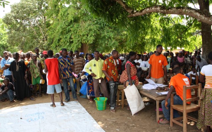
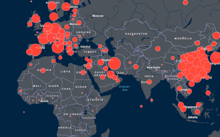

Related episodes
About the show
The 80,000 Hours Podcast features unusually in-depth conversations about the world's most pressing problems and how you can use your career to solve them. We invite guests pursuing a wide range of career paths — from academics and activists to entrepreneurs and policymakers — to analyse the case for and against working on different issues and which approaches are best for solving them.
Get in touch with feedback or guest suggestions by emailing [email protected].
Our crash course on transformative AI
We've carefully selected 10 key episodes to help listeners get to grips with the potential upsides and downsides of powerful, transformative AI.
Check out 'The 80,000 Hours Podcast on AI'
Listen here, or anywhere you get podcasts:
If you're new, see the podcast homepage for ideas on where to start, or browse our full episode archive.